Why The Color Blue Has Blown Up In Popular Culture
06/15/2023 | Marni Mervis |
Why Blue is Popular
You might have noticed something recently that you’re seeing the color blue everywhere. And when you’re not seeing blue, you’re likely reading about it. Blue is bountiful and seemingly everywhere these days. So why has the color blue blown up in popular culture?
New Blue
To provide a little context, let’s back up a bit to last year. In 2022, a new blue hit the market stirring up excitement around the tone. The blue, which is similar to cobalt, was an accidental discovery by chemists at Oregon State University.
From oceans to pools and every body of water in between, the color blue also ties uniquely well to summer. And with the summer season now upon us, it’s no surprise that blue is ubiquitous. Just last year we began to see the emergence of cobalt blue in a powerful way with the Pinterest-predicted trend of Hellenistic Revival, as well as when The New York Times highlighted cobalt, citing the palpable buoyancy provided by the electric color;. It is a color trend that continues on today.
Mermaidcore
The proliferation of blue throughout popular culture has also been aided by the release of Disney’s new live-action film, The Little Mermaid. Just like the anticipation behind the new Barbie movie spawned a movement of Barbiecore that influenced design and style aesthetics, so too has The Little Mermaid cultivated excitement around underwater, mermaid-inspired aesthetics. In fact, Mermaidcore has over 14.8 billion views on TikTok, and the term is up 183.4% in internet searches according to Predictive Data Platform, Trendalytics.
Furthermore, our recently released Dunn-Edwards 2024 Color + Design Trends Report even highlights some of ocean-inspired paint colors. Nautical (DEA139) can be found in the View To Wonder design story color palette, while Big Sur Blue Jade (DET577) appears in our Time of Comfort design story color palette.
Tech-nically Blue
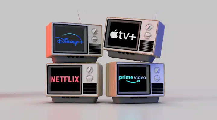
The fact is, we’re even seeing a shift to the color blue when we stream our favorite movies and television shows. That’s right, tech has jumped on the color blue’s bandwagon as well. With the proliferation of streaming services, platforms are under immense pressure to make their services as attractive as possible, says Marketingbrew, which means turning to the color blue for their logos. Why exactly? Well, blue is a color that is considered to be the world’s most popular color, and one that denotes serenity.
For example, Warner Media recently rebranded their HBO Max streaming service and its distinct purple logo to Max with a new blue logo motif. The race to brand with the color blue is likely tied to the idea that blue is one of the most-clickable colors, as noted by Travel + Leisure’s social editor precisely because of its approachability and mass appeal. In fact, Max now joins the ranks of Prime Video, Disney +, and Paramount + as streamers all touting the color blue in their logos.
Learn more about the color blue and its essential color theory and symbolism with our complete breakdown of the hue. And if you need more blue inspiration? Here are 8 blue palettes to inspire your next interior design project.


