Visions of Springtime Tranquility: 20 Calming Shades of Pink and Ideas for the Perfect Pink Pairings
05/15/2022 | Sara McLean |
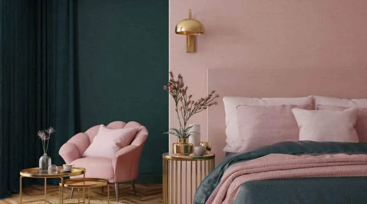
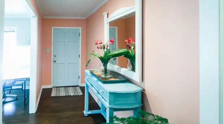
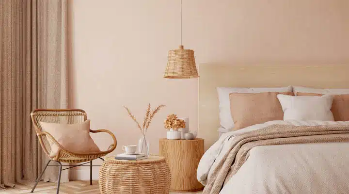
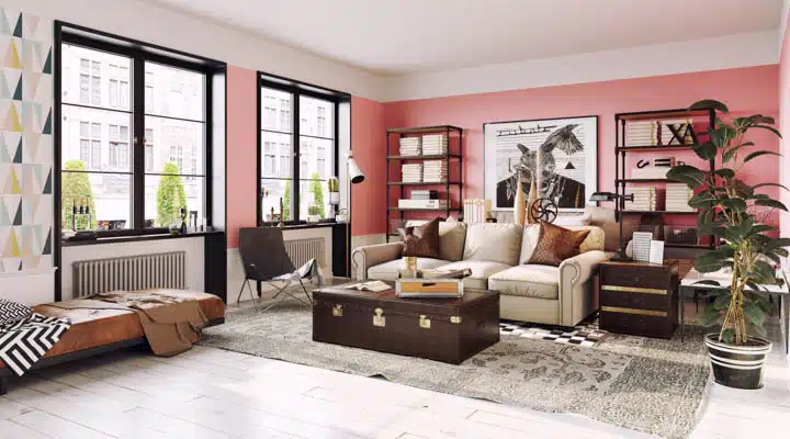
What are these softly-colored expressions of romance, the tranquil rosy hues with peaceful blushing tones we see everywhere? These ever-present calming shades of pink are stylish, versatile, and grown-up shades that can work in almost any design style. As it seems the color pink continues its reign in popularity and is here to stay, here are some of our favorite calming shades of pink, along with tips on colors to pair with for strong, cohesive color palettes.
20 Calming Shades of Pink
Colors to Pair with These On-Trend Rosy Hues
What are some of the best colors to pair with pink? These softer pinks are stylish, versatile, grown-up shades that pair well with many colors.
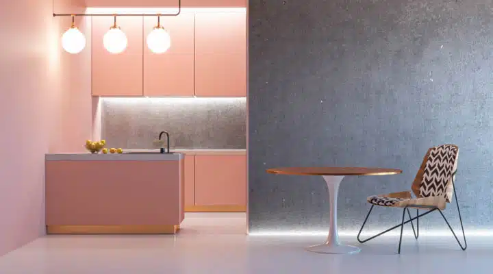
Soft Pink with Concrete Grays
This pairing balances the sugary notes of pink with an edgier, industrial touch.
Pink and Green
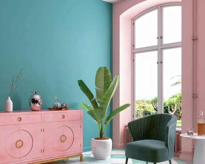
This is a trendy combination with high contrast, complementary colors. Look to pair soft, sage green with subtle pinks or vibrant emerald with deeper pinks.
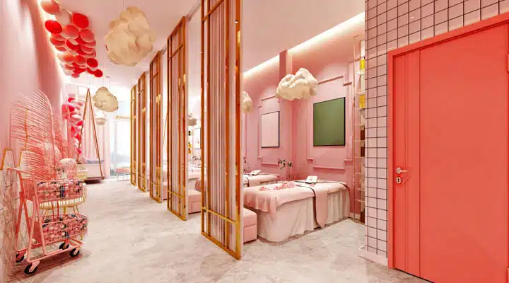
Pink and Orange
These joyful hues sit next to each other on the color wheel. Hot pinks and vivid oranges spark up contemporary designs, while softer shades of tinted pinks and peaches are reminiscent of an English garden. Pair with soft blue for a balancing touch. Try playing with values once you get comfortable with the combination. As an example, pair softer pinks with vivid, Vitamin C oranges for retro or modern interiors.
Muted Pinks and Blues
This pastel pairing creates a serene palette. Add off-white for final balancing touch. Want more punch? Add a pop of yellow to create a triad scheme (where 3 colors sit together on the color wheel).
Pink and White
A simple combination with maximum impact in rooms, pink and white highlights crisp, fresh interior spaces.
Pink and Black
The addition of the color black balances out the playfulness of pink with a grounding influence.
Pink and Yellow
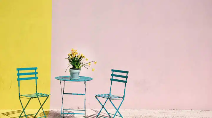
This cheerful combination is perfect for summertime vibes.
Pink and Red
Influenced from the fashion runways, this hot combination has permeated the interior design industry.
Pink and Gold
For an iconic color pairing, think of the past few years obsession with rose gold, and while rose gold is down trending we still continue to see variations of pink and gold palettes.
Colors that Pair Well with Light, Sweet Pinks
Lighter, sweeter pinks pair well with grounding shades like grays and blacks for an uplifted, fresh approach with an edge. For more colorful combinations, look to navy blues or deep, jewel tones for glamorous aesthetic.
Colors that Pair Well with Blush Pink
These more earthy, less sweet pinks and more popular as these shades can act as neutrals. Pair with a range of greens and blues, as well as reds and oranges for the strongest palette choices.
Did You Know? Surprising History Behind the Notion of Pink as a Calming Color
Many of us remember in our color theory courses a well-known 1980s psychological experiment using the paint color pink in prisons. The basic premise was to see if the color pink would calm male prisoners as the color was noted with more feminine attributes. The shade of pink used in the experiments was actually a brighter pink, not a calming neutral pink.
Pink colors similar to Baker-Miller Pink
The wardens were inspired by a series of experiments for a study by a research scientist named Alexander Schauss. He created a pink that he stated would reduce the aggressions of male prisoners. This study was set up where he had male prisoners look at a piece of paper with this color pink along with a blue color with their arms stretched out. When looking at this shade of pink, he could easily push the arms down, yet with the blue color, their strength returned. He called this pink "Baker-Miller Pink" after two naval officers, Gene Baker and Ron Miller, his two co-experimentors. The naval officers, impressed with the findings, painted their holding cells pink and continued to widely praise the results and the color gained global notariety. However, several years later, Schauss conducted the experiments again and didn't find the same outcome. Rather, Baker-Miller Pink provided no positive results, the color actually didn't reduce aggression.
Decades later the debate over pink's calming effects continues. Several other experiments studying the effects of the color pink have been conducted including those by psychologist Oliver Genschow and Swiss psychologist Daniela Späth who used a cooler shade of pink in her experiments. She called her shade "Cool Down Pink" and painted cell walls in ten prisons across Switzerland for the study with mixed results.
Photo Credit: GIULLIANNA BALZA ON UNSPLASH
So whether pink actually calms or invigorates, it still retains its popularity across a wide spectrum of design disciplines.


