Three Must-Have Unexpected Spring Color Palettes
04/17/2019 | specs+spaces staff |
When it comes to color we’re kind of obsessed. Lucky for us then when it comes to spring, a lot of color abounds. And when it comes to THIS spring, perhaps even more than usual. Simply step outside and glance around at spring’s bountiful blooms — virtually everywhere you look you’ll notice the colorful and vibrant results of this year’s wet winter in the Southwest. We’ve been inspired by the unique colors that have come with winter’s substantial rains and want to share with you some fresh and unexpected paint color palettes that reflect what we’re seeing in nature.
To kick things off, we’re starting with a palette inspired by this year’s much-talked about super bloom. That’s right, we’re talking about the colors of those dreamy California poppies. Ranging from golden tones to deep reds, this combination of paint colors will bring warmth and sunshine to any space. This palette is a great way to add a bold pop of color in your space with shades of oranges and reds.
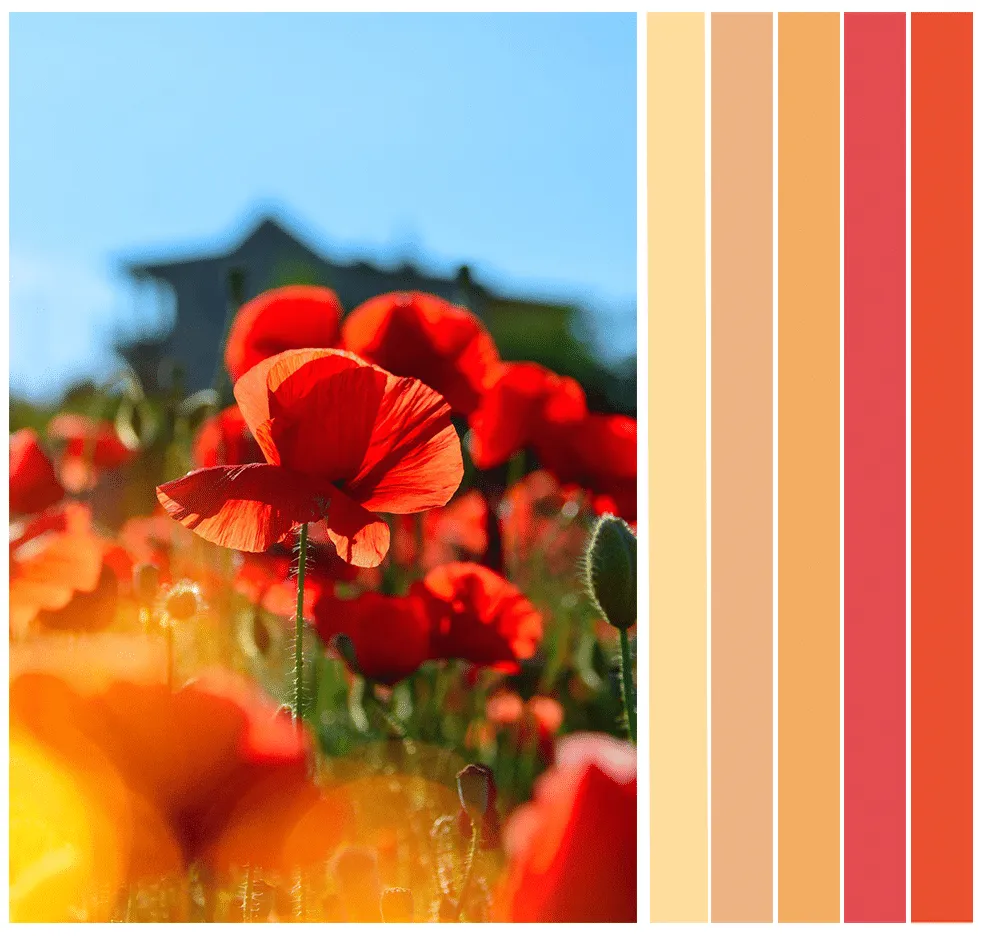
Colors used in order from left to right: Valley Flower (DEC727), Rusty Orange (DE5248), Blazing Autumn (DE5235), Strawberry Jam (DE5076) and Burning Tomato (DEA111).
This next palette is comprised of colors we see when we look up at the beautiful spring skies. A soft blue backdrop interrupted only by billowy white clouds softly passing by. Cool-toned colors such as these shades of blue help make a space feel relaxed. Seen here leading the palette is January Frost (DE5849), a paint color which is also part of the Dunn-Edwards’ Curated Colors of 2019, a collection of hues inspired by balance and
the search for soothing escapes. These blues can be accompanied by darker, moody colors to create a balanced palette with contrast and interest.
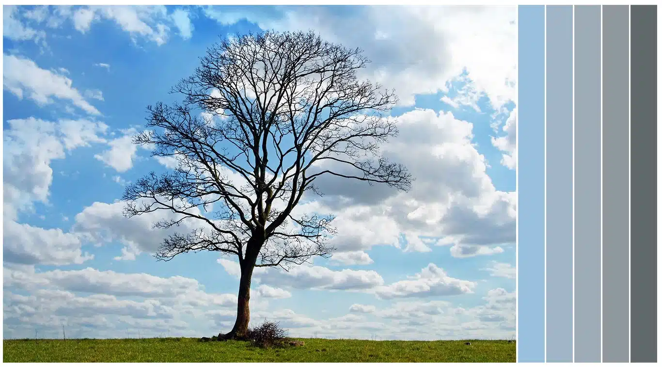
Colors used in order from left to right: January Frost (DE5849), Country Air (DET581), Irogon Blue (DEC796), Wolverine (DET610) and Equinox (DET616).
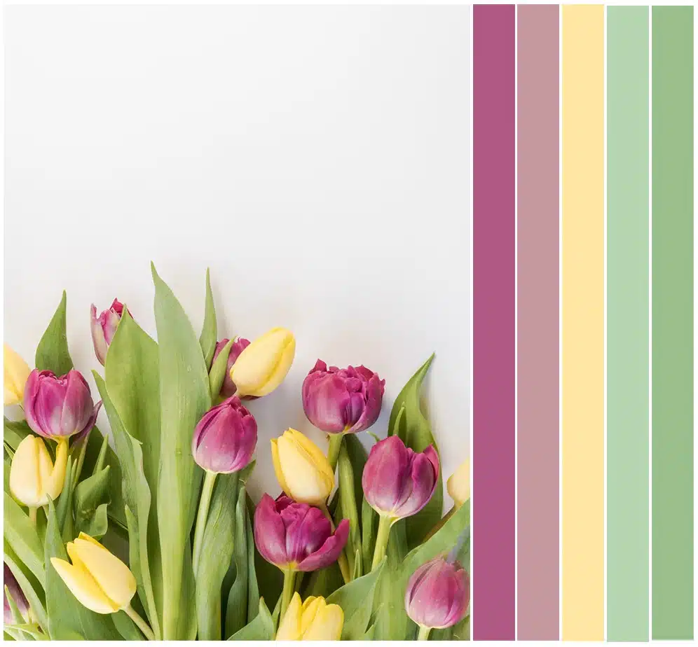
Last but not least, we have another palette inspired by spring blooms. This time it’s tulips, a flower often associated with the Easter holiday. Easter palettes are traditionally lighter-toned and pastel-based. We wanted to kick the color up a notch with more vivid shades of green and violet. If you prefer a more traditional palette, try incorporating April’s Color of the month, Spring Lilac (DE5001), as an accent color. And for even more
inspiration with purple and green tones, see how the two paint colors interplay in our Country Caper color trend palette.
Colors used in order from left to right: Vivid Violet (DE5012), Rose Meadow (DE6025), Sun Drenched (DE5304), Flower Stem (DE5605), and Rolling Hills (DE5606).
We hope that spring’s super blooms and bright blue skies have also inspired you to add refreshing coats of paint in your spaces. If you’re more of a visual person, download our Insta-Color® app. You can upload a photo from your personal library or one from ours, to give the space an instant, digital paint job. You can also order color samples to ensure you pick the perfect spring colors for you.
Featured Articles
-
Announcing the Color of the Century - Viridian Odyssey (DE1925)
-
 Best Oranges for the Perfect Summer Beach Cottage
-
 Get Ready for Fall with These Trendy Color + Design Moods
-
 Try These Color Palettes To Nail A Tomato Girl Summer At Home
-
 Embracing Barbiecore: Popular Pinks Throughout The Ages
-
 The Color Yellow: Essential Color Theory, Symbolism and Design Application

