The Relevance of Pink Throughout Design
01/05/2023 | Marni Mervis |
Pink is Here to Stay
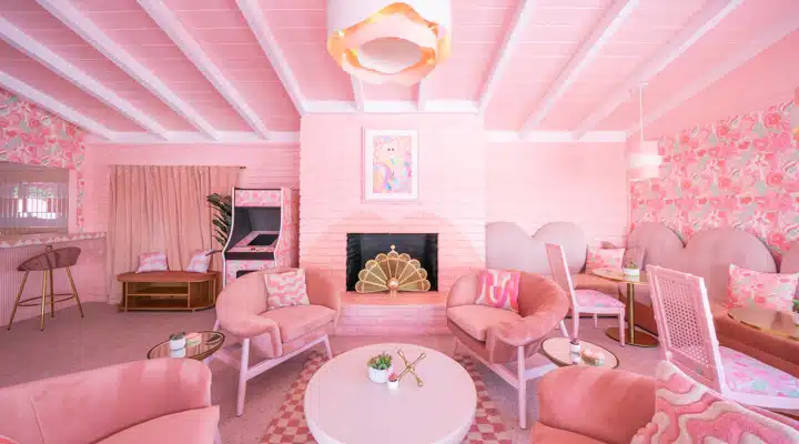
Pink, it seems, is everywhere. Terra Rosa (DE5096), a deep, rosy pink with terra-cotta influence, is our Dunn-Edwards 2023 Color of the Year. Hot pink has been front and center in the new Discovery+ show Trixie Motel, which showcases the renovation of a rundown mid-century Palm Springs motel by drag personality Trixie Mattel. Further, Architectural Digest recently took a dive into the importance of the color pink throughout Latin America; where it is a timeless color, prevalent in its design application due to its ability to evoke emotion. The color’s significance in Latin American architecture and textiles is profound, and with this in mind, we thought we’d explore the relevance of pink throughout history and the world of design.
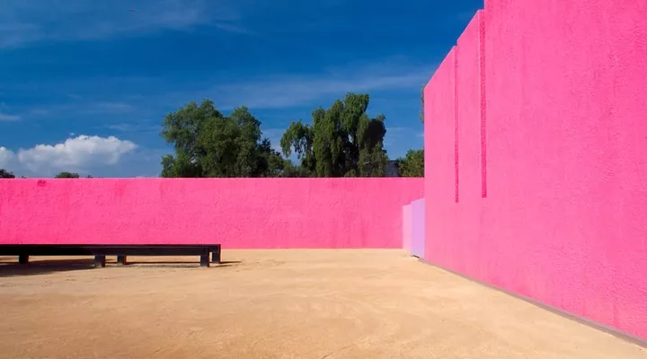
Cuadra San Cristóbal. Photo credit: Šarūnas Burdulis
Pink in Latin America
From rosa mexicano, a color used throughout Mexican crafts and homes, to the work of architect Luis Barragan pink plays a pivotal role to establish a memorable built environment throughout the region.
Pink in the Victorian Era
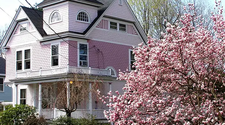
The ornate detailing of Victorian era architecture lent itself to more vivid color palettes, including
those that featured inspiring shades of the color pink. A wider array of colors helped the
numerous decorative elements of this architectural style stand out. Think the famous ‘painted
ladies’ Victorian homes of San Francisco. You can find historically accurate dusty rose hues
from the Victorian era in our Then, Now, and Forever® Collection.
Pink in Morocco
The city of Marrakesh, Morocco is known for its pink-tinted walls, made this way as a result of
the red earth used to construct the city. The city’s trademark color imparts its impact worldwide,
embraced by those trying to channel the city’s unique spirit thousands of miles away, like this
Palm Springs duo.
Photo Credit: Fred Moser
Pink in the Mid Century
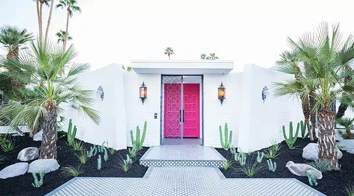
First lady Mamie Eisenhower sparked pink’s prevalence in the middle part of the 20th-century. Her trademark pastel hue spawned countless pink bathrooms and kitchens in the post war housing boom. While more vibrant pink tones often don the doors of mid-century modern homes today, such as that pink door or this pink one, it is blush pink hues which are most accurate to the era, including a number of Then, Now, and Forever® Collection colors such as Rose de Mai (DET432), Gypsum Rose(DET452) and others.
Pink in Activism
Pink ribbons are synonymous with breast cancer awareness and activism. But before that little pink ribbon was everywhere, hot pink, particularly hot pink triangles, represented gay rights activism during the 1970s. The symbol, which was used by the Nazis during the Holocaust as a way of identify gay men, was reclaimed during this period.
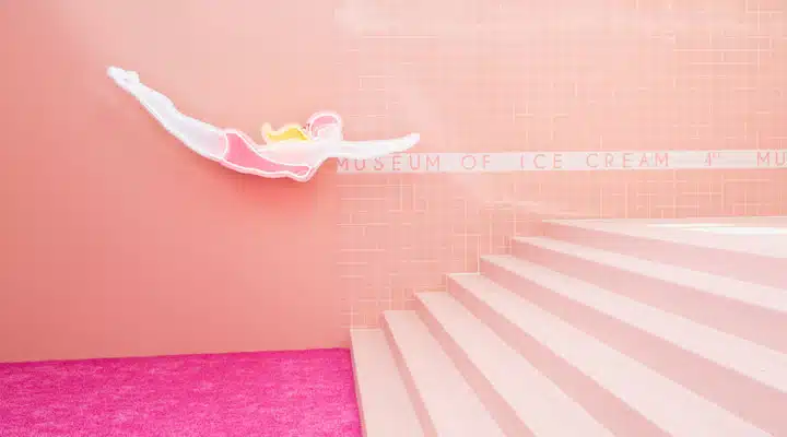
Photo courtesy of the Museum of Ice Cream
Pink in the new Millennium
In the 2010s Millennial Pink took the world by storm. This gender-neutral pink quickly became
both a new neutral and an Instagram sensation. The color gave birth to colorful new tech,
experiential museums, and restaurants and cafes all looking to capture some part of the color’s
powerful cache. In a world where the second half of the 20th-century became synonymous
with girls and femininity (but more on that later), Millennial Pink became a new neutral in the 2010s. So neutral in fact, that Millennial Pink was often featured as the base in color in everything from office
spaces to restaurants like the Insta-famous India Mahdavi-designed Gallery at Sketch. In fact, this barely there shade of pink helped usher in the minimalist aesthetic that dominated the decade.
Trixie Motel Lobby
Pink in Barbiecore
Barbiecore is the latest social media design trend. Inspired by the Mattel fashion doll Barbie,
which originally launched in 1959 amid the above-mentioned Mamie Eisenhower pink craze,
Barbiecore is, you guessed it, all about pink. This recent explosion of hot pink, bubblegum-colored everything is perhaps best explained as a manifestation of pandemic fatigue. Pink in the context of Barbiecore is all about embracing fun - unabashedly girliness and kitsch is why the hashtag #Barbiecore has over 7 million views on TikTok.
Click here for more about pink’s symbolism and design application.


