The Color Yellow: Essential Color Theory, Symbolism and Design Application
07/10/2023 | Sara McLean |
Yellow Color Theory
Refreshing, joyful, and lively–just a few of the many ways to describe the color yellow. Recognized widely as a cheerful, energetic and happy hue, yellow inspires enthusiasm, creating a sense of warmth and vitality. As a color that elicits strong emotions—varied and complex—care needs to be taken on the appropriate use of the color when designing spaces.
How is the Color Yellow Created?
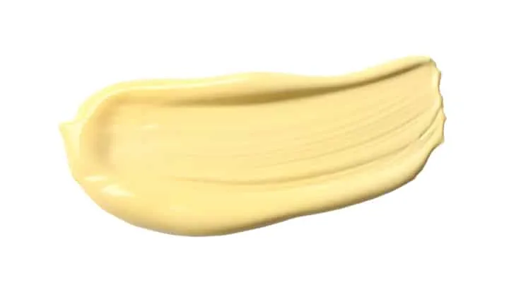
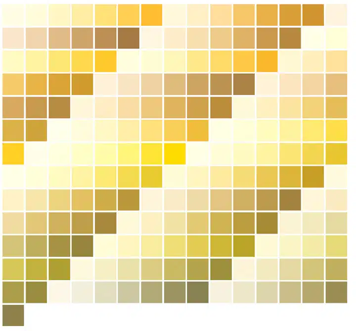
Yellow is known as a primary color on the traditional color wheel and sits between orange and green. It is considered a warm hue, along with red and orange. There are shades of yellow in light, medium and dark and range from orange yellows to green yellows. Light yellows consist of tints of yellows, created by mixing yellow with white and consist of names like lemon chiffon, cream, and flax. Medium yellows are saturated and include sunshine, pineapple, and lemon. And dark yellow shades, created by mixing yellow with black, veer into browns include goldenrod, mustard, and brass. In the architectural coatings industry, we create nuances in color by working with colorant formulas to add depth and character, adding the right balance to create the perfect touch of yellow to a space.
Light Yellows
- Light yellow – Pale shade of yellow
- Lemon chiffon – Light, airy yellow slightly warmer than light yellow. Reminiscent of the color of lemon chiffon cake or spun sugar
- Flax – Dull, muted earthy yellow similar to tan and ecru. Named for the dried stems of the flax plant and often used to describe the light golden color of hair
- Light goldenrod – Pale version of goldenrod with a slight pink undertone
- Light khaki – Brownish beige yellow inspired by a type of trousers worn by many
- Cream – Pale, warm shade of yellow similar to the color of butter, closer to an off-white
- Jasmine – Pale yellow color inspired by the jasmine flower
Medium Yellows
- Canary – Bright shade of yellow named after the bright plumage of the canary bird
- Sunshine – Bright, medium shade of yellow named after the light from the sun; a cheerful, warm color
- Lemon – Light to medium shade of yellow similar to the rind of the lemon fruit
- Saffron – Medium golden yellow to yellow-orange color similar to flowers of the saffron plant
- Royal yellow – Warm golden shade of yellow
- Gold – Warm, brownish or orange shade of yellow named after the mineral gold
- Amber – Warm color between orange and yellow inspired by the fossilized tree resin
Dark Yellows
- Goldenrod – Deep, earthy warm yellow named after the wildflower; similar shade to mustard
- Citrine – Golden yellow shade with an acidic hint of green
- Brass – Dull gold or yellowish brown shade similar to the metal brass
- Dark yellow – Golden to brownish yellow shade darker than mustard and brighter than gold
The Meaning of the Color Yellow
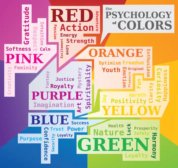
The color yellow has both positive and negative connections and is one of colors that provide the most contradictory emotions. The psychology of the color yellow tells us that the color has traditionally been a symbol of joyfulness, happiness, and energy and is associated with summer months. While on the other hand, it also symbolized caution and cowardice and irritates people in certain shades.
Where Does the Color Yellow Originate From?
Yellow has a long, rich history in art and society. As one of the most useful colors in artwork, we first note that in prehistoric times, yellow pigment was used in cave paintings. Fast forward to the Medieval and Renaissance eras, a color called “Indian yellow,” a pigment created from restricting cows to a diet of mango leaves, was used to display outsiders. When viewing artwork of biblical times, the traitor Judas is often depicted in this shade of yellow, and over time the color became associated with cowardice and poor character.
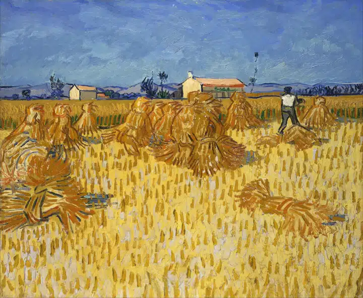
And in the Impressionist and Post-Impressionist eras, artists chose yellow to evoke light, vibrancy and life. Vincent Van Gogh focused on a painting series using yellows during a period of time when living in Arles, France as he had a fascination with the range of yellows in lighting, fields and sunflowers in this region. During his time there, he wrote in one of his letters to his sister in 1888, “Sunshine, a light which, for want of a better word I can only call yellow—pale sulphur yellow, pale lemon, gold. How beautiful yellow is!”
Harvest in Provence. 1888. Vincent Van Gogh. Credit: Public Domain Wikipedia Creative Commons
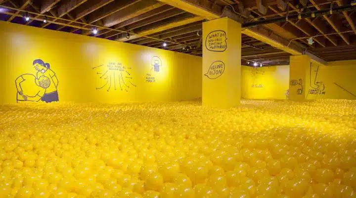
In more recent times, the color has been used widely due to its high visibility. Signage is often displayed in a vivid shade of yellow. And within the past several years, this a bolder shade of this hue has surged in popularity due to its connection with Gen Z. This hard to miss yellow is has youthful fun and energetic vibes.
The Color Factory. Photo Credit: Color Factory
How to Design with Yellow
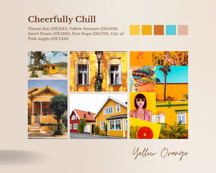
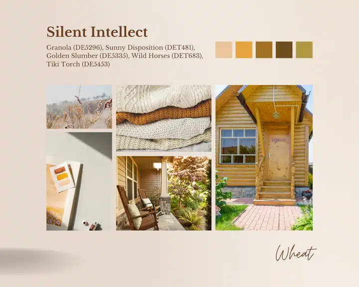
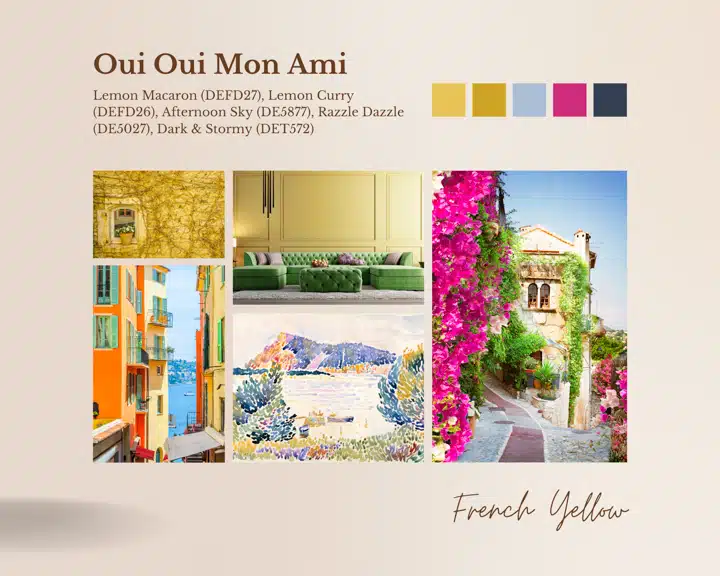
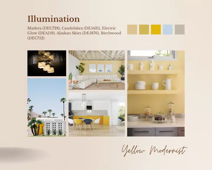
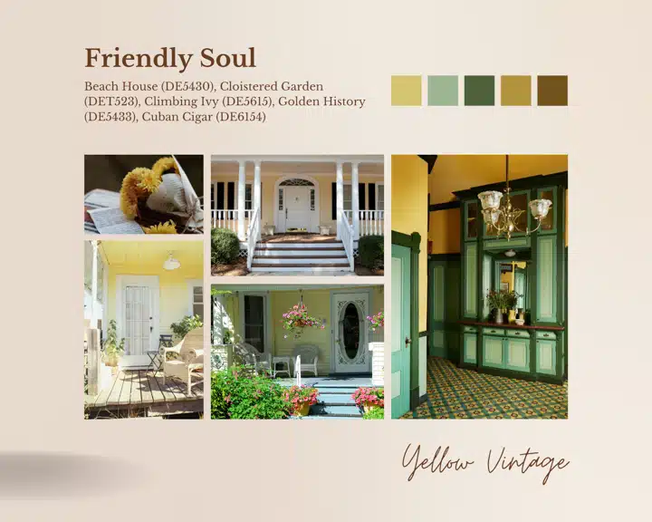
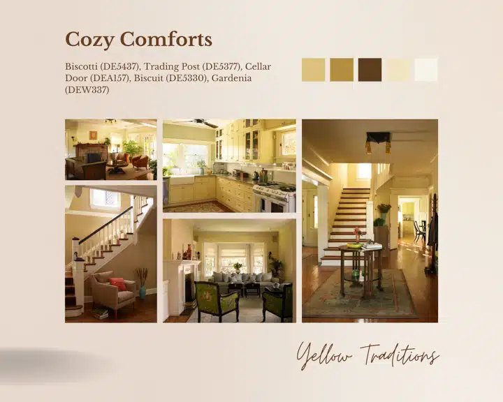
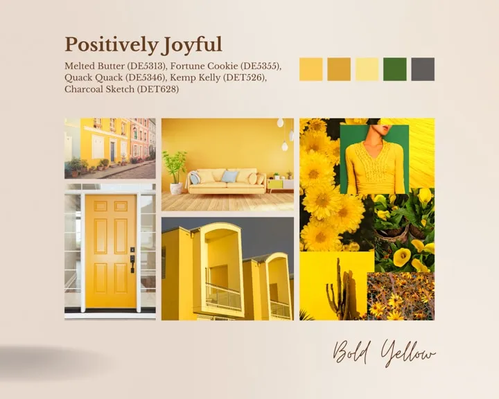
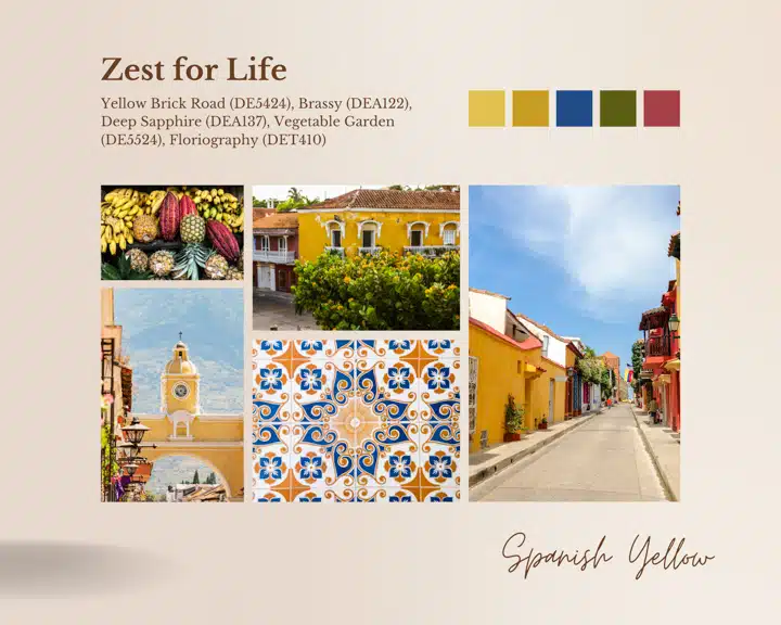
Yellow is a versatile hue that makes a space feel summer fresh, soothing or bold. Here are 8 mood boards to inspire your next yellow project:
Orange yellows like amber and golden yellow are sophisticated and look beautiful in interior design styles.
Browned yellows like mustard and ochre add a sense of tradition to design styles. These are some of the oldest yellow pigments.
Green yellows like citron and chartreuse lend a vintage quality to design schemes.
A a soft touch of yellow to well lit spaces for a modernist retreat.
An important tip for designers is remembering that there's the potential for a variety of colors to work in different styles when the right shades and hues are chosen. A traditional room filled with deep, wood tones benefit from shades of yellow. These more sophisticated shades of yellow give the space an earthy, cozy and friendly feeling.
It's common to see buttery yellow warming the gathering hub of the home.
Bring in touches of yellow to gives a space a cheery, welcoming disposition.
The right shade of yellow that isn't overly bright or soft transforms any space into an invigorating oasis.
Check out more about the color yellow and how to design with this hue. And read on to see why we chose the following shades as our Colors of the Months over time: Lemon Gelato (DE5464), Summer Sun (DE5405), and Beach House (DE5430) . And read on to see why we chose Honey Glow (DE5354) as our 2017 Color of the Year. Need more inspiration? Read our 2024 color + design trends report for an in-depth look at all the trends we look forward to in the next year.


