The Color Palettes of Wes Anderson
03/21/2018 | specs+spaces staff |
Color is one of the easiest, most effective and budget-friendly ways to completely transform a space. It’s incredible to see how color’s use is adapted for, and how it translates to, other mediums such as film. In fact, the notable and creative use of color is a common trademark of film director, writer and producer Wes Anderson.
Anderson’s films are widely known for their very specific color palettes. In fact, his films consistently showcase a detailed use of color, which invariably define the self-contained, whimsical and fictional worlds for which his films are famous. Because design inspiration can strike from any number of sources, we’re offering our own take on a few Wes Anderson-inspired color palettes to help inspire the creation of your own whimsical worlds.
The Grand Budapest Hotel
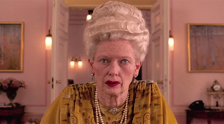
Image Credit: FOX SEARCHLIGHT
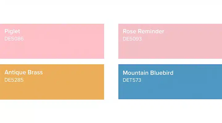
If you’re looking to be on trend, then this is the color palette for you. This palette includes one of the hottest color trends in the design world at the moment, Millennial Pink. Additionally, it also features one of the hottest color trends we’re seeing for 2018: denim blues and warm blue. Pinks such as these, Dunn-Edwards’ resident color expert Sara McLean, notes are “more grounded, less candy-sweet and a bit nostalgic and is shown in both men’s and women’s fashion runway shows, art installations, product launches, as well as a range of marketing and branding launches.” Then add a warm blue to help the eye relax, while a mustard-toned yellow can infuse a feeling of happiness and sunshine, steeped in nostalgia. These colors are great in serene spaces such as a bedroom, bathroom or dining area.
Isle of Dogs
Image Credit: FOX SEARCHLIGHT
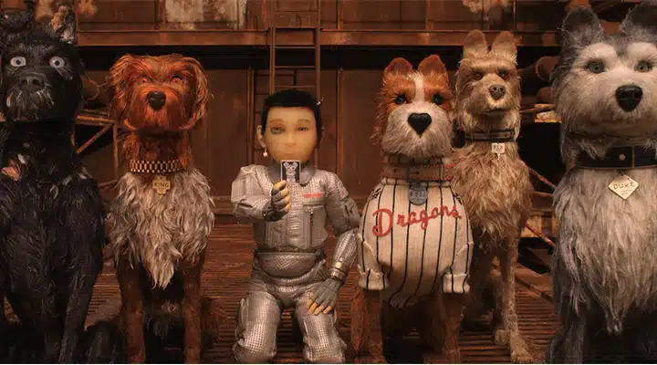
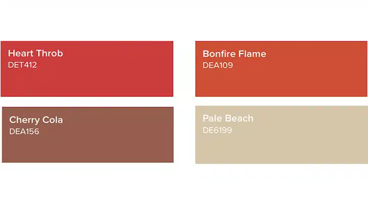
Anderson’s newest film “Isle of Dogs” hits theaters on March 23. From the looks of it, we can expect the new stop-motion film to be just as vivid and rich in hues as any of Anderson’s live-action films, but perhaps with a grittier approach. This palette relies on variants of red, a color signifying power and strength, love, as well as danger. Try using this color in fun, high-traffic areas, like game rooms or living rooms. It provides a high-energy and colorful environment.
The Darleejing Limited
Image Credit: FOX SEARCHLIGHT
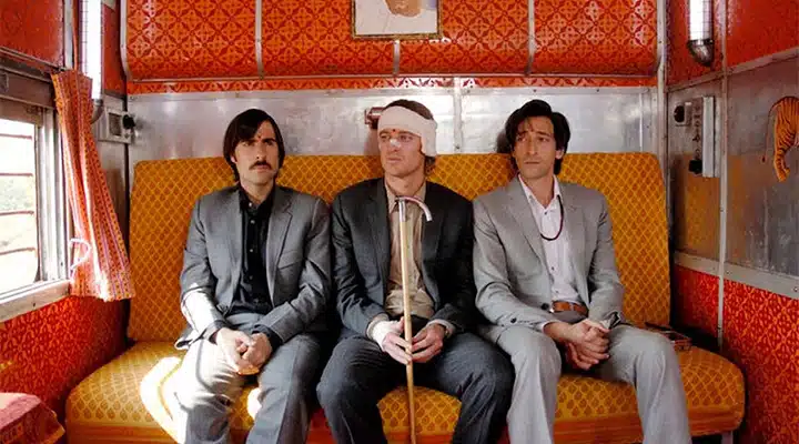
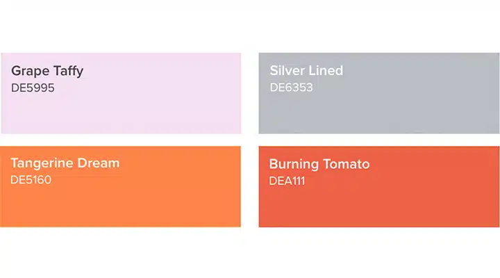
The third and final film we took inspiration from is "The Darjeeling Limited." The movie was filmed in India and its palette is largely influenced by the locale’s use of rich, warm and vibrant hues. This palette expertly contrasts those warm orangey-red tones with the stark opposition of the cooler hues sported by those worn by the film’s characters. The result? A medley of depth, vibrancy and contrast in any space.
Want to bring a whimsical color palette into your next design project? Dunn-Edwards paints are composed of the highest-quality paint trusted by both design experts and painting professionals. Dunn-Edwards is committed to bringing you the freshest paint colors for commercial, residential and exterior uses. Get ahead and on board with these color trends by using our InstaColor® app, just upload a picture from your library or choose one from ours to give your space an instantaneous paint job.
Featured Articles
-
 Best Oranges for the Perfect Summer Beach Cottage
-
 Get Ready for Fall with These Trendy Color + Design Moods
-
 Try These Color Palettes To Nail A Tomato Girl Summer At Home
-
 Embracing Barbiecore: Popular Pinks Throughout The Ages
-
 The Color Yellow: Essential Color Theory, Symbolism and Design Application


