Querencia: Dunn-Edwards 2021 Color + Design Trends
11/11/2020 | Sara McLean |
As we move forward into the new decade, we are faced with the repercussions of a global pandemic and chaos. Out of these events comes a period of reflection and radical change. What have we learned? What will we change? Can we heal?
A revolution of mind, body and soul is upon us as we seek out a new normal, challenging outdated notions of life and design and nourishing our creativity with new magic and mystery. Our relationship to nature becomes humbler, as we look to heritage and craft for a renewed nostalgia.
Creativity is often forgotten when we talk about sustainability. However, we see a real evolution in the “aesthetics of sustainability.” The quest for meaning and desire to act concretely motivate us to take an interest in materials, reconcile ourselves emotionally with these ideas, and focus on eco-responsible
creative processes and the virtuous aesthetics that result from them.
Welcome to the Roaring ’20s, Part 2!
2021 Trends Story: Querencia
Querencia: a place from which one’s strength is drawn, where one feels at home; the place where you are your most authentic self.
In Querencia, we discover a renewed fascination for artisan crafts. When we talk about sustainability, creativity is often forgotten. However, we see a real evolution in the “aesthetics of sustainability.” The quest for meaning and a desire to act concretely motivate us to take an interest in materials, reconcile ourselves emotionally with these ideas, and focus on eco-responsible creative processes and the virtuous
aesthetics that result.
Like a remedy to anxiety, we prefer immersive vegetation decors and take inspiration from the flamboyant colors and incredible textures of the plant and animal world. Aesthetics linked to climate change are adorned with a resolutely poetic veil of nostalgia.
Rooted in the charm of regional traditions and history, establishing local foundations and rediscovering emotions. We look to simple joys filled with gratitude and generosity. Leaning into connections, we cherish family, especially the elderly, as well as first responders who selflessly come to our aid in times of crisis.
As we seek goodness in life, we treasure simple joys and days filled with gratitude, generosity and kindness. Amid the current crisis and staying away from friends and family for safety’s sake, we crave intimacy and connection.
The chase for perfection has comes under fire, and there is now a backlash to the never-ending cycle of unattainable lifestyles. We learn to trust our inner voices and find comforts in the home are where we are meant to be.
Inspiration
Think local and rediscover the know-how and vitality of regional richness, redesigned through the filter of modern times. There is a decadence in the uncomplicated tasks of daily life, while disconnecting from technology and resetting daily life.
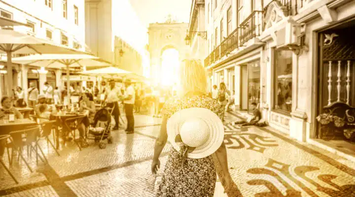
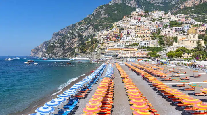
We connect to emotions based on authenticity. There is a focus on the south Mediterranean, a region rich with a tradition, and rediscovering the pleasures of good products created with established, local know-how. As a result of the touch crisis, we seek tactility and comfort in these authentic products.
New immersive spaces, modeled on old-fashioned specialist stores, celebrate an authentic part of living with a contemporary take, based on regional gastronomy and everyday functionality.
Design
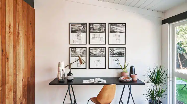
Through the design lens, we crave innocence and whimsy and delight in homespun, small-town delights filled with humor and nostalgia. Retro styles of the 1950s — ’60s era highlight a return to the golden age of design. And, as we tire of the cheap fast-fashion, we yearn for simple classics that are updated to modern times. Home offices are key jumping-off points, as many of us will continue to work remotely for the foreseeable future.
Photo credit: BETHANY NAUERT PHOTOGRAPHY
There is a design revival in learning new skills to turn the ordinary and outdated into a new, timeless and whimsical aesthetic. Interior design take shape through themes of playfulness and whimsy, to the simple elegance and a focus on the core essentials.
Color Palette
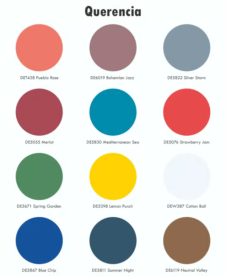
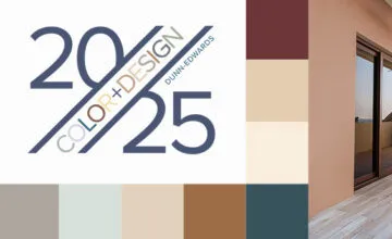
Subtle, delicate and graceful, the palette starts with soft, chalky and watercolor tones with infusions of light and patina effects. There is a soft warmth to the range of hues balanced by toned-down cooler shades. Pops of tangy pastels add a cheerful, fresh mood, while ’70s sunset gradients punch up the retro vibes.
Rethink the red, white and blue flag colors and classic tricolors, as the importance of joyfulness highlights delightful quirkiness. Transparent filtered colors are sentimental, while graphic tones, tempered by gradated half-tones applied on summer stripes, as well as mini geometrics from the archives, showcase a softened retro, summery vibe.
Materials and Textures
There is a light-heartedness and focus on comfort in materials and surfaces. Soothing and organic, heirloom-quality and artisan. Here are distinctive concepts to consider when designing with Querencia in mind:
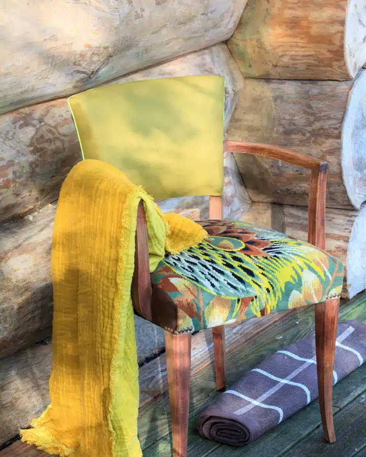
- Regional heritage — hand-crafted braiding, straw and cane work, and traditional weaving. Workmanship from another era is revived and reinterpreted in artisan-designer collaborations. Add to this a fondness for Mid-century modern revivals: snake-channel tufting, soft curved lines and ergonomic chairs in poppy hues.
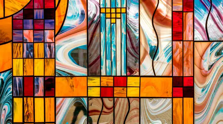
- Stained glass revival — colored neo-stained glass transparency and cloisonné enamel, in addition to metal outlines or satin patchwork, precious ornamental and geometric textures.
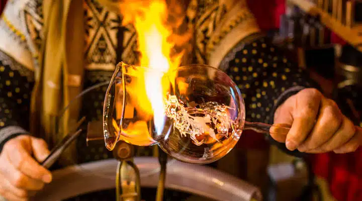
- Barware revival — glassblowing is a fascinating art form that has recently regained traction and — along with that — a renewed interest in artisan glassware and barware. As we continue to practice social distancing, home bars are in-demand design elements.
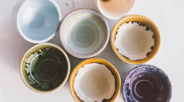
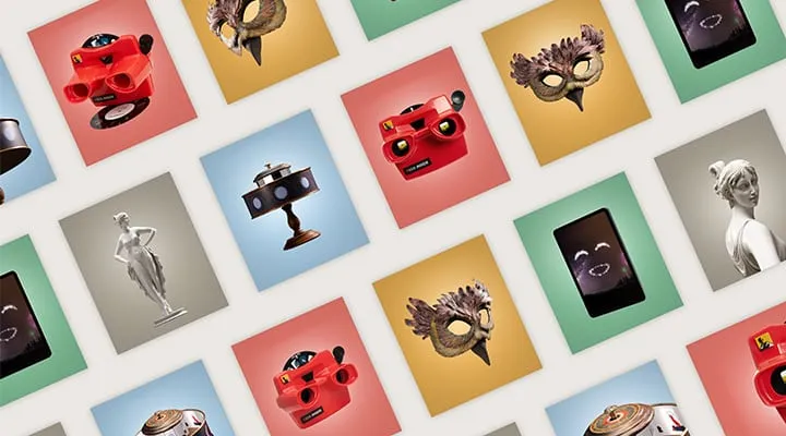
- Modern chatelaine — medieval references — such as chains, precious historical ornamentation in jacquard, and resin-coated feathers and vintage ceramics, and couture scarves recycled as cushions highlight a new decorative industry.
- Kitsch florals and country calico — overdyed checks, blocky contrasted color, rural mini-geometrics, trompe l’oeil embroidery, country florals or naïve gouaches. Fresh decorations combined or working in positive-negative treatments.
- Re-enchanted nostalgia — turned wood and painted paneling, stained-glass windows from yesteryear, azulejos or cement tiles reawaken the charm and emotion of a family home. Combine precious details and folk accessories to tell a new story of the place and live there in the present. Modernized tailoring in silk, linen and wool muslin with updated pinstripes, argyle and painterly surfaces exude qualities of bygone eras.
- Customized tradition — showcase the handcrafted aspect of production, highlighting quality and sense of detail, for illustrations as well as for the choice of material-media and for expressing developed expertise.
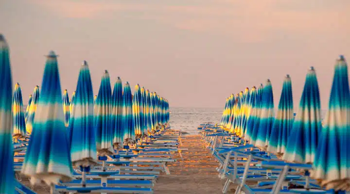
- Family story — like a summer seaside memory, we romanticize regional traditions. The result is authentic, intimate and comfortable. Seaside graphics, diagonal stripes, retro geometrics and candy-colored saturated stripes and glassware are key to seaside nostalgia.
- Childhood charms — childlike, simplistic forms and fonts highlight positivity and energy to Querencia. Voluminous constructions and malleable forms permeate the brighter range of colors within the palette.
To learn more about our 2021 color + design trends report, click here. And to view the full 2021 color palette, visit us here.
Featured Articles
-
 Best Oranges for the Perfect Summer Beach Cottage
-
 Get Ready for Fall with These Trendy Color + Design Moods
-
 Try These Color Palettes To Nail A Tomato Girl Summer At Home
-
 Embracing Barbiecore: Popular Pinks Throughout The Ages
-
The Color Yellow: Essential Color Theory, Symbolism and Design Application


