Matching Your Mood: A Guide to Picking the Perfect Paint Color for Your Space
02/28/2018 | specs+spaces staff |
Color is perhaps the most important part of a design. It sets the tone for the entire project. It’s no wonder then that picking out your paint colors can take a fair amount of research. After all, the right color helps to convey the desired mood, or atmosphere, of a space.
Mood+Color
Blue
The color blue is cool toned. Blue paint evokes a feeling of comfort and calm. If your goal is to create a room that matches you peaceful and tranquil mood, then this is the color for you. Building a bedroom around blue paint can be ideal for exactly this reason. Blues ideally work best in areas where you want recharge after a long day and relax, like a bedroom or a spa-like bathroom.
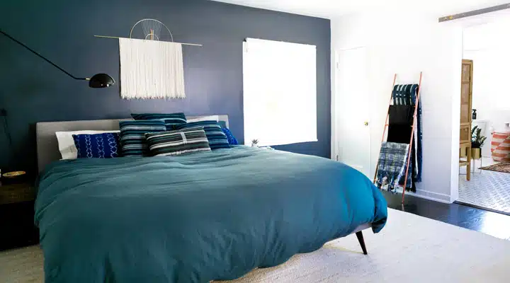
Image Credit: Monica Wang
Alternatively blue-green tones are a great base color with which to build an eclectic or worldly space. Are you adventurous? Create an atmosphere that inspires your adventures spirit and sense of wonder. Need further inspiration? See how we would Build a Room Around Blue.
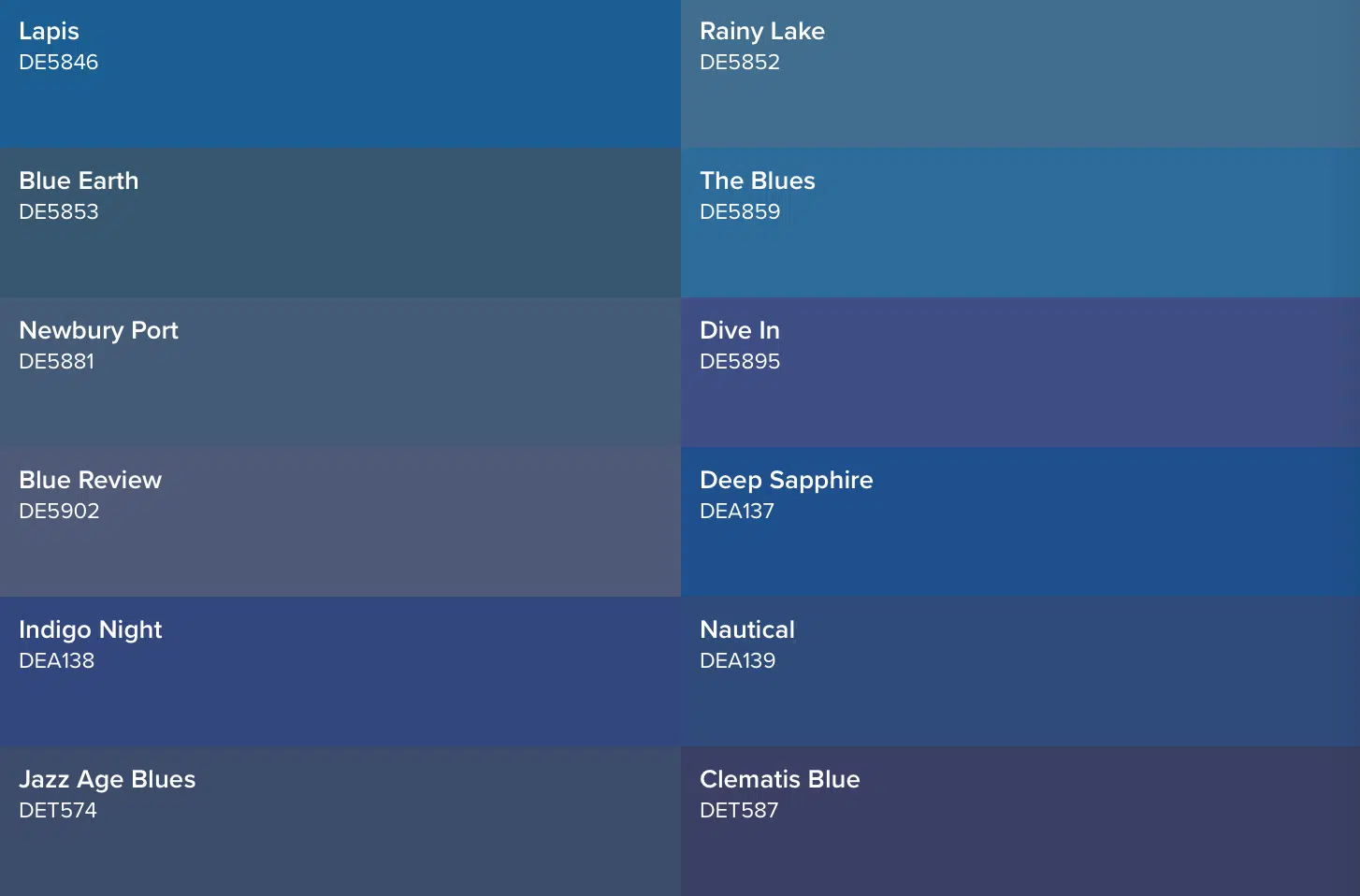
Check out a palette of some of our favorite blues, below!
Red
Red is a bold color, and is often associated with moods of passion, love, and determination. This color is for a fun and energetic space and works well in bustling spaces. In the mood to channel your determination and power? Try red tones in a work space. To help visualize what red could look like in your space, check out February’s Color of the Month, Amour (DE5104), then see how we’ve built a room around red, here.
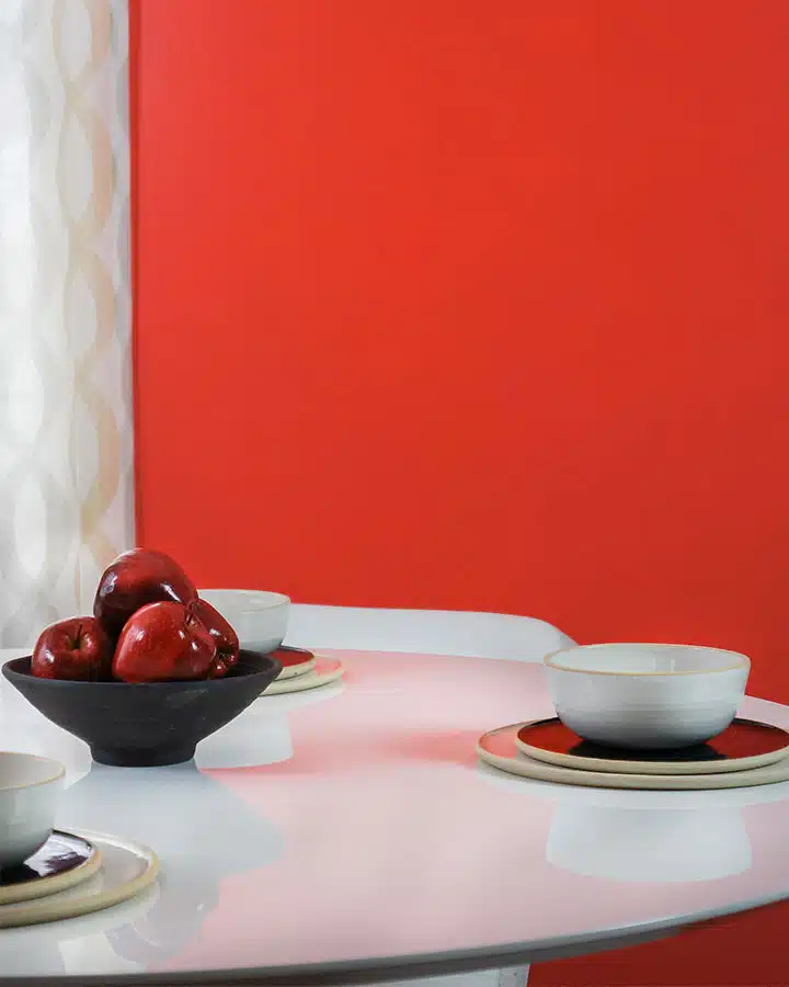
Image Credit: STRUKTR Studios
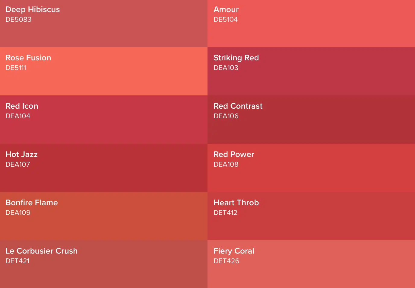
Check out a palette of some of our favorite reds, below!
Green
This is a color choice for those who feel most at ease in natural environments. The color green symbolizes growth, rejuvenation, and is representative of life; it is why green is so often associated with spring. And let’s be honest, Jungalow influence is every right now - from everything designer Justina Blakeney does to the interior design of hotels around the world, like Velona's Jungle Luxury Suites in Florence to Los Angeles’ Nomad.
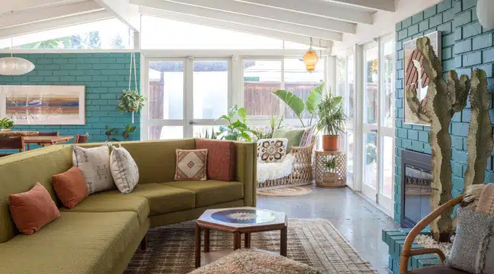
Image Credit: Bethany Nauert
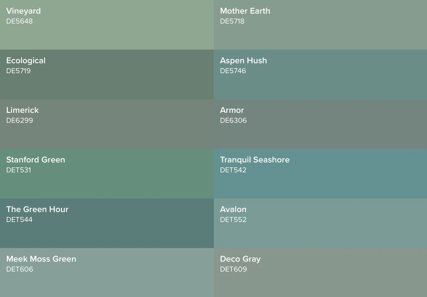
Because green is universal and has the ability to bring life to a room, green paint is a color that works well in practically any space. It creates balance, calm, and harmony, so if those moods are your goal, we recommend taking a peek at some of our favorite greens, below. See how we even utilized The Green Hour (DET544), our Dunn-Edwards 2018 Color of the Year, as a neutral in this Long Beach, California mid-century home
curated by 6th and Detroit owner Michelle Qazi.
Check out a palette of some of our favorite greens, below!
Yellow
For a joyous and radiant mood, perhaps there is no better choice than Yellow, the brightest hue in the color spectrum. The explosion of Gen-Z yellow in the design world and yellow’s use at pop-up exhibits like HAPPY PLACE only help to reinforce this association. And in fact, it’s the friendly and bright tones of Dunn-Edwards yellows, like Brittlebush (SPS006), which have helped make Palm Springs’ Saguaro Hotel an Insta-Fave!
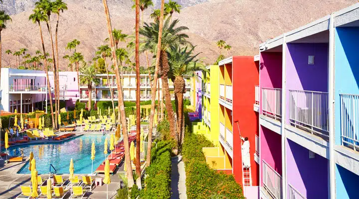
Image Courtesy The Saguaro Palm Springs
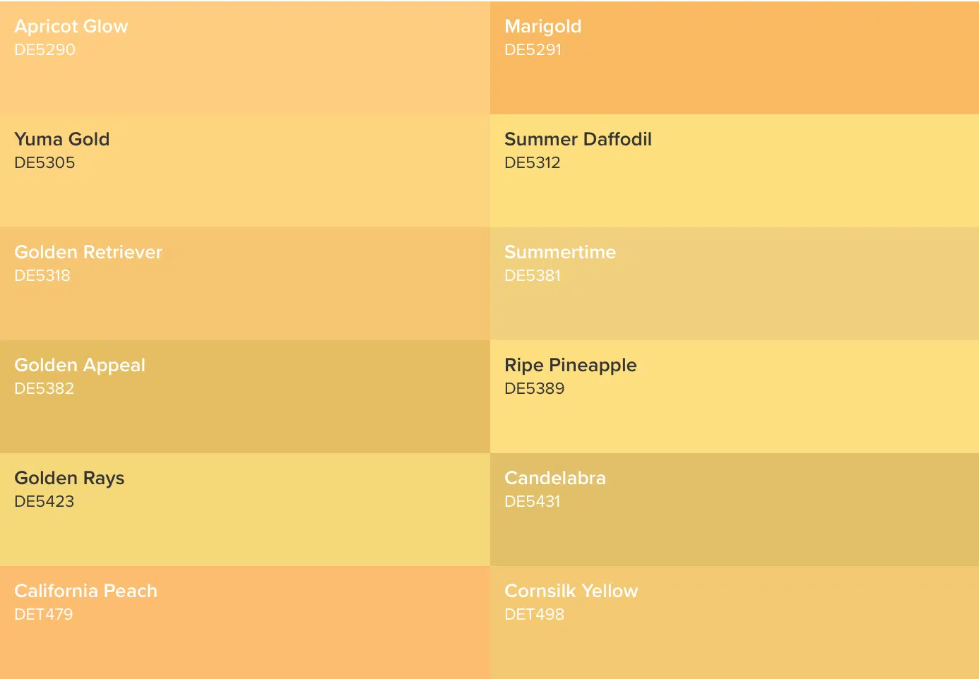
Yellow hues bestow a space with energy and an inviting feel. Cultivate a space to match your mood by using yellow paint in the places it works best: high traffic areas like a kitchen, living room, or office space.
Check out a palette of some of our favorite yellows, below!
To get started choosing the colors that best fit your mood, download our Insta-Color ® app and simply upload a photo from your personal library or one from ours, to give the space an instant paint job. Dunn-Edwards is committed to bringing you the highest-quality paint that is also trusted by both design experts and painting
professionals. Once you’ve picked out some colors to try, get moving on your project by ordering your free samples.

