Introducing the Multifamily Color Collection
05/14/2024 | Dunn Edwards |
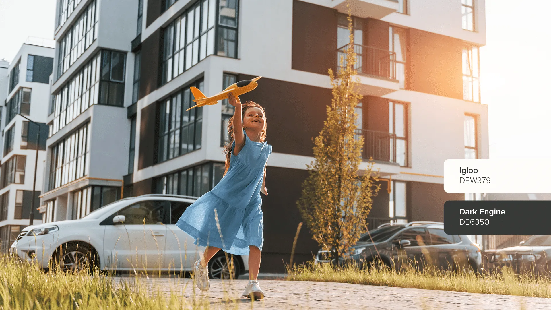
If you're a multifamily property owner or manager, you know how important it is to attract and hold onto good tenants. The best ones report maintenance issues promptly, keep common areas tidy, treat their units with care, and always pay on time. In fact, going the extra mile to keep these "unicorn" tenants happy can literally pay off in the way of lower maintenance and turnover fees. Now at this point, you might be wondering: what does any of this have to do with paint, much less color?
It turns out, color has immense power in terms of attracting (or repelling) people. Studies have shown that our emotional reactions to color can influence us to see a place as either hospitable or hostile. When it comes to multifamily properties, the impact of color cannot be overstated. Using high quality paint in the right colors can strategically help you attract the right tenants while enticing them to stay longer.
The art of choosing colors for dwellings that other people will inhabit is complex, and it involves so much more than your personal preference. Special care must be given to ensure a broad appeal, maintain consistency with architectural styles, and stay on top of the latest trends. That's why we've turned to our own color and design experts to help us launch the Multifamily Color Collection.
With four carefully-selected palettes appropriate for a range of building styles and regional tastes, multifamily property owners and managers now have an easy way to select primary, secondary, tertiary, and accent colors that harmonize inside and outside to create spaces where people love to live. These fresh palettes are both timeless and trending, meaning that they give an upscale, contemporary impression while also ensuring that your property will look good well into the future. Without further ado, here are the four new palettes that make up the Multifamily Color Collection:
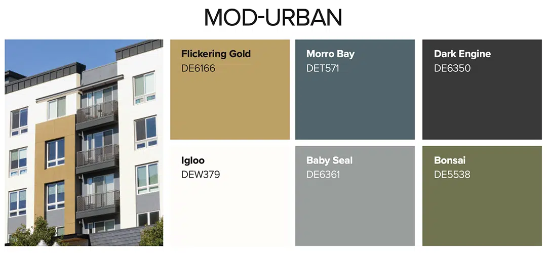
If a modern, sophisticated look is what your property demands, go for this mix of bold contrasts. The colors in this palette complement properties with clean lines and minimalist or industrial styles. The Mod-Urban palette can look polished or playful, energetic or subdued—depending on how you combine the colors. Adding a splash of bold color or leaning into the dark end of this palette can give an exterior an edgy, fresh feel that will attract upscale tenants, while the lighter and more muted tones allow for design flexibility inside.
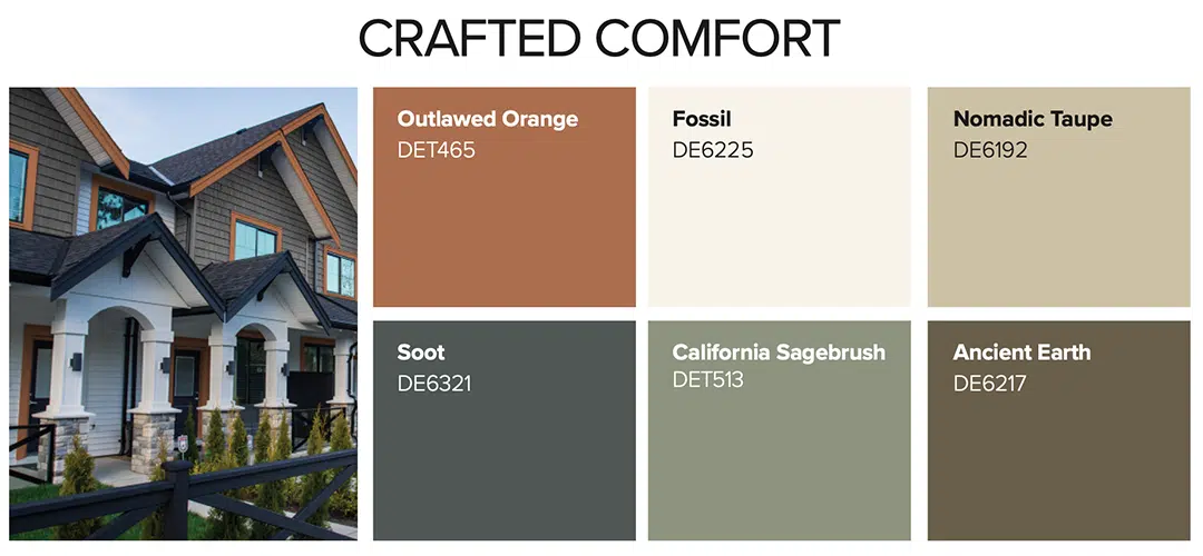
Perfect for families and those who desire a cozy place to call home, the Crafted Comfort palette works best to highlight the architectural details of Craftsman, Art and Craft, and Spanish-influenced buildings. With grounding earth tones and pops of orange, green, and gray blue, this palette feels effortlessly fresh and classically comfortable. Experimenting with multi-colored exteriors can give a building a more hand-crafted impression that attracts tenants who are looking for longer-term stays, while using this palette indoors helps to create a welcoming and soothing atmosphere that outlasts fleeting trends.
For older buildings or those crafted in a more classical style, the Classic Character palette provides an elegant, yet updated feel. Perfect for Art Nouveau, Neo-Classical, and Regency buildings, these sophisticated, timeless colors let period accents and elegant architectural details take center stage. On exteriors, the soothing, lightly saturated tones in this palette convey a quiet confidence that attracts tenants, while interiors benefit from the neutral scheme that coordinates with an array of decor styles.
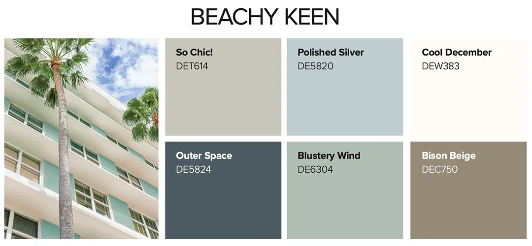
Like a breath of fresh seaside air, this palette is both restorative and energizing. Peaceful pastels, calming sand, and ocean blue look great with Coastal, Victorian, and Art Deco style buildings—particularly those near water. Use this palette to evoke the feeling of vacation that your tenants will enjoy all year long. On exteriors, mixing the blues and browns from Beachy Keen creates a nice contrast for architectural details, while interiors benefit from the coordinated color scheme that flows effortlessly from room to room.
When thinking about paint color for your multifamily property, it's important to look beyond the standard, boring white color schemes that most properties use—while taking care not to alienate potential tenants with choices that are too bold and off-putting. Using a designer-coordinated palette that works with your building's architectural style can give your property an edge that attracts more loyal and long-term tenants, boosting your return on investment.
Learn more about the new Multifamily Color Collection and reach out to a Property Services Representative for individualized support such as complimentary job walks, spec creation for contractor bidding, contractor recommendations, and expert color advice that is tailored to your multifamily property.


