Fresh and Free: A Journey through Dunn-Edwards 2020 Color + Design Trends
10/01/2019 | Sara McLean |
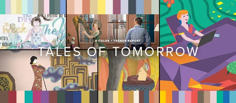
Dunn-Edwards recently unveiled its 2020 trends color + design report, Optimistic Endeavors: Tales of Tomorrow. The five trend stories are highlighted through a series of video short stories, along with corresponding color palettes — so expect to see an explosion of bright, deep colors next year as we welcome in a new decade that promises to be filled with optimism and joyful life experiences.
Fresh and Free
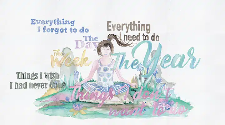
Innovation, tranquility and a desire for transparency lead us to a clean, light palette of bright pastels and soothing neutrals. We are on a quest for balance between stillness and progress.
In the quest for rejuvenation, we choose to control elements in our lives that are within our power, while technology takes a backseat to health and wellness. We begin rethinking connections and convictions as we
place greater emphasis on our inner views. We seek community threads that make us feel comfortable with a peaceful state of mind. This cleansing contemplation recharges our next directions — and how we’ll get there.
Upbeat and optimistic — nature is omnipresent. Innovation is always in the pursuit of wellness, and this caring approach combines technology with the natural world. Subtle hints of surrealism create a base for the soft
visionary who looks inward for solutions. The immersive experiences are keys to finding personal time, balance and privacy in a chaotic world. After years of frenzied lives, we look to grounding elements that provide clarity. A focus on better, peaceful times ahead.
Color
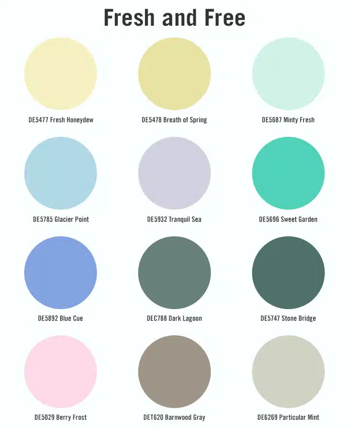
This movement touches off a new decade of fresh starts full of tangy brightness and watercolor effects, grounded greens, and watery blues. The palette speaks to quiet moments of reflection but with an undercurrent of resolve. Soft neutrals are soothing and contemplative, evoking serene feelings, respite from a
complicated world and quiet moments of reflection. These introspective colors feel ambiguous, with tonal compositions and gradients that are key to the palette. Dark hues are scarce, and shadow and light play emphasize subtlety over high contrast.
Soft greens are transparent like glass, representing clarity in emotions. Light, ethereal lilac is reminiscent of early morning fog. Blues represent ocean and sky — calm, quiet and reflective.
Mid-tone gray is grounded and strong, authentic and balanced — inspired by slate and smooth river rock. Harmonious color connections include dark forest green paired with aquatic blue, bleached yellows melded with tender green, gray tempered by porcelain pink, lightened camouflage greens coupled with urban matte browns, and blues offset by optic white. Quiet, spring-fresh, balanced.
Materials and Textures
Fresh and Free is bathed in light, creating illusions and beautiful atmospheres. Delicate textures and materials complement earthy textures and weaves.
Material design feels almost alien with meditative landscapes, liquid reflections and otherworldly organic textures. More materials become embedded as technology becomes more humanized and empathetic.
Watercolor inks soften design edges, while frosted and glazed effects are displayed on glassware and metalwork. There is a visual tactility to the design.
To find more inspiration from our 2020 color + design trends stories and see the other four videos, visit us here. To view the full range of trending 2020 colors, visit us here.


