Electric Realism: Sarah Stieber Discusses Her Artistic Style and Latest Mural
08/07/2023 | Sara McLean |
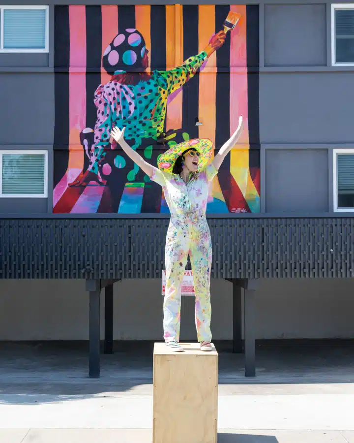
As an artist focused on bright, colorful and uplifting work, Sarah Stieber expresses her cheeky sense of humor and cheerful attitude toward life through many murals and paintings found throughout San Diego. In this community, she has developed deep roots over the years, cultivating her unique artistic vision. While reflecting on her colorful body of work for us, Stieber discussed the challenges and high points of being an artist widely known for her use of punches of color and strong, empowering female graphics, while also explaining her latest mural, The Painting Ladies of Hillcrest.
When did your dream of becoming an artist begin?
I remember being 2 years old and painting a rainbow on one of those play school easels and thinking I wanted to be an artist when I grew up. Being good at art was a huge part of developing my confidence and expressing myself as a shy kid, and pursuing art as my career has been a dream for as long as I can remember.
How would you describe your aesthetic?
I describe my painting style as ‘Electric Realism,’ capturing empowered individuals who are full of inspiration and joy. The aesthetic across my interiors, art, jewelry and personal style tends to be a combination of whimsy and pop! I love incorporating bold patterns, vibrant colors and playful elements into everything I create.
Many of your art pieces feature women as the main focus. Can you speak to the reasoning behind that?
Most women depicted in artwork are from the male perspective or the male gaze. I love being a woman and having the opportunity to paint women from my own perspective; as powerful, badass, self-aware, and fully expressed individuals! My paintings also serve as a personal guide. I paint my way into the type of mindset I aspire to cultivate and into the type of person I’d like to grow into. I hope that my paintings can inspire all women to cultivate and celebrate the most expressed and authentic versions of themselves.
You have worked for some notable clients, including Samsung and Marriott. Can you talk about those projects and how they came to be?
As much as I love collaborating with brands—and I do plenty of outreach to make magic happen—both of these clients ‘fell into my inbox.’ Samsung commissioned me to create a painting in celebration of International Day of Families, and it was featured on billboards in Piccadilly Circus in London, Times Square in New York, and near the Duomo in Milan! Getting to see my painting in Times Square was such a life highlight! And Marriott commissioned me to create their large-scale lobby centerpiece paintings hanging in downtown San Diego and Oceanside properties.
You express your art in multiple formats, including canvas, murals, jewelry and even with tape! Which medium is your favorite and why?
For the first 10 years of my full-time art practice, I focused exclusively on making paintings on canvas. Lately, I feel like I’ve reached a tipping point where my aesthetic, technical skill, and what I want to say with my work are in alignment, so it has felt like the perfect time to branch out into other mediums! Having the opportunity to infuse my aesthetic across jewelry, interiors, murals, canvas and tape art keeps my art practice endlessly interesting and keeps my creative juice flowing. I can’t say I’ve got a favorite, but I love the freshness of being able to mix it up from week to week. I’ll be designing an interior on my iPad one week, painting a giant mural the next, and then I’ll find myself creating tape art in my studio!
How did the opportunity for the mural with F&F Properties in San Diego come to be?
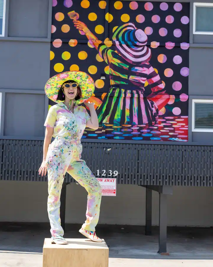
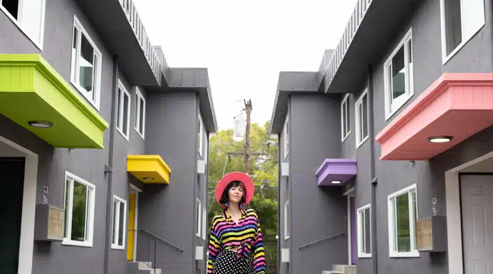
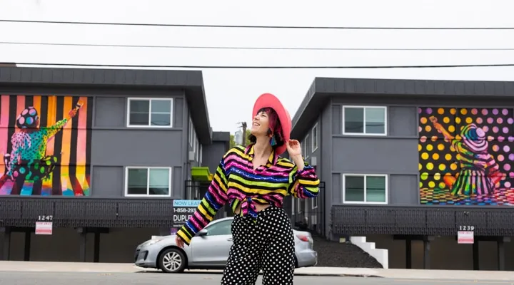
F&F loves supporting artists and bringing artwork into their communities, so they reached out to me to do something fun at their newest Hillcrest property, Duplet! This is the second time I’ve created a large-scale mural for F&F, and this project has been especially meaningful because they trusted me to select the Dunn-Edwards paint colors for the entire building. I hand-selected the base color and all of the accents for the doors and awnings throughout the property!
With your use of bright hues, like Citrus Leaf (DE5558) and Strawberry Frappe (DE5102), you didn’t shy away from color on this project. What was your process for choosing the colors?
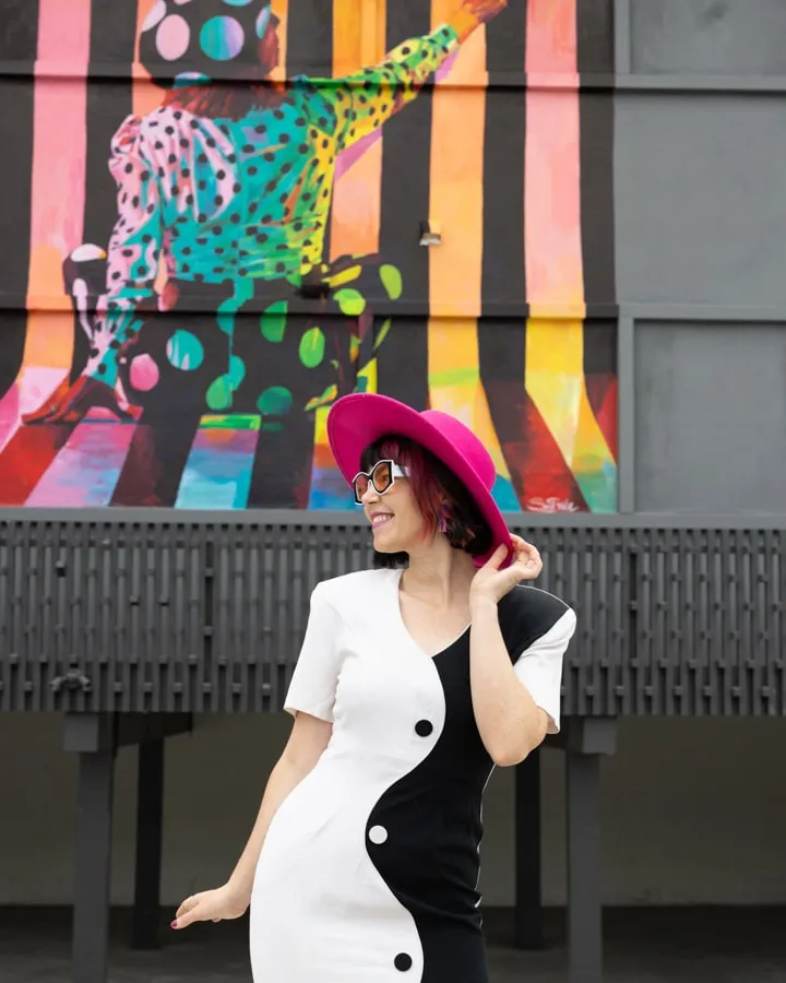
I wanted to select a palette that would bring my mural to life and echo the artwork throughout the entire building! I chose Bank Vault (DE6383) for the exterior because it is such a complex and purple-heavy dark gray that allows my mural to really pop! To find the fun accent colors, I selected a bunch of color swatches from my local Dunn-Edwards store and brought them up in the boom lift with me to color-match them for my mural! From there, I pared down the palette to four colors that contrast well, yet sing together.
Please describe the story/message behind the mural set.
The *Painting Ladies* are about cultivating and manifesting the world you want to live in. On one side, a woman in stripes is painting polka dots, and on the other side, a woman in polka dots is painting stripes. Since I knew that people would be creating and cultivating their own homes inside of Duplet, I wanted the murals to be a blessing to the residents and to the community—a reminder that if you cultivate your space with magic and intention, it will start to rub off on you!
What challenges, if any, did you face when painting this large exterior murals?
I mayyyy have run out of gas while I was 30 ' up in the boom lift! I didn’t panic too much though, and was able to figure out how to get down and gas up!
What is your favorite Dunn-Edwards color?
Haha, I can’t answer that! I have used Dunn Edwards on so many projects and I’m obsessed with the variety of hues, the way the colors sing together, and how you can completely transform a space with color!
What’s next for you and your future projects?
I’m hoping to collaborate with Dunn-Edwards on a mural this year!! I’m also planning my next pop-up gallery in Palm Springs and it’s going to be absolutely epic!
To learn more about Stieber and her work, visit her Instagram page and her website. Also, check out how she transformed her home into a ’70s-style living work of art!
All artwork by Sarah Stieber. Photography credit: Melissa McClure
