Destination Inspiration: The Colors of South Africa
08/01/2018 | specs+spaces staff |
South African Color Palettes
The places we travel so often inspire our design choices — the textures, the styles, the people we meet, and of course, the colors. That’s why we’re continuing our “Destination Inspiration” series where we take a look at the color palettes of some of the most sought after and far-flung travel destinations around the world. South Africa is large and possesses varied terrain, from savannas in the northwest, to rocky beaches at the southern Cape and everything in between.
Below, we’re exploring the country’s landscapes, style and culture, showing you how to draw inspiration from South Africa’s color palettes in your next design project.
Burnt Tones
The sunsets in South Africa are some of the most vivid in the world. The rich spectrum of oranges, reds and golden yellows light up the entire sky in a way that will quickly have you comparing all other sunsets to those seen here.
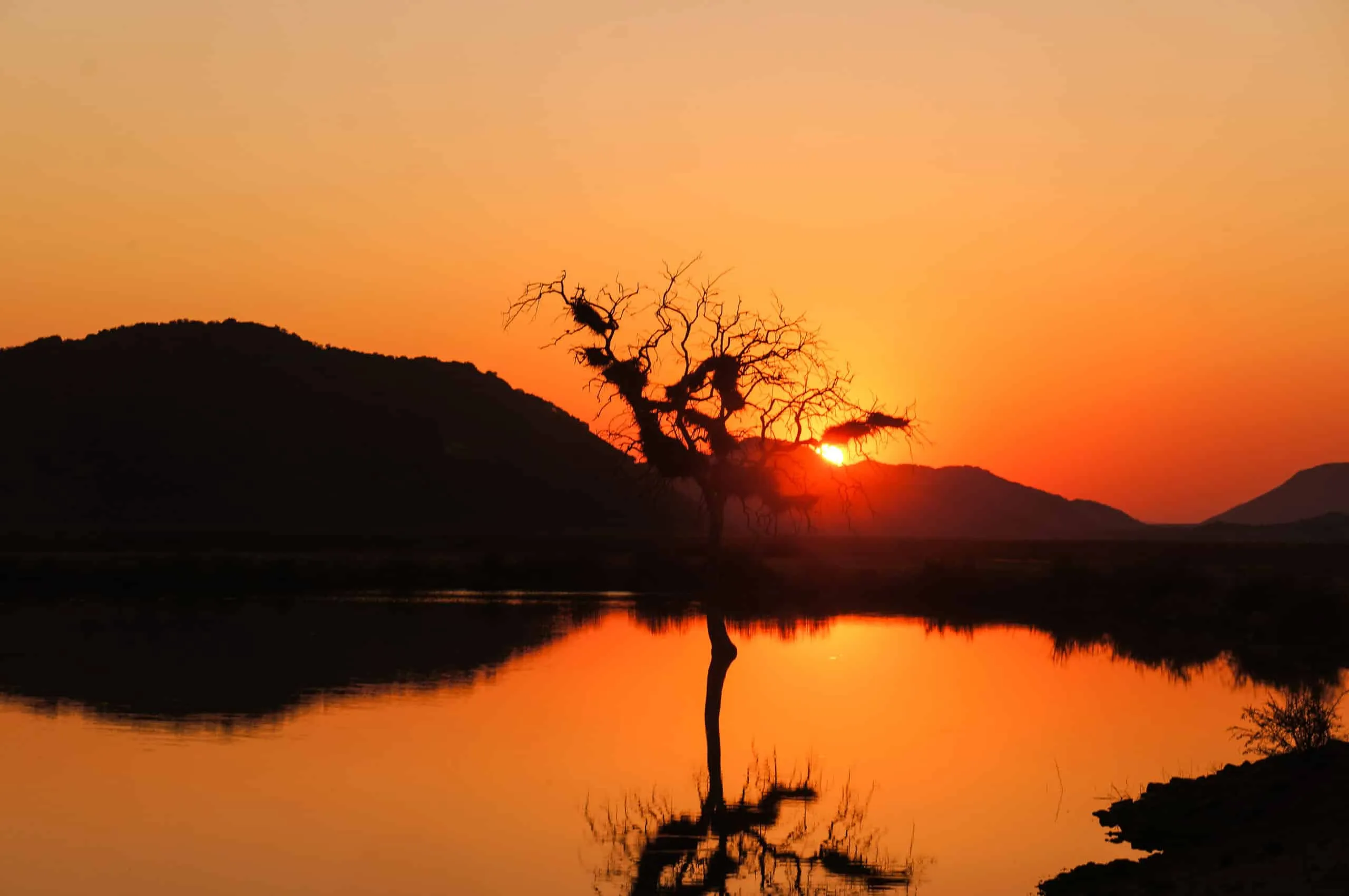
Sunset in Madikwe, South Africa
To bring this warm look into your design project look to Dunn-Edwards Instant Orange (DEA114), Untamed Orange (DEA110) and Tangerine Tango (DE5194).
Bright Primaries
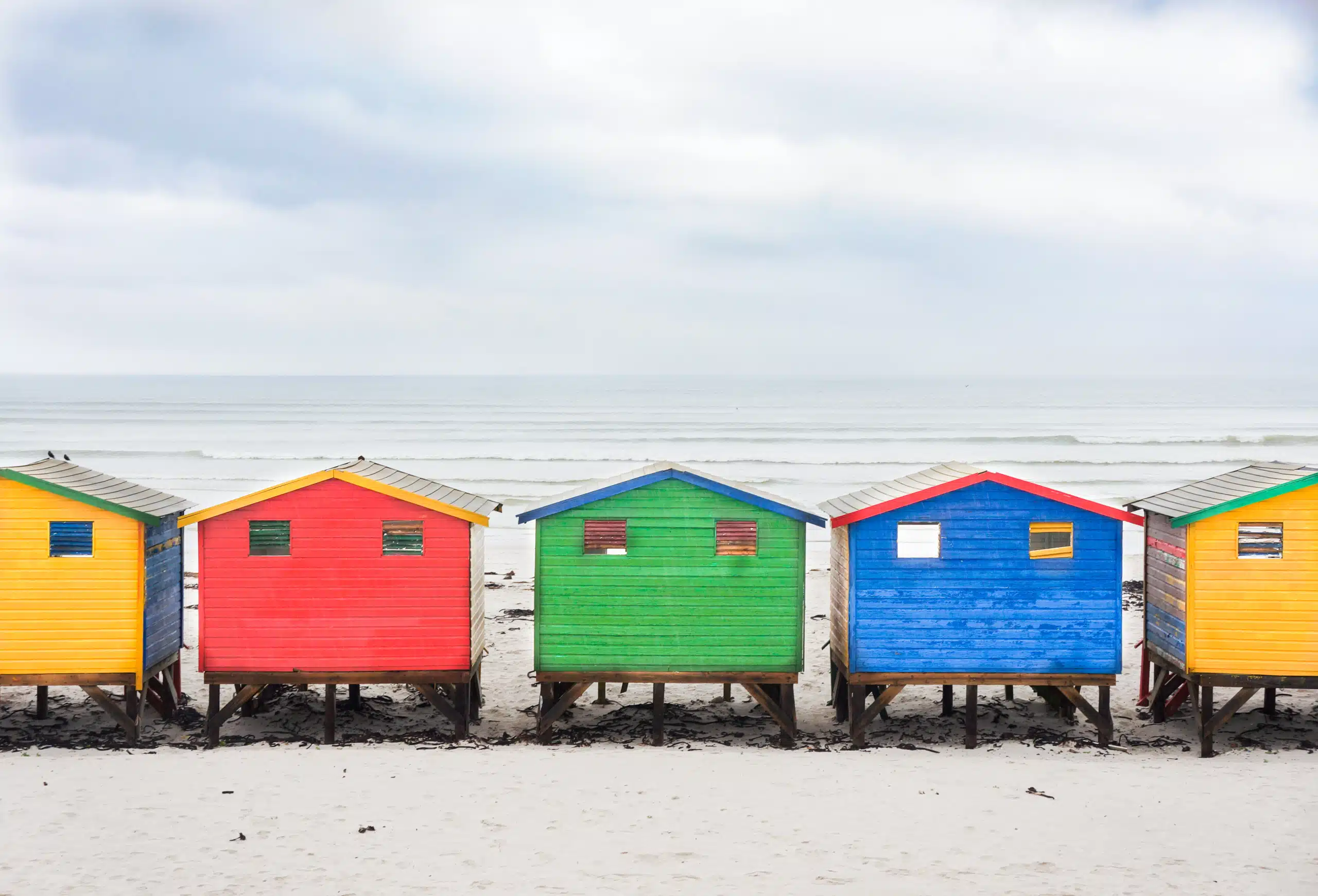
The playful colors of the Cape Town’s beloved and historic beach huts evoke the carefree sensibilities of a childhood summer day. The huts may be little more than changing rooms, but it’s nearly impossible not to smile at the bold application of this Crayola-esque color palette.
Beach huts at Muizenberg Beach
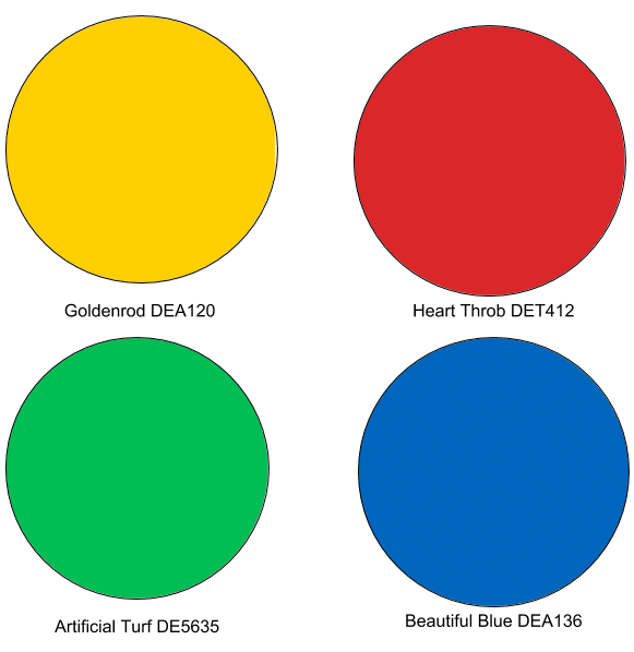
Conjure the feel of an endless summer in Cape Town with Goldenrod (DEA120), Heart Throb (DET412), Artificial Turf (DE5635), and Beautiful Blue (DEA136).
Pinks and Greens
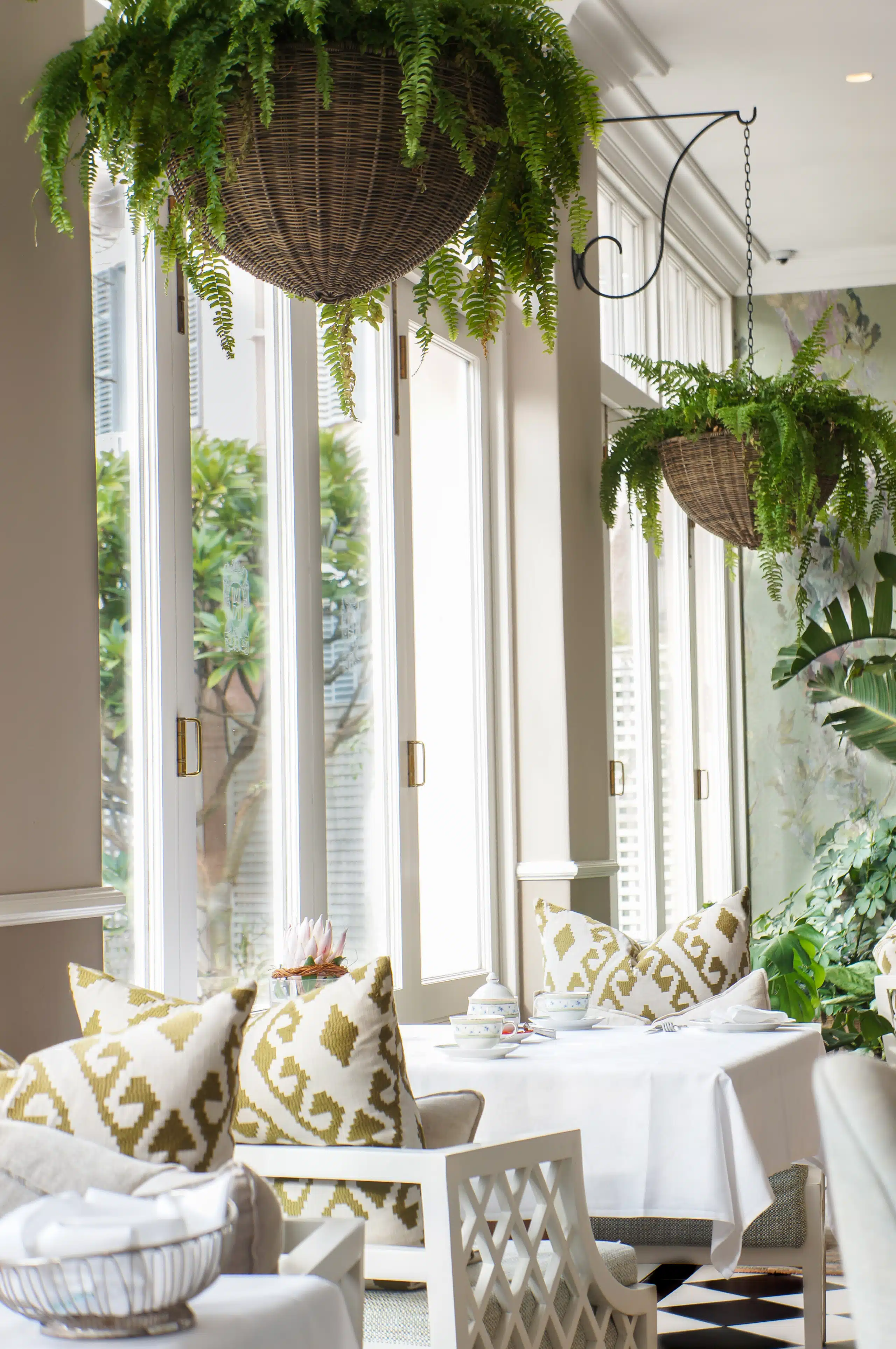
Tea culture abounds in South Africa. It’s a tradition brought to the former British Colony by the English. A proper high tea is genteel, and as such is served amid a similarly precious palette. Most notably one of soft greens, dusty pinks, and accents of black and white. The color influences of tea rooms, reminiscent of establishments such as Ladurée, throughout the design world is a topic we’ve touched upon before.
Belmond Mount Nelson Hotel
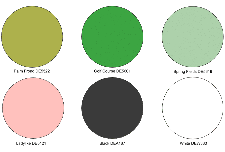
Cape Town, in particular, embodies this color palette. Take inspiration from the plants, wallpaper, fabrics and tile floors at the iconic Belmond Mount Nelson Hotel to evoke this classic vibe. Mix Palm Frond (DE5522), Golf Course (DE5601), Spring Fields (DE5619), Ladylike (DE5121), Black (DEA002) and Warm White (DEW380). And should you want to create a particularly eye-catching version of your own tea room, go even bolder with your selection of pinks and greens.
Saturated Hues
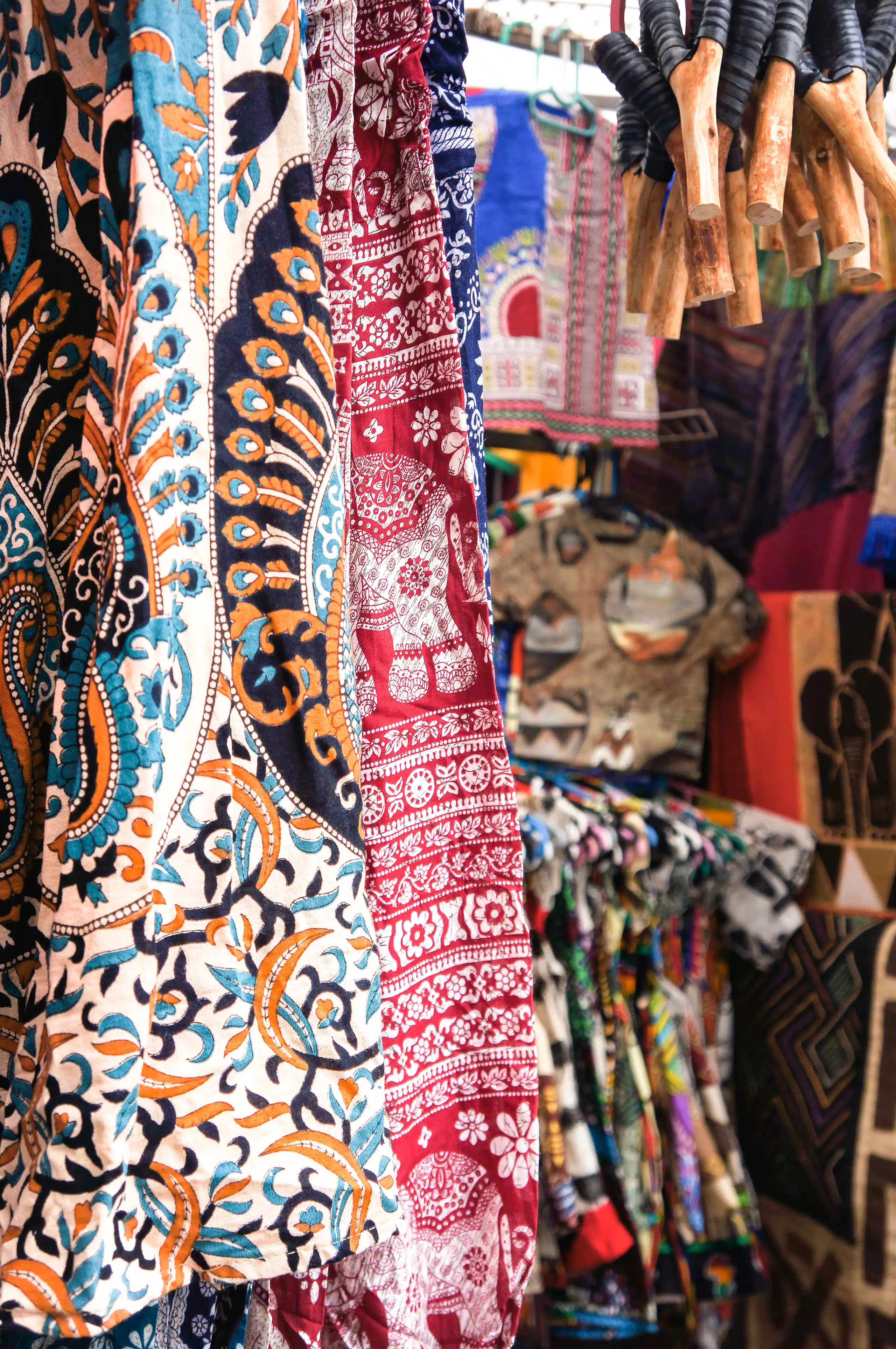
Shopping the markets of Cape Town and Johannesburg, you’ll encounter a wealth of textiles and a kaleidoscope of colors. Make no mistake about it, these colors are rich, saturated hues, sure to catch the eye of any passerby.
Greenmarket Square
The below array of Dunn-Edwards Paint colors can help you pay homage to clothing textiles found throughout South Africa’s craft markets.
Want more destination inspiration? Check out the color palettes of Iceland here.
All photography by STRUKTR Studios


