Artik Transforms Gardner Health Network into a Colorful San Jose Landmark
01/07/2020 | Sara McLean |
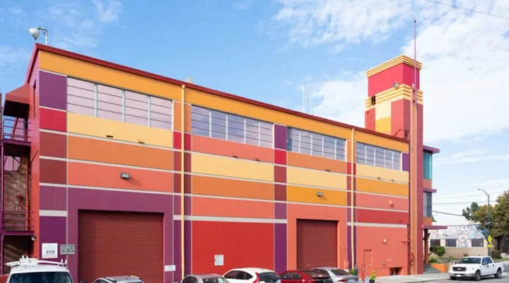
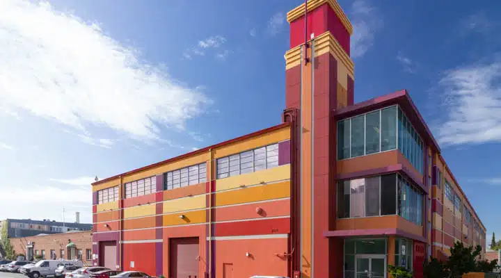
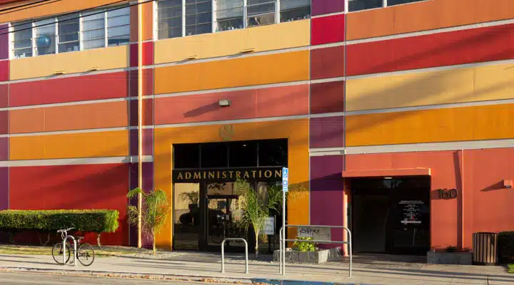
Gazing upon the Gardner Health Network building in downtown San Jose, Calif., one first notices the colorful façade. How did this vibrant vision come to life? We spoke with Morana Medved, senior lead tech at Artik Art+Architecture, a leading architecture and design firm based in San Jose regarding the background of the project and the outcome.
Please describe the project and the company background of the client.
Gardner Health Services wanted to transform its downtown San Jose headquarters into a neighborhood landmark, a community beacon and a source of pride. The building was originally constructed in the 1960s as the home of the Hawaiian Pineapple Company, later renamed Dole, and has been Gardner’s home since the 1990s. Located at 160 E. Virginia St. — just across Interstate 280 from bustling downtown San Jose — the building was starting to look old and gray amid new neighborhood development. To solve this problem, Gardner hired Artik to re-envision the building’s exterior to more closely reflect the company’s cultural diversity, as well as the neighboring communities.
The history of the area provided ample inspiration for the project — starting with the San Jose Art Colony immediately behind it and the Gardner facility across the street, which features one of the last surviving Chicano murals in San Jose, painted in the 1990s by Gustavo Bernal. Other influences came from the varying
cultural backgrounds of all the communities served by Gardner, including Chicano, Latino, Vietnamese and Pacific Islander.
Please describe your firm and its philosophy on color with this project.
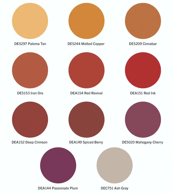
We wanted to make the building as bright and new as the contemporary buildings rising across the freeway with no variation of "San Jose gray" cutting it. Encouraged by our client, we went bright and bold with warm ochres, reds and complementary deep plum tones. These are the colors of the fruits; warmer climates; locally created artwork; historic brick buildings; and, of course, the Dole red.
Color Palette
How has the reaction after completing the project?
The result has been amazing. The energy the building now exudes mesmerized both the staff and the clients. The overall response has been of utmost enthusiasm. The old building has transformed into a place of pride for staff and it brightens the day of integrated behavioral health clients served here. Perhaps, it even imparts a bit of joy.
About Artik
President and principal architect William E. Gould, AIA, founded the firm in 1996. Artik is a full-service architecture firm committed to producing great educational environments. Artik’s multiple-partner firm focuses on balancing artistic creativity with technical excellence to create functional, economical projects with the highest quality of design. With these thoughts in mind, it has consciously developed a practice that allows the firm to focus on just a few clients in order to provide the highest level of communication and service. The staff specializes in educational architecture, and over 80 percent of our work is for public K-12 and community college districts in Northern California.
To learn more, visit artika3.com.
Images used with permission of Artik


