An Exploration of Color’s Impact on Travel
05/22/2019 | specs+spaces staff |
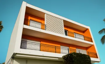
With summer travel season just on the horizon, we can’t help but think about the relationship between color and travel. It’s a relationship that dictates everything from the exotic locales we’re drawn to, the hotels or vacation rentals we stay at, and not to mention the fact color significantly informs the memories of the trips we take. In a recent article, Conde Nast Traveler explored the way travel provides a “unique way to look at color,” exploring five distinct colors, detailing where in the world to find them, and the typical psychological responses they elicit. With that in mind, we’re delving a little deeper into the interplay between travel and color.
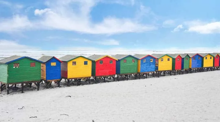
Photo Credit: MARNI EPSTEIN-MERVIS
An Emotional Response To Color
There is no doubt that color triggers emotions in people. “Memories of many places begin with a
connection to color. The ties could be historical — from where and how you grew up — to cultural ties referencing the people, food, architecture and design,” says Dunn-Edwards’ color expert and stylist Sara McLean.
And travel, too, is often more emotionally-based than intellectual. “Memories of a trip or a time period,” adds Brittney Hepler, senior design manager of Mariott’s Global Design Strategies, “are often visceral hits of an image, colors, smells.”
Trending Travel Destinations + Their Colors
Egypt
What are 2019’s trendiest travel destinations? Egypt is one destination seeing a rise in tourism. In fact, according to the Central Bank of Egypt, tourism revenues rose 36.7% in the first half of 2019 alone. McLean notes that sunset colors have and will continue to trend as destinations. While beach locales are an obvious source for said sunset colors, McLean stated, “the warm sand and clay hues of Egyptian architecture and historical monuments also supports these hues.”
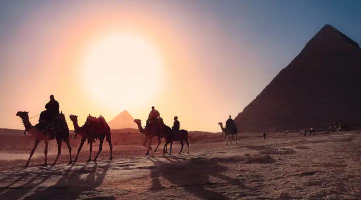
Egyptian Pyramids
The colors of Dunn-Edwards’ Sojourn, one of our design and color trend palettes reflects these color highlights.
Turkish Riviera & Greece
While locations on the Italian coast were once steadfast travel spots, those seeking less touristy destinations are discovering areas such as the Turkish Riviera. The city of Antalya in Turkey’s southern Mediterranean region had record-breaking tourism numbers last year.
Travel + Leisure declared blue to be the most clickable hue based on an analysis of the travel publication’s own Instagram, as well as on research from Colorcom. Perhaps that’s why water vacations continue to be key for travelers today. This means a blues from watery hues to deep blues continue to be strong colors — colors which also heavily define islands like Santorini and Rhodes.
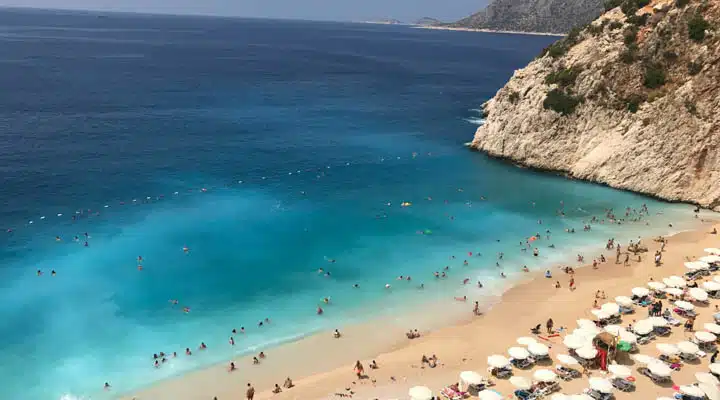
Kaş, Turkey
See the blues of Dunn-Edwards’ Extreme Odyssey, one of our design and color trend palettes reflect these color highlights.
Joshua Tree
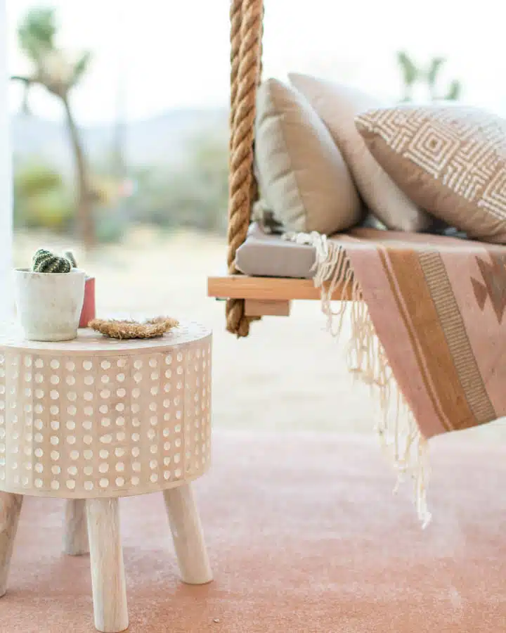
“Desert locales such as Palm Springs and Joshua Tree continue to provide vivid, key color moments for tourists,” stated McLean. Joshua Tree National Park has set a number of attendance records over the last few years, while 2019’s Palm Springs Modernism Week (the eponymous city’s trademark event) smashed previous records with a 20% jump in attendance. Everything from earthy tones like burnt umber, to tangy and psychedelic brights, and desert-pink undertoned whites can be expected here.
CASA JOSHUA TREE. Photo Copyright©MARISA VITALE
The colors of Dunn-Edwards’ City Stroll, one of our design and color trend palettes reflects these color highlights.
Color Defines Hospitality Design
When it comes to hotel and vacation rental design, gone are the days of simply decorating a space. Today, hospitality design is about designing a destination, an experience, and color is the key (just ask the owners of Airbnb Soukie Kasbah!).
Colorcom, a leader in color merchandising and color systems, notes that people make judgments about their environment nearly instantaneously and that between 62% and 90% of that assessment is based solely on color. That translates in a big way for hotels. Mariott’s Hepler stated, “[Color is] about storytelling at a property in regards to time and how certain shades of a color can harken to decades past or cultural movements in a given locale.” Hepler adds that color is a means to create a holistic and hyper-local statement. “By considering localized materials and/or being inspired by the color of those local materials, arts and craft techniques, and the like, we’re able to add meaning into everything we select.”
It’s a design choice that helps appeal to visitors’ travel-inclined right brains which processes images and feelings. “You may not look at a lobby and be able to use words and dissect why it reminds you of Arizona, but you can stand there and say it just feels right," stated Hepler.
The importance of crafting an experience with color in hospitality can also be seen in the rise of shoppable hotels like West Elm and Madewell. McLean says the aesthetic of which “will range from traditional styling, with homey, saturated colors such as those of Country Caper, to modern and contemporary, such as those hues of Extreme Odyssey."
Looking for more travel design inspiration? Check out our Destination Inspiration series, where we explore the colors of one location’s architecture, landscapes and style, showing you how to draw inspiration for your next design project.
Destination Inspiration: Iceland
Destination Inspiration: Normandy
Destination Inspiration: South Africa


