9 Beiges That Are These Top Designers’ Go-Tos
03/02/2023 | Marni Mervis |
You may have heard about a certain beige trend taking over TikTok. A color genre beloved for its serenity, its orderliness, its luxury and its simplicity. But which beige paint color is the right beige for your project? In fact, Apartment Therapy notes that today’s beige has so many more tones than in decades past, making . If you fall in the ‘love it’ side of the debate over this controversial color, you’ll be excited to know we’re sharing which Dunn-Edwards paint colors are these top designers’ go-to beiges.
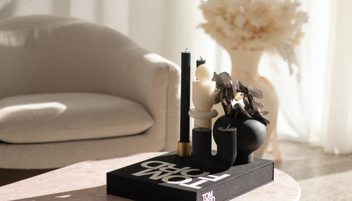
Arizona-based designer Jennifer Ferrandi of NoMad Design is opting for more earthy-beige neutrals like Shady (DEC774) or Heather (DEC773). Such colors, she explains, are great for millwork, as these creamy, complex shades are warmer than traditional whites and look amazing when mixed with zellige tiles, marble and unlacquered brass.
Designer Carly Waters of Los Angeles-based Carly Waters Style says some of her go-to Dunn-Edwards beiges are Bone (DEC765) and Desert Rock (DE6066). Warm neutrals like these soften a space versus a stark white. Neutrals still provide a blank canvas, but offer a warm and cozy feeling upon entering a room, shares Waters.
2020 Pasadena Showcase House of Design designer Ammie Kim gravitates toward Sand Dune (DE6128) and Light Aspiration (DE6185). Both colors appeared in her design for the home’s dining room—a mural depicting the idyllic French countryside.
Sara and Rich Combs of the Joshua Tree House looked to more earthy beige tones like and Warm Hearth (DE6110) when it came to their Sonoran Desert retreat, The Posada.
With regard to these colors, the Combs explain that they’re about “finding a certain luxury in stillness, quiet and the ordinary.” A quintessential part of evidence as to why beiges and the Vanilla Girl aesthetic are resonating so strongly right now.
A fan of neutrals because of their ability to evoke feelings of serenity and comfort, Marina Edwards of looks to versatile beige because it’s earthy and timeless, so it works great with white, natural woods or even bold earth tones. “The key is strategic contrast … utilizing light and dark shades, which can add lovely depth while remaining sophisticated, explains Edwards. However, there’s a huge variety of beige undertones, so making sure the undertones work well together is a subtle but important part of layering the colors in a neutral palette.” One of her go-to beige paint colors is Navajo White (DEC772) for walls in historic homes. Edwards also likes when it comes to kitchen palettes. “It’s especially lovely for cabinets when mixed with warm metals like unlacquered brass,” she says.
Beiges blew up in 2022, so are you curious about where this hot trend stands in the new year? Read what Dunn-Edwards color expert and stylist Sara McLean has to say about this top design trend in 2023 here.

