7 Calming Interior Paint Color Ideas to Refresh Your Home for 2022
01/17/2022 | Sara McLean |
Color in the home has taken on more importance as we continue to spend a majority of our time staying indoors. And as we all know, color can instantly transform the mood of a room. So while we’re in the midst of winter and stressful times, many of us are ready for a calming color refresh in one or more of our rooms.
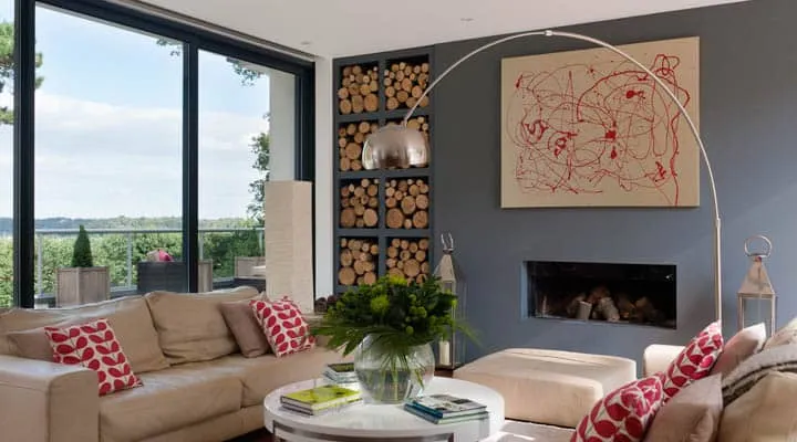
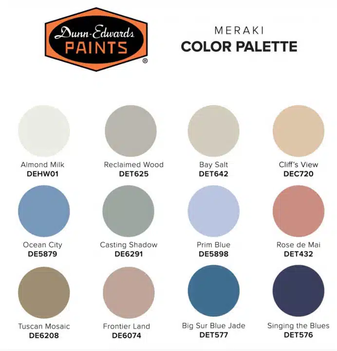
We’re highlighting color with health and wellness more often these days and trends toward a healthier home environment have taken center stage. Also, design trends such as Japandi and Scandinavian styles have gained so much traction in recent years. Even our 2022 trends story Meraki highlights the need for simplicity and calm with its clean and comfortable color palette. So if you’re unable to pull off a major renovation anytime soon, refreshing your paint colors is an easy fix.
Ready for a calming makeover to kick off 2022? Read on for 7 recommendations:
Blues and Blue-Greens
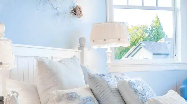
How do you create a calm atmosphere while still wanting color? Peaceful and tranquil, softer blues and blue-greens create an atmosphere free of stress, yet provide a spot of color. And light-blue shades feel like
you’re gazing up at a summer sky, dreamy and serene. One example, Wild Blue Yonder (DE5855), our 2021 Color of the Year, showcases clarity and calm in this invigorating light-blue hue. Wild Blue Yonder pairs well with a range of colors including teals, marigolds and grassy greens.
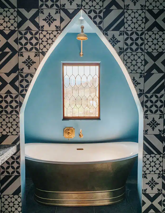
Consider making over a bath into a spa like Claire Thomas did at her recent project, Oeste. Here, she used Eames for Blue (DET564) to design a gorgeous guest bath that feels like one is at a resort.
photo credit: Claire Thomas
Greens
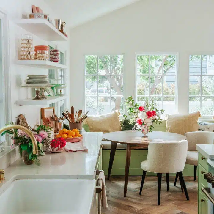
Greens are restful and tranquil and, as this color references nature, the range of greens in both light and dark are all great choices for a calm atmosphere. Light Pine (DE5535) is a soft, lime green that envelopes a
room in cozy charm. At Sweet Laurel Cottage, the kitchen cabinetry display cottage charm with the addition of green.
Sweet Laurel Cottage. Photo Credit: Claire Thomas
And check out the office space of a recent remodel by the Raskinds, painted in Granite (DE6283), a muted gray-green that is a cool, soothing backdrop to the decor.
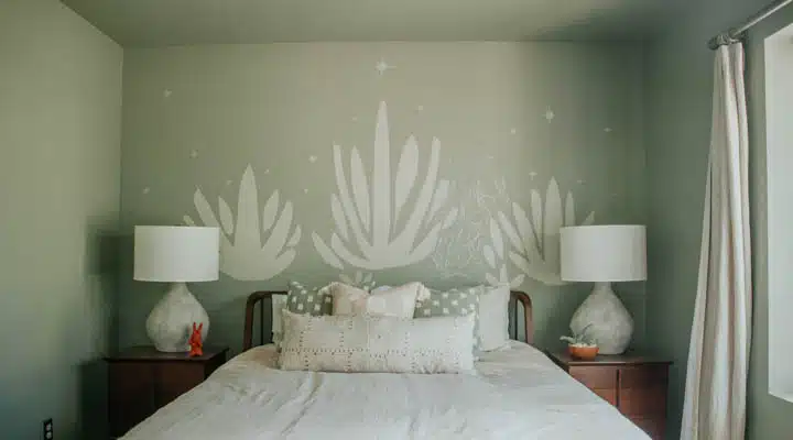
For more inspiration, the restful guest room at Oeste, painted in Antique Coin (DE6270), perfectly coordinates with the agave plants and desert theme.
photo credit: bethany nauert
Soft Pinks
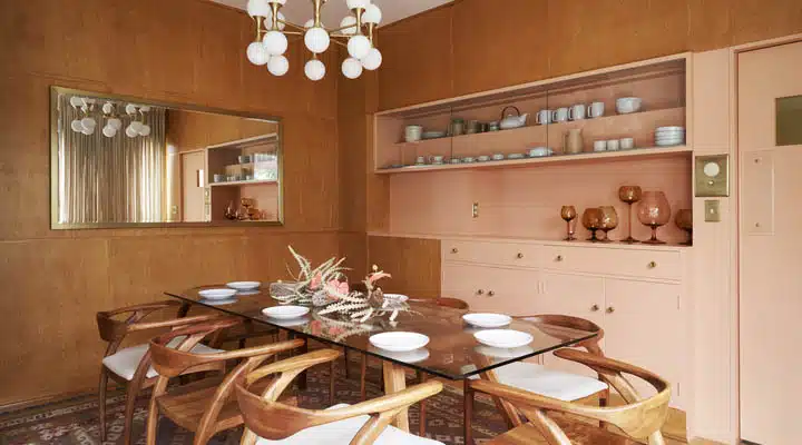
Soft, dusty pinks leaning toward beige tones create a soothing, composed effect to a space. Inspired by earthy influences, pair it with plants and natural fibers to create a spa-like oasis. Try Light Carob (DE5183), as shown in the dining room of Claire Thomas, where she highlights the original woodwork against this subtle hue.
photo credit: bethany nauert
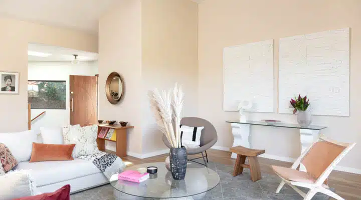
Rosy Cloud (DE5182) borders both pink and beige and, with subtlety, adds a graceful, harmonious touch to a space.
Warm Neutrals
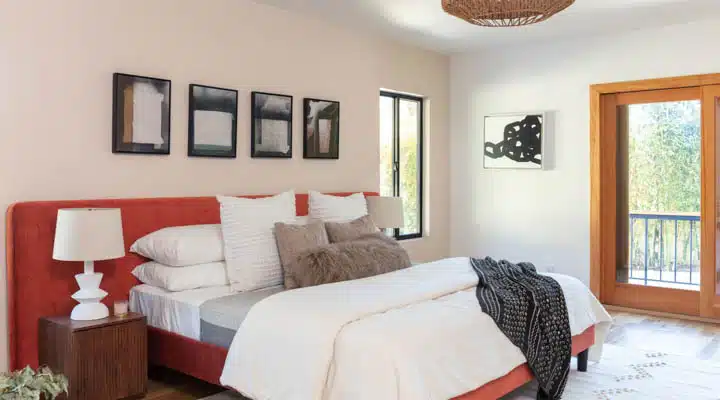
Neutrals leaning toward warmth immerse one in restfulness and respite from the stresses of the day. These hues warm up a room and make it feel more inviting. In a recent remodel project, the Raskinds used Almond Latte (DE6143) and Cashmere (DEC758) to create a mellow oasis.
photo credit: bethany nauert
Whites
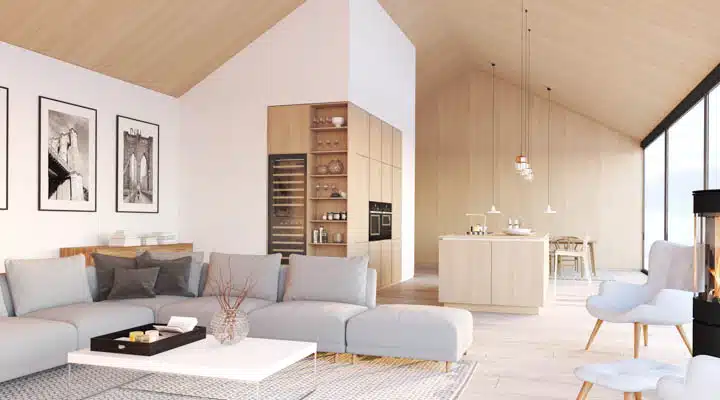
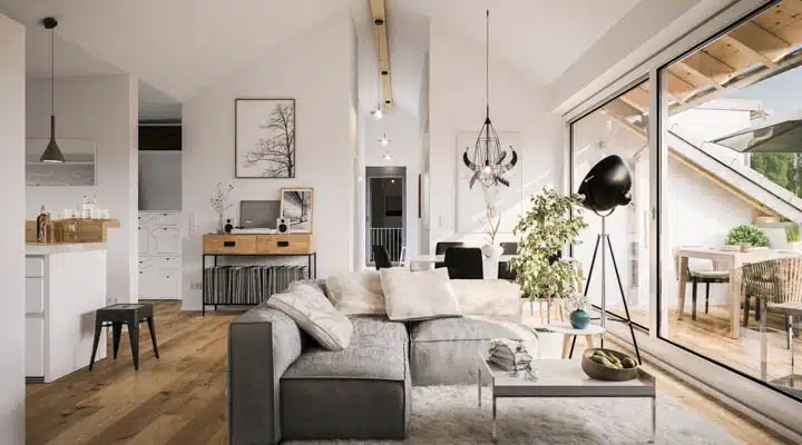
Whites are unsurprisingly calming in cleaner, brighter tones. And when it comes to whites, Classic White (DEHW08) is the perfect neutral, slightly cooler white. It’s crisp without feeling too stark, and the slightly cooler tone gives it a more modern vibe.
Ivory and Soft Yellow
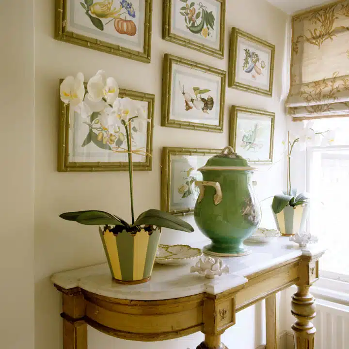
The most muted of yellows and ivories give energy and warmth to a room, creating a space where one feels comfortable and happy. An example is Celtic Linen (DEC744), a soft ivory perfect for traditional spaces, creating a welcoming environment. It is not overbearing and plays well with a variety of other colors.
Calming, Quiet Neutrals
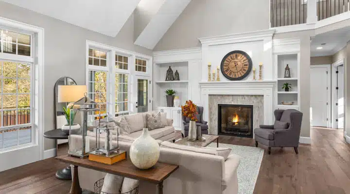
In the midst of chaos, adding just a hint of a hue in hushed tones can pull a design together. Crystal Haze (DE6219), a light, versatile hue is a chameleon and pairs great with both warm and cool colors. A neutral with staying power, try Crystal Haze throughout the home as a main body color.
Reclaimed Wood (DET625) is another neutral that supports a wide variety of warm and cool hues. This is a gray with warmth, adding depth to other room accents.
For more ideas on using paint color for calm environments, health and well-being, check out our 2022 trends story Meraki and see how to integrate Japandi style (link) into your home.
Featured Articles
-
 Best Oranges for the Perfect Summer Beach Cottage
-
 Get Ready for Fall with These Trendy Color + Design Moods
-
 Try These Color Palettes To Nail A Tomato Girl Summer At Home
-
 Embracing Barbiecore: Popular Pinks Throughout The Ages
-
 The Color Yellow: Essential Color Theory, Symbolism and Design Application


