Armoniosa Estate Brings New Wow Factor to Las Vegas
06/11/2020 | specs+spaces staff |
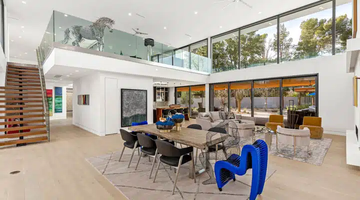
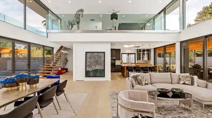
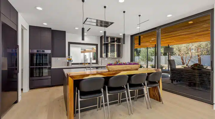
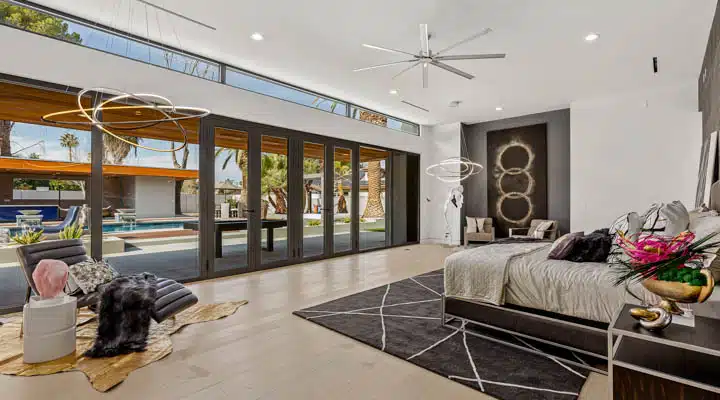
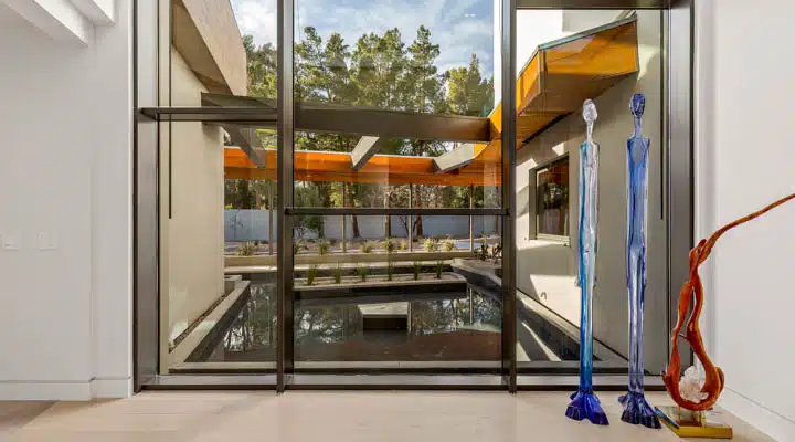
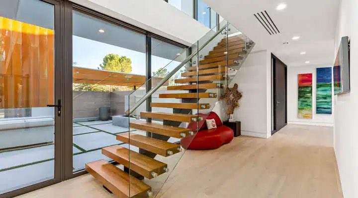
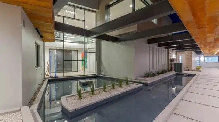
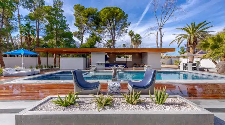
In a city as glitzy as Las Vegas, packed full of entertainment and hotels that vie for attention, it takes a lot for a project to garner attention. But that’s exactly what Las Vegas’ latest luxury show house accomplishes. The Armoniosa House, originally unveiled at Las Vegas Market, is a newly built 10,000-square-foot estate on two acres designed in the modern minimalist style by architect Richard M. Cuen, AIA of RMC Design + Planning, Inc. with interiors by Kimberly Joi McDonald of Designing JOI and HGTV personality Donna Moss of Donna Moss Designs. The residence boasts a “wow” factor that includes dramatic, soaring glass walls, long reflection ponds, a floating staircase, as well as a stunning pool and manicured landscape featuring palm trees and cacti.
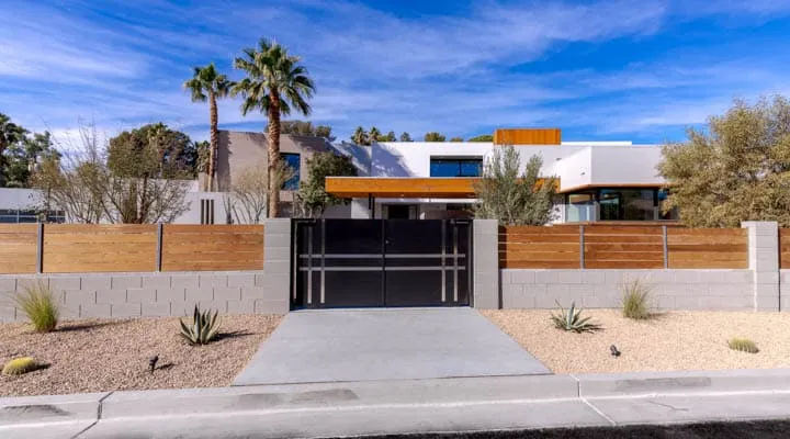
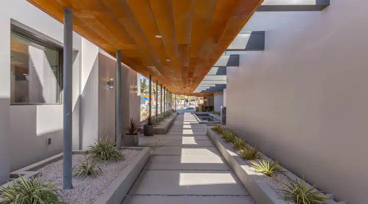
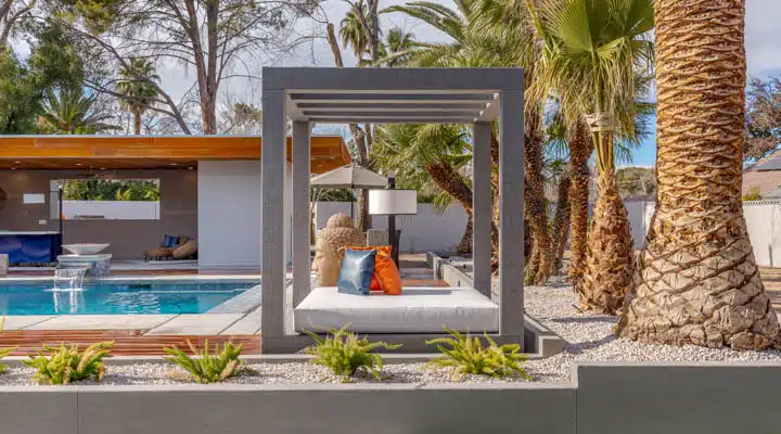
“Armoniosa” is spanish for harmonious — and indeed the use of rusted metal framing gives the home an amber glow that allows it to “harmoniously” tie into the earthen color palette of its desert surroundings. Additionally, “we chose a light gray palette for the exterior of the home (primarily Gray Pearl (DEC795) to reflect radiant heat,” stated Armoniosa architect Cuen.
This harmony also extends beyond the home’s aesthetic qualities. True to its modern and minimalist style, the energy-efficient principles of passive house technology helped guide the home’s construction, giving it a more minimal and sustainable footprint and keep it in harmony with nature. The homeowner’s priority of sustainability can be seen in the home’s paint choices as well. After all, Armoniosa is not just a showhouse —first and foremost it’s a home. Interior designer McDonald stated, “Dunn-Edwards premium paint with low odor, low VOC latex, and Zero VOC colorants, were a perfect fit for the homeowners, whose highest priority was for their home to be built using eco-friendly, sustainable principles.”
To strike the perfect balance between a space that feels like home but is also a backdrop for colorful and unique art, Armoniosa’s designers and architect wanted a color palette that could be both neutral and warm. To do this, they opted for Faded Gray (DEW382), Gray Pearl (DEC795), Looking Glass (DE6376) and Raindrops (DE6057). “We wanted the house to be light, but not white. Since this is a home, we didn't want to lose the intimacy and warmth. These colors provided us with the light quality we were looking for while maintaining a very comfortable residential feel,” stated architect Cuen.
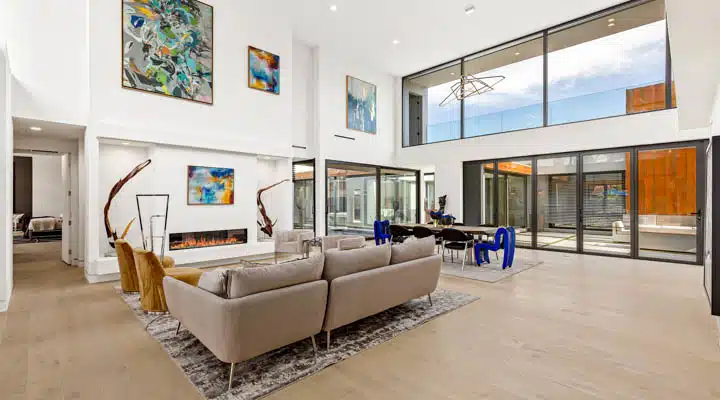
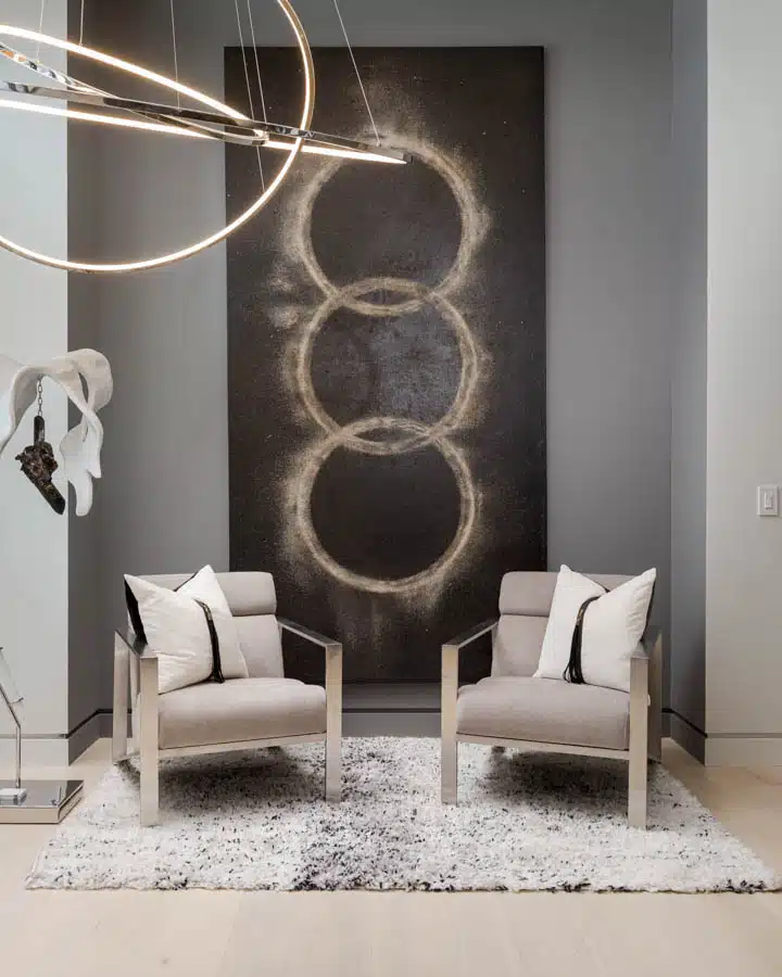
The interior design duo faced the unique challenge of melding the homeowners’ aesthetic with organic and contextual references to Las Vegas in a single look. Moss stated, “The mood was set with the stunning colorful art throughout the home that paired perfectly against the neutral wall colors.” For example, in the living room large blue and green abstract works of art pop off the airy walls. Additionally, the color palette complements the residence’s high-end materials like the kitchen’s Staturario Gloss Porcelain countertops and sleek matte gray cabinetry. In the master bedroom a sitting alcove is set back painted in Looking Glass (DE6376), the deepest of the home’s color palette, giving the nook enhanced depth and dimension.
“Donna Moss and I created a showhouse that was chic, bold and unexpected, yet true to environmentally-conscious and sustainable principles,” stated McDonald.
Curious about how Dunn-Edwards paint has transformed a variety of complex and large spaces? Check out this cool downtown Los Angeles office space or the Pasadena Showcase House to see designs of all styles. More recently, one graphic artist used Dunn-Edwards paint to create fresh, vibrant murals that display outdoor vibes into a Santa Barbara tech company’s 18,000-square-foot headquarters.
All photos by Luxury Home Photography. Courtesy of KNB Associates.
Featured Articles
-
 Best Oranges for the Perfect Summer Beach Cottage
-
 Get Ready for Fall with These Trendy Color + Design Moods
-
 Try These Color Palettes To Nail A Tomato Girl Summer At Home
-
 Embracing Barbiecore: Popular Pinks Throughout The Ages
-
 The Color Yellow: Essential Color Theory, Symbolism and Design Application


