Then, Now & Forever® – International, Mid-Century Modern, Ranch Color Collection
08/03/2015 | Sara McLean |
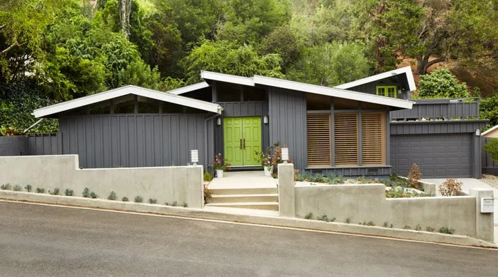
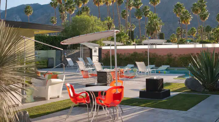
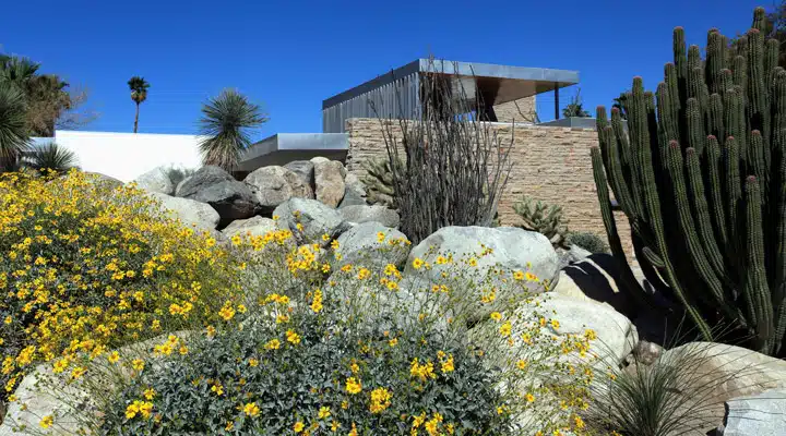
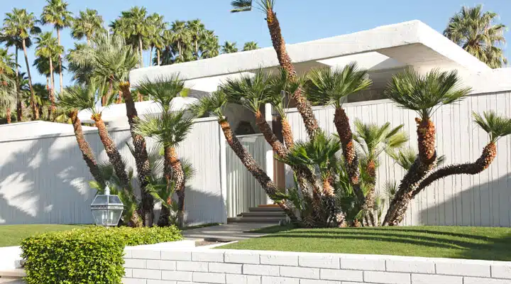
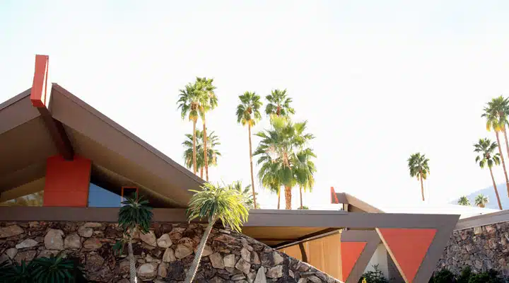
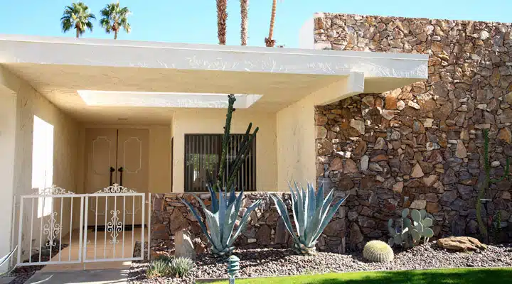
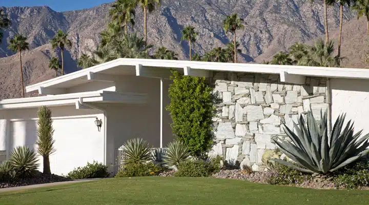
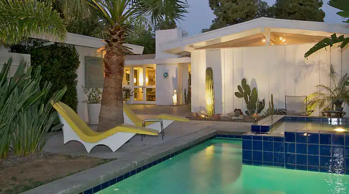
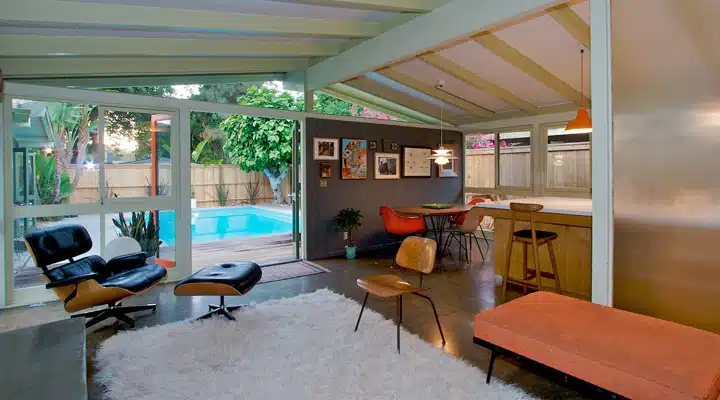
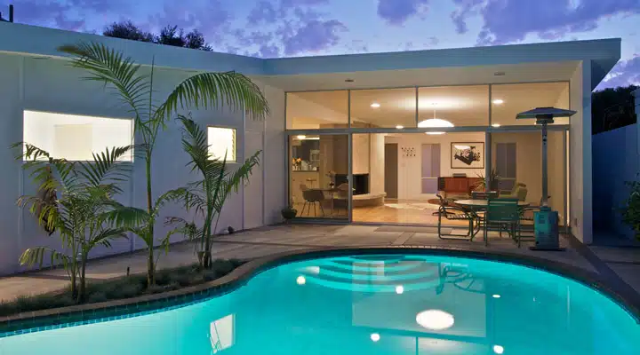
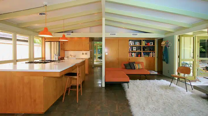
We are pleased to introduce the final in our series of the Then, Now & Forever® historic color collections. The period before and after World War II saw a new movement in architecture based on simplified design and easy, low-cost living. The International, Mid-century Modern and Ranch architectural styles embraced clean lines, careful use of color and meticulous use of craftsmanship, while displaying the new concept of outdoor living to suburbia.
Background
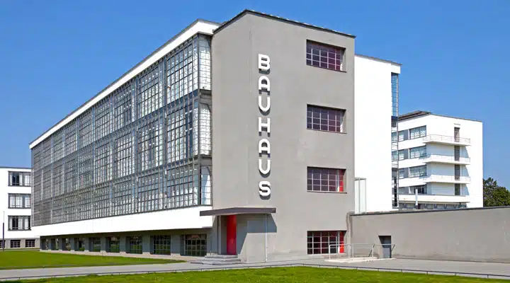
The period leading up to World War II saw a large immigration of architects into the United States, leaving behind the increasing instability within Europe. In the 1920s came Rudolph Schindler and Richard Neutra, followed by Walter Gropius, Ludwig Mies van de Rohe and Eric Mendelsohn in the '30s and '40s. Many settled on the West Coast and brought with them the principles of the prevalent architectural style within Europe, the International Style, along with the ideals of the Bauhaus movement(1). Originating in Germany, Bauhaus professed the appeal of beauty and quality craftsmanship within industrial processes, along with the responsibility to enrich the lives of the masses and improve the social condition.
Within the context of American architecture, the Bauhaus principles evolved into a challenge to provide a simplified architectural design that would provide low-cost housing without sacrificing good design. The resulting style was marked by a radical new use of materials such as glass, steel and concrete.(2) Architecture was no longer rooted in the Classical orders, but was based on geometric shapes and abstraction. Form was streamlined to follow function, and ornamentation was removed. These design experiments were not widespread and, while they tended to be for isolated commissions, they were no less ground-breaking.(3)
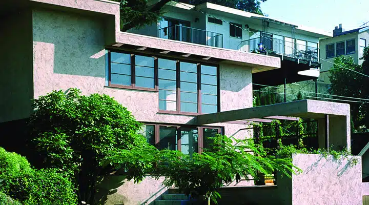
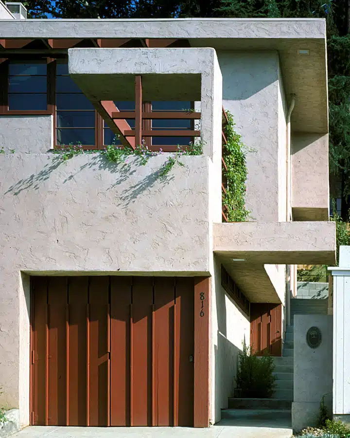
Schindler/Grokowsky Home. 1928. South Pasadena, CA
As the United States was pulled into the war, and workforce efforts were redirected toward support of the military, shortages of raw materials and quotas on the use of materials within the civilian market led to the development of new products and an increased focus on the pursuit of substitutions. Corrosion-proof metal coatings; water-proof wood sealers; and synthetic binders for paints -- these were just some of the developments that came out of this period. The availability of new types of products would later open the door to greater experimentation with architectural materials.
As the war ended, a flood of young men left the military, and some of these men attended architecture school and opened new practices. Architects such as William Krisel, A. Quincy Jones(4) and Donald Wexler(5) all served in the military before opening their practices. These men had spent formative years working in close proximity to the streamlined forms of military aircrafts and were introduced to the technical knowledge required for the weapons industry, as well as new materials and coatings technology. The U.S. Army Corps of Engineers taught a whole generation of men the regimented construction and mechanization of military building components. This new crop of architects took their encounters with the modern buildings designed by the International architects living in California in the '20s and '30s, merged it with their experiences in the military, and took architectural style in a new direction. The advancement of Mid-century Modern design included architecture, design and urban development, typically encompassing the years between 1945 and 1965, though earlier and later advancements in design also celebrate the style.(6)
In a surge of optimism and prosperity after the war, more people became new-home buyers, taking advantage of low-cost housing loans available through the Federal Housing Agency. In 1945, the Case Study House program was sponsored by Arts+Architecture magazine to challenge architects to meet the increased demand for housing stock, while keeping costs down and without sacrificing the principles of good design. Design for prefabrication and standardization was the call-to-arms, and it allowed builders to contain material costs. Labor costs were also kept down as construction methodology was made repetitive and simplified.
In the late 1940s, into the '50s, architects began integrating elements from the organic forms of Frank Lloyd Wright, and other Chicago architects into their designs. Residential architecture became less stylized but remained simple in form. Colors became muted earth tones with occasional accents of bright colors such as turquoise, orange and yellow, usually found on plywood or Masonite panels.
Southern California afforded young architects the opportunity to experiment within the environmental challenges of the desert, heavily utilizing earthen materials of wood and stone. Architects’ color palettes were influenced by
the military camouflage colors of browns and greens. Trim accents were usually white, gray or brown.
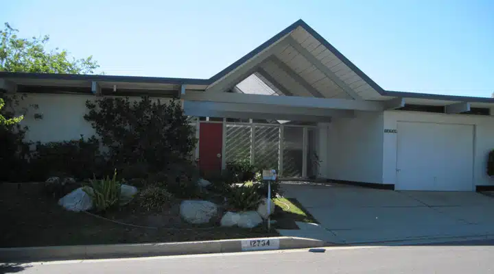
From 1955 to 1965, the Alexander homes in Southern California (builders/developers George and Robert Alexander, working with architect William Krisel) and the Joseph Eichler (developer) homes in Northern
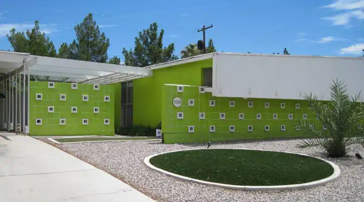
California came to represent the epitome of the modernist concepts.(7) These were homes that repeated the same floor plan but with slight changes in orientation and adornment, which gave them each a unique look without increasing costs. The use of two-tone color paint on decorative concrete block served as a decorative finish to the exterior of the home.
Phillips House. 1963. Granada Hills, CA
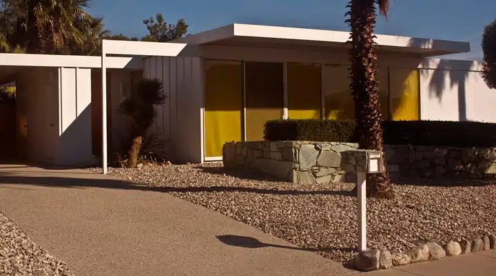
Stratton House. 1963. Las Vegas, NV
Cliff May began designing homes in the 1930s with open floorplans that flowed easily from one room to the next and provided ready access to the outdoors.(8) He combined the qualities of the traditional Hispanic ranch with abundant floor-to-ceiling glass and the new modern simplicity of form. His designs became known as the Rancho. (9)
Examples of Cliff May architecture. Long Beach, CA. Photos: Rochelle/Doug Kramer
Color Palette Examples
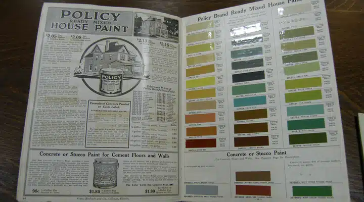
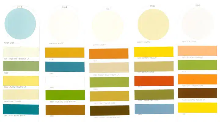
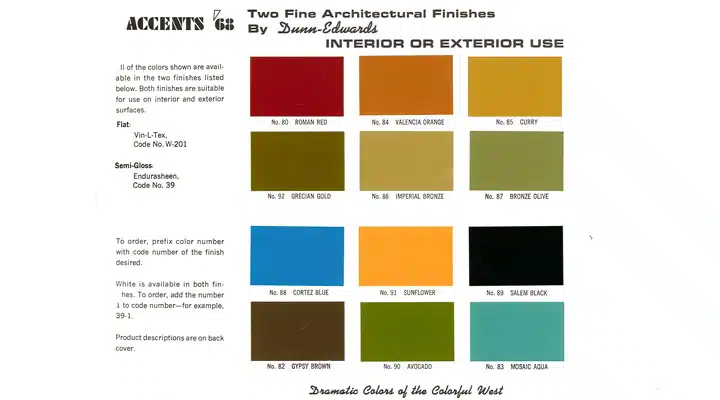
This style was defined primarily by the heavy use of natural-toned materials such as wood, stone and glass. Wood siding and interior paneling was stained or clear-coated, allowing the grain pattern to become part of the structure’s design. Painted concrete block, aluminum or steel provided visual accents without detracting from the overall design simplicity. Although paint cards from the era show a wide variety of available colors, the choices appear to gravitate towards natural earth or neutrals as the predominant color with brightly colored accents, although muted colors are also in use. It’s more about where the color is used than color choice.(10)
Sears, Roebuck, & Co catalogue
Sears, Roebuck, & Co Color Strips
Dunn-Edwards Accents Color Card Interior. 1968
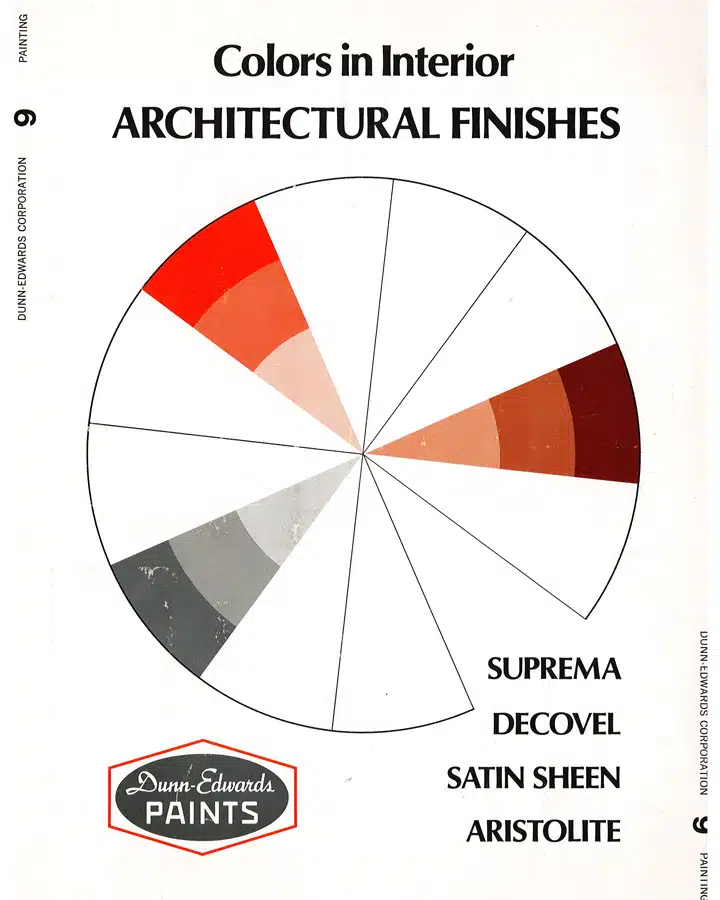
Dunn-Edwards Interior Architectural Finishes Card
Three Case Studies: Architectural Resources Group
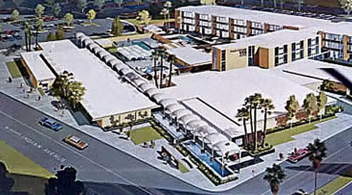
Palm Springs Spa Hotel/Cody, Wexler, Harrison and Koenig -- 1959-65
The specifications for the gymnasium building of this complex are available in the architect’s archives, located at California Polytechnic University in San Luis Obispo(11). This document states that exposed concrete
was to have been painted with a polyvinyl, acetate-based emulsion paint; however, the color was to have been approved by the architect, and no information was found as to what color was chosen. The exposed structural steel was to have been painted with Andrew Brown’s Synchro Green or W.P. Fuller’s No. R9142, or equal.
Palm Springs Spa Hotel Presentation Drawing. 1955. Palm Springs, CA
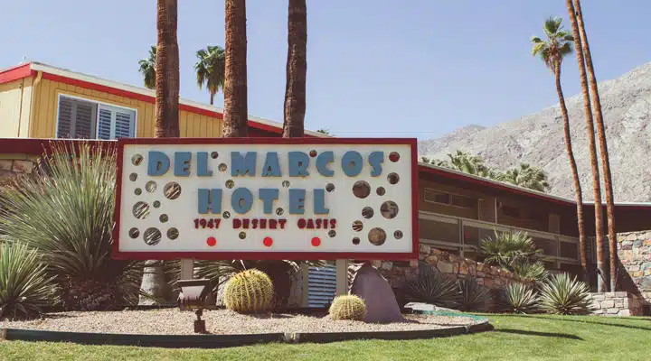
Del Marcos Hotel/William F. Cody – 1947
Color images of this building have not been found, and the architect’s papers did not provide any details regarding paint color choices. Black and white photographs(12) indicate that the wood siding on the second floor was left unpainted, (the wood grain is visible); however, it appears that the fascia board and handrail/balcony railings were painted.
Del Marcos Hotel. 1947. Palm Springs, CA
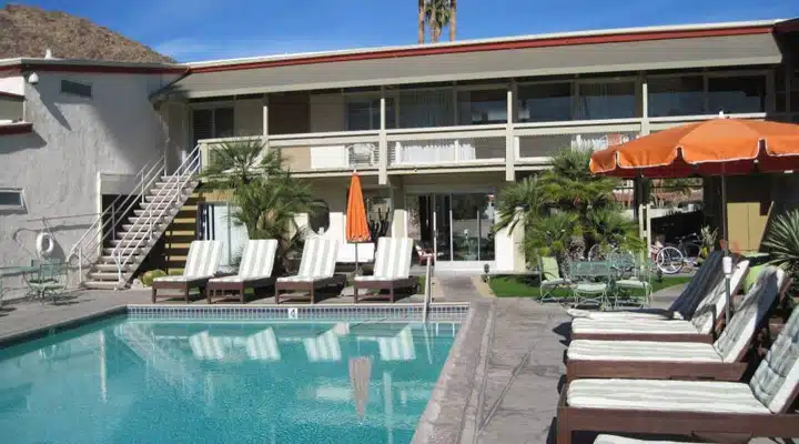
Ocatillo Lodge/William Krisel (Alexander Construction) – 1956
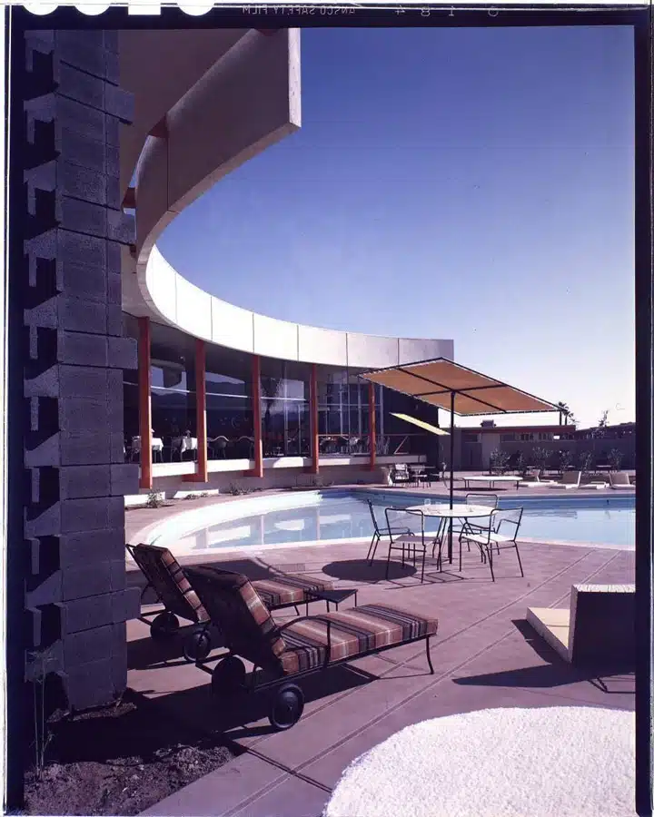
Color digital images were obtained from the Huntington Library Collection(13), documenting the colors of the pool area for this former hotel (now condominiums). A site visit confirmed that the colors on exterior steel columns and concrete block are still being used.
Ocatillo Lodge. 1957. Palm Springs, CA
Click here to download the color master PDF document of the color collection.
Additional References:
1. Henry Russell Hitchcock and Philip Johnson, The International Style, W. W. Norton & Company, New York, 1997 (originally published 1935)
2. Gabriel Gössel, Functional Architecture, Funktionale Architektur, Le Style International, 1925-1940, Taschen,
Berlin, 1990
3. Le Corbusier. Toward an Architecture, Translated by John Goodman, Los Angeles: Getty Research Institute, 2007
4. Buckner, Cory (2007), A. Quincy Jones, Phaidon Press, ISBN 978-0714848433.
5. Bricker, Lauren Weiss; Williams, Sidney J. (2011), Steel and Shade : the Architecture of Donald Wexler, Palm Springs, CA:Palm Springs Art Museum, p.131, ISBN 978-0981674346
6. Johns, Howard (2004), Palm Springs Confidential: Playground of the Stars!, Fort Lee, NJ: Barricade Books, pp.156, 216.ISBN 978-1569802694
7. Adamson, Paul; Arbunich, Marty (2002), Eichler: Modernism Rebuilds the American Dream, Gibbs Smith, ISBN 978-1586851842
8. Dunn-Edwards, Cliff May correspondence papers and other material
9. Robertson, Bruce; Opie, Catherine (2012), Carefree California: Cliff May and the Romance of the Ranch House, Rizzoli, ISBN 978-0847837823
10. Gringeri-Brown, Michelle.(2006), Atomic Ranch: Ideas for Stylish Ranch Homes, Gibbs Smith, ISBN 978-1423600022
11. William F. Cody Papers, (MS007) 1924-1975, Box 29 Folder 7 – Palm Springs Spa Hotel Gymnasium Specifications
12. William F. Cody Papers (MS007) 1945-1975, Box 19 Folder 6 – Julius Shulman prints, 1949
13. CL MLP, Maynard L. Parker negatives, photographs, and other materials
Featured Articles
-
Best Oranges for the Perfect Summer Beach Cottage
-
Get Ready for Fall with These Trendy Color + Design Moods
-
Try These Color Palettes To Nail A Tomato Girl Summer At Home
-
Embracing Barbiecore: Popular Pinks Throughout The Ages
-
The Color Yellow: Essential Color Theory, Symbolism and Design Application


