Popular Color Palettes Through The Decades: 1970s—2010s
05/11/2022 | Dunn Edwards |
You may be familiar with our Then, Now and Forever® Collection of historically-accurate paint colors inspired by architectural styles of the American West. Or even our newest initiative, Dunn-Edwards’ Poolside Gossip Color Collection, inspired by Palm Springs’ iconic 1960s and 1970s homes. But have you ever wondered exactly what color palettes defined each decade? We love looking back at the history of design and exploring exactly what cultural trends and phenomena led to the dominance of certain colors. As we look towards the release of our 2023 Trend Report next month, we’re taking a look back at the kinds of color palettes that helped define each decade of the last 50 years.
2010s
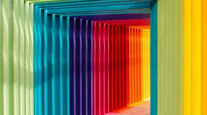
In the 2010s Millennial Pink was nearly inescapable. Pink, a color that in the second half of the 20th-century became synonymous with girls and femininity (but more on that later), became a new neutral in the 2010s. So neutral in fact, that Millennial Pink was often featured as the lead color in everything from office spaces to restaurants like the Insta-famous India Mahdavi-designed Gallery at Sketch, as well as technology. In fact, this barely-there shade of pink helped usher in the minimalist aesthetic that dominated the decade. While Millennials and their eponymous shade of pink reigned over the decade, up and coming Generation Z was not about to be outdone by its preceding cohort. Enter Gen Z Yellow. This energetic, joyful hue made waves at nearly every interactive exhibit of the late 2010s, such as the Color Factory and Museum of Ice Cream.
2000s
While “Millennial Pink” might have still been a few years away, in the 2000s on Wednesdays we most definitely wore pink thanks to cult hits like Mean Girls. The decade was also noted for Apple’s omnipresent tech and marketing—all of which were key drivers in the defining colors in the zeitgeist of this decade. In the home, however, a wave of Tuscan-Spanish inspired design spread like wildfire, perhaps thanks to the wistful 2003 film Under The Tuscan Sun, and brought with it sun-baked color schemes, iron accents, terracotta tiles, and faux finishes.
1990s
Tradition and grunge—two key elements that helped define some of the reigning colors of the 1990s. Both components bring with it a darker palette than those we’ve previously touched on. Deep reds, dark greens, browns and beiges, these colors all set the tone for this down-to-earth decade. While purple walls like those in Monica Gellar’s apartment on Friends may have been a dream come true, this daring design move may have been too bold for most.
1980s
Lisa Frank. Bold makeup. Jazzercise. Miami Vice. Rattan. MTV. The 1980s was chalk full of phenomena that helped propel color palettes infused with neon colors and beachy hues to the forefront.
1970s
The flower child movement of the times helped bring subdued, earthy tones to the forefront in the 1970s. From appliances to furniture and carpeting, avocado greens, rustic browns, and mustard yellows dominated design. Interested in more ‘70s colors? Check out this updated chalet that pays homage to 1970s alpine culture.
Featured Articles
-
 Best Oranges for the Perfect Summer Beach Cottage
-
 Get Ready for Fall with These Trendy Color + Design Moods
-
 Try These Color Palettes To Nail A Tomato Girl Summer At Home
-
 Embracing Barbiecore: Popular Pinks Throughout The Ages
-
 The Color Yellow: Essential Color Theory, Symbolism and Design Application
