An Exhibition of Color: Unveiling Dunn-Edwards 2021 Color + Design Trends
10/20/2020 | davidcamacho |
Follow us through a world of forgotten hues, undiscovered combinations and inspiring stories to find the palette that speaks to you.
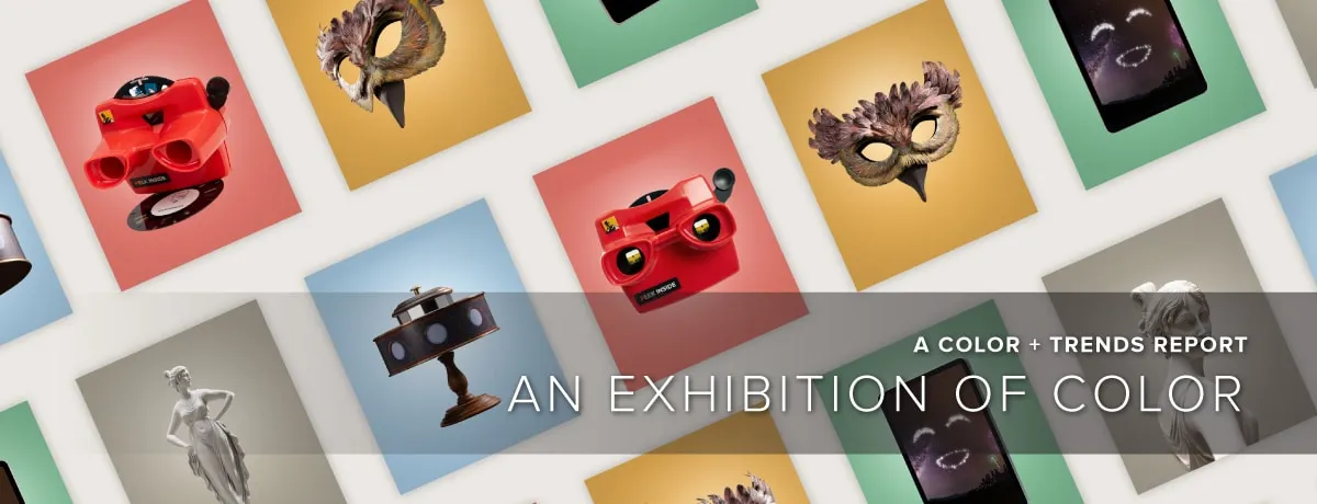
Introducing “Color + Design 2021: An Exhibition of Color.” This year marks a period of reflection and renewal and, as we move through this new decade, we are facing the repercussions of a global pandemic and chaos. Yet, great challenges are often followed by a period of reflection and radical transformation. What have we learned? What will we change? Can we heal?
“An Exhibition of Color” takes us on a journey through an art gallery, marking five unique works that inspire us to pause and reflect on five 2021 trend stories. Each art piece leads us through a unique storyline that
captures the essence of what inspires and enlightens us as we approach 2021.
The trend themes are complex and, sometimes, contradictory, reflecting ongoing drama in the world and the search for authenticity. The warp speed of information and dizzying pace of change have led us to
collectively refocus on timeless, universal and inventive themes. Overall, this year’s palette has grown warmer and deeper — highlighted by almost-artificial brights juxtaposed against mysterious shades, reflecting our global attempt to find balance.
Welcome to 2021 Color + Design.
Querencia
Querencia: a place from which one’s strength is drawn, where one feels at home; the place where you are your most authentic self.
This piece, Querencia, explores the relationship between human identity and place. A classic view-master is the mechanism that takes us into the story where we’re able to experience the inner thoughts of the artist’s muse, Sergio. As we travel with Sergio, we find that color is the connection that binds us across time and distance.
Querencia is rooted in the charm of regional traditions and history and learning to put down local foundations and rediscover emotions.
Color Palette Inspiration
Subtle, delicate and graceful, the palette starts with soft, chalky and watercolor tones with infusions of light and patina effects. There is a soft warmth to the range of hues balanced by cooler, toned-down shades. Pops of tangy pastels add a cheerful, fresh mood, while ’70s sunset gradients punch up the retro vibes.
Rethink the red, white and blue flag colors and classic tricolors, as the importance of joyfulness highlights delightful quirkiness. Transparent, filtered colors are sentimental, while graphic tones, tempered by gradated half-tones applied on summer stripes — as well as mini geometrics from the archives — showcase a softened retro, summery vibe.
Solibre
Solibre: literal translation “sun free.” Sounds like “soy libre” — I’m free.
This mural, Solibre, celebrates the power of the desert landscape, teaching us to let go of old ways so we can adapt and thrive. An artist paints a mural inside the gallery and showcases the influences of desert scenes of the American Southwest. As she navigates the painting process, she finds inspiration by trusting her instincts, pulling from ancient knowledge that lies within, and realizing that the desert is about the wisdom of adaptation. We should not fear change but embrace it and find our
natural place in the cycle.
Solibre puts climate issues back into the heart of restorative creation, nourished by a symbiotic relationship with nature and indigenous cultures.
Color Palette Inspiration
The Solibre color palette is strong and nurturing, comforting us through uncertain times. This organic palette is reminiscent of desert landscapes, real and surreal, revealing brown and red tones that echo the Earth’s hues. Creating balance, pastels whisper the promise of new life, greens protect flora and fauna, and yellows showcase the power of solar energy. Bathed in light that radiates from all surfaces in pearly glints, ambers and
soft iridescence, this color scheme is invigorated by a soft Day-Glo acid yellow.
This warm palette is influenced by raw materials, art and nature, all enhanced by yellow. Paired and gradient contrasts reinvent light and shadow, echoing the day’s beginning and end. Botanical hues are omnipresent, greens and khakis are filtered through the sunlight and polished with yellow accents, yet blended with shades of dark brown.
Hanabi
Hanabi: a Japanese term meaning “fireworks.” Hana = flower. Bi = fire.
This computer-generated, animated story, Hanabi, takes place in our gallery where a video screen turns itself on and comes to life… we will go inside the screen and follow the story of a star that dreams of becoming more. Here, light is our main character. After some various light-hearted attempts, the story concludes with the star finally achieving its dream of becoming a dazzling, fireworks show.
Hanabi explores the codes of inclusiveness, optimism and laid-back design re-creating links between the generations.
Color Palette Inspiration
The Hanabi color scheme is experimental and fresh. Early childhood shades of marshmallow pink, mint and bleached yellow boost the playful palette, which is darkened by bright blues and greens and stimulated by radiant purple and coral.
Color can play a role in function and fun. Monochromatic coating and graphic color blocking reveal practical purposes, while highlighting the enjoyment that design can bring to commercial and residential spaces. Multicolored and childlike graphics are shown on floor trails, resulting in wayfinding fun.
Lagom
Lagom: a Swedish term that signifies the right amount or balanced perfection. Not too little, not too much — just right. Lagom is easygoing, unplugging, connecting with others in real life and disengaging from social media. It's about taking time for yourself, doing something with your own hands and giving back.
A beautiful, classical sculpture, Lagom lights up with super-imposed images and videos in a poetic tale that reminds us of the enduring “energetic” footprint that every artist leaves upon their work. Reality is vibration and movement — nothing is ever still, even the particles in stone are continually shifting. Life is one complex choreography in which we are all dancers, from the tips of our fingers and toes, to the depths of our cells.
The lesson: existence at the largest scale resembles itself in the smallest subatomic particle. Everything is always moving in a graceful, universal dance. Lagom challenges the notions of academicism and classical
form, while praising timelessness.
Color Palette Inspiration
Lagom celebrates neutrals through layers of time, along with antique hues with a touch of decadence and romance. A global, archaic influence peaks through as grays are softened and touches of flesh pink and deep rust red infuse the palette with the spirit of art.
This mineral-inspired theme layers shades of marble, granite and concrete, while overlaying a veil of sand and fragile, fresco hues. Nature’s influence is displayed through modern blues and plant-based greens.
Moonwake
Moonwake: reflection of moonlight on a body of water.
As we move to the antiquities area of the gallery, we spot a zoetrope titled Moonwake. As it spins, we see real-life animation of a moon rising. A woman runs through a forest, while a man runs from the city toward her. As the two come together in the zoetrope, we see long shadows on the wall of the gallery — a couple’s embrace.
Moonwake speaks to our collective desire to connect. Design takes on an atmosphere of romance downtown at night. The mood is artificial with nocturnal colorways, shadowy florals and organic shapes that often feels disturbed.
Color Palette Inspiration
Moonwake conjures a warm, romantic and decadent ambiance filled with nocturnal moods. This melancholy palette starts with a base of deep darks tinged with acid, luminous cloudy blues and flashy purples.
Splashy accents on city-influenced dark tones, shimmering mono-chromatics, intense color — a story of noir fiction. Positive energies display luminous brights and intense neutrals, uplifting the spirit in this dreamy escape that sparks energy. Hyper-blends of blues, greens and pinks mixed with pastels showcase these fantasy-driven colors.
Intense chromas are decadent ties to digital realities, while purple shades nurture the imagination. Uplifting coral and chartreuse promote the importance of mood-boosting color.
To explore more on An Exhibition of Color, including color palettes and design details, click here.

