Back to School! Colors for the Classroom
09/02/2016 | Sara McLean |
It’s that time of year again! Children and young adults are returning to or entering into new schools, ready to tackle another year of learning. Through the years, many studies have been conducted regarding the best uses of color in the classroom. All concur that color is an important factor in the physical learning environment and impacts student achievement. And, although these studies vary somewhat in how much of a role color should play in a class room environment, most recommend a variety of colors within a room to reduce eye strain, boredom and passivity. Many studies also show that color can provide positive and negative impacts on learning so the use of color in classrooms on walls, chairs, floors, and other surfaces should be well thought out. Learning begins at the point a child enters the school campus; therefore, creating positive, colorful experiences can play a key role in an overall successful school year.
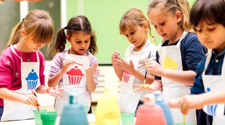
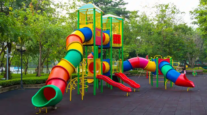
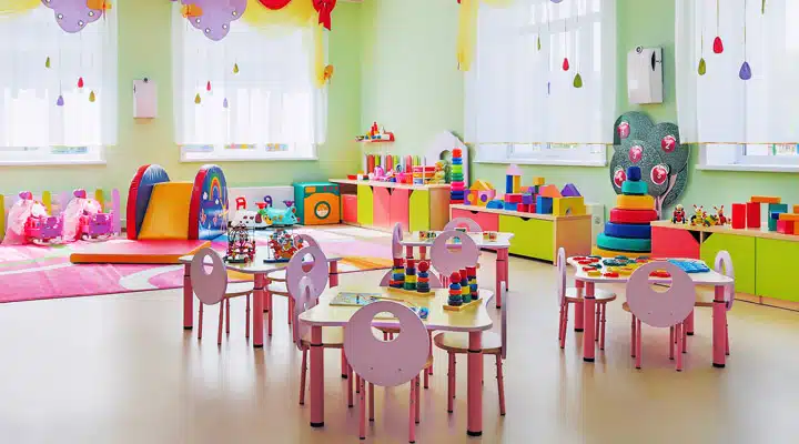
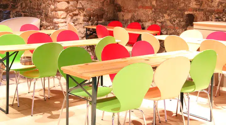
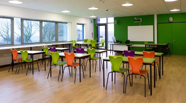
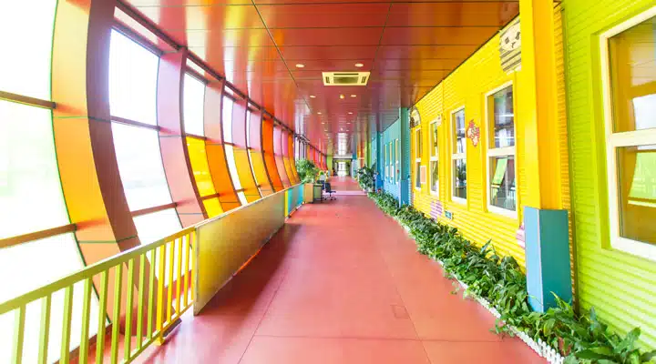
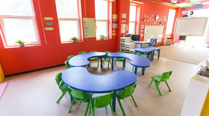
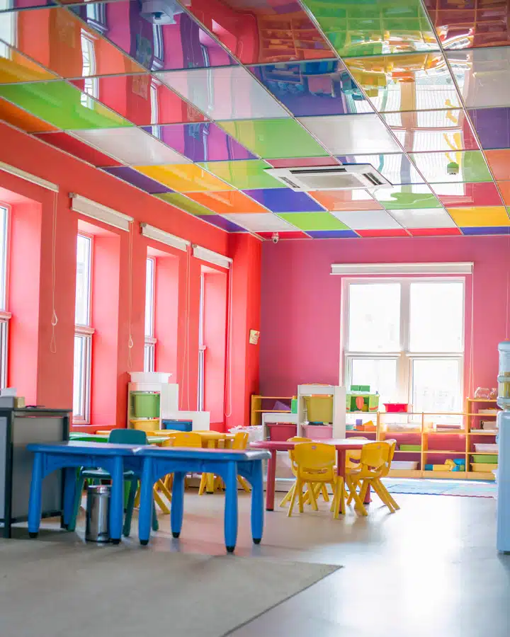
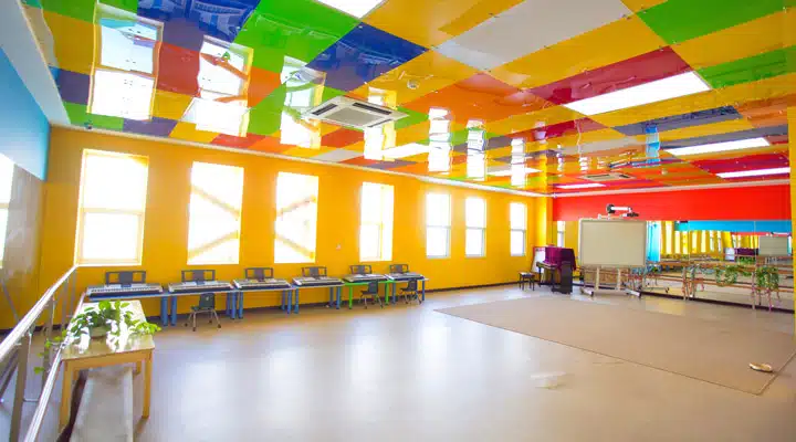
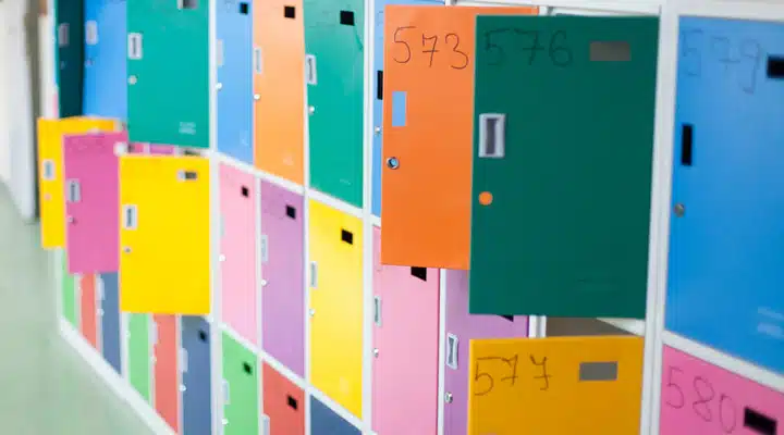
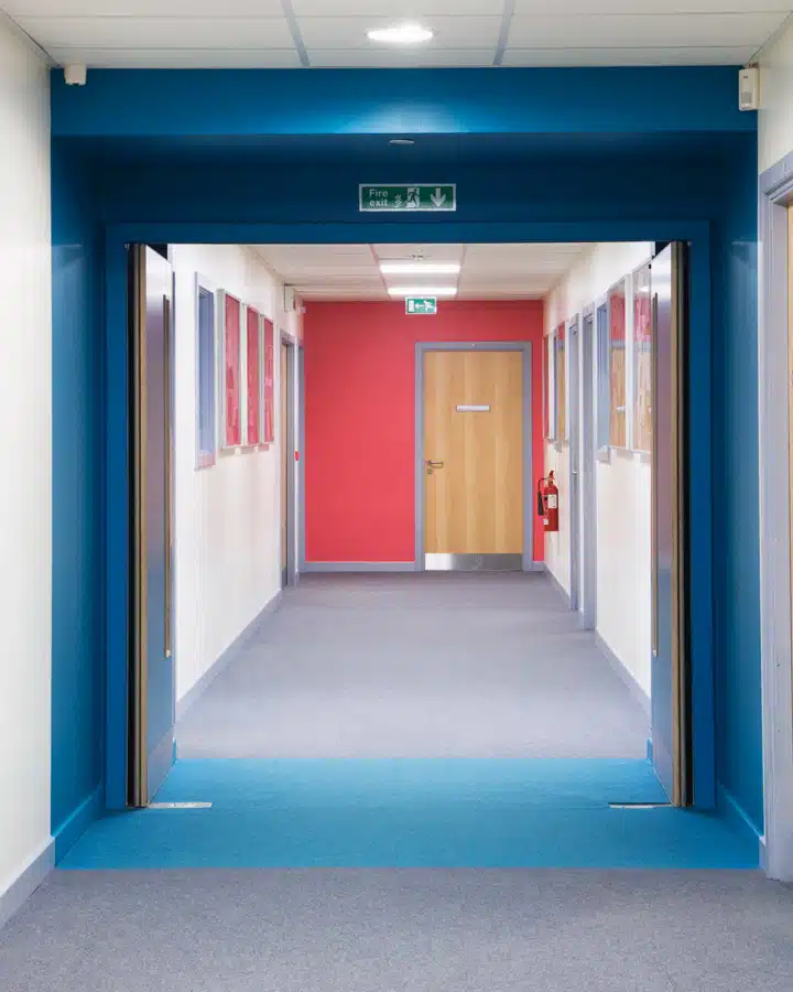
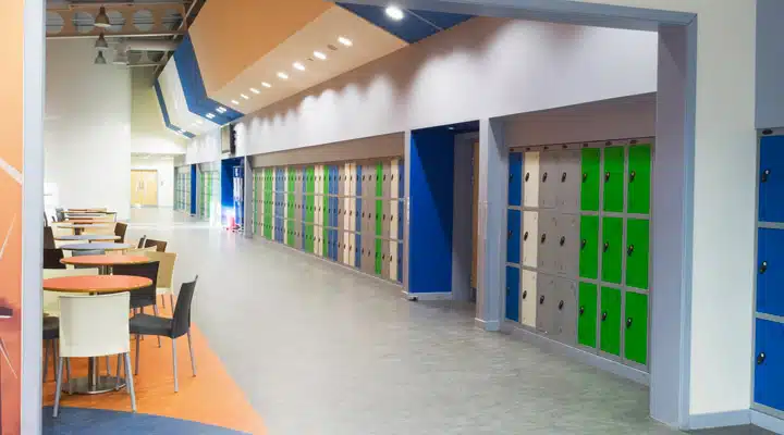
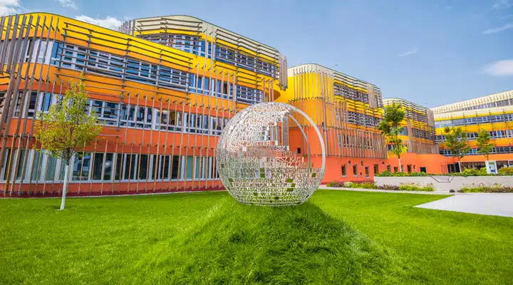
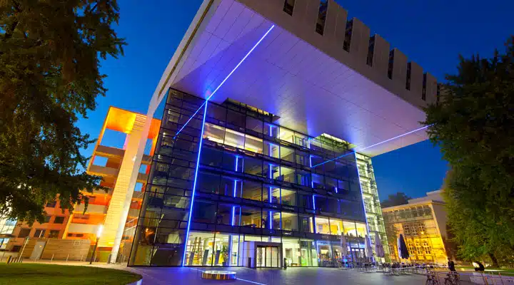
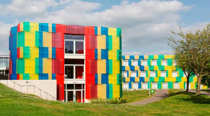
Four images above: Early childhood interactions with color. Photo credits: iStock
To create positive color interactions in a school environment, design professionals look at the purpose and emotional reactions of color in rooms – from cafeterias to classrooms, hallways to libraries, as well as school colors – in order to choose the best palettes. The optimal palette is a range of colors using lighter hues with deeper accents to provide a stimulating environment. For example, a softened sage green paired with a pop of orange catches the eye without being overwhelming. Creating a monotone color scheme tends to not work for children, as the lack of color doesn't engage the senses. Nature-based greens create an atmosphere of calm and restfulness, making these spaces more conducive to studying and learning.
Images Above: the use of color in a cafeteria and high school classroom. Photo credits: iStock
Productivity or creativity? Choose your paint color. Softened yellows are cheery and warm and, if not too bright, yellow can assist in productivity. Blues tend to be spa-like and restful, reminders of oceans and tranquility; studies have shown that blue rooms promote creativity. Violets and softened lavenders
are also shown to engage children in increasing their creative senses.
In classrooms, it is key not to over-stimulate or agitate –– the child needs to feel calm and relaxed in this learning environment. Large splashes of color such as red, orange and purple can be difficult, while the use of calmer colors such as soft greens and blues works better. However, brighter furniture can be used to make these classrooms pop. With younger children, brighter colors actually help children thrive so a livelier color palette can be used. Many of these bright color palettes help children with color way-finding and color learning. Young children tend to be attracted to warm, bright colors, which parents and teachers can see just by walking down the toy aisle.
Four Images Above: Creatively designed preschool and kindergarten in Beijing, China using a bold color palette to engage the young children. Photo credits: Getty Images
As children age, they grow from an interest toward pastels in elementary school to brighter, medium-cool colors in middle school. In high school, darker colors are preferred and there is less preference for primary colors. If parents have any input on colors in school rooms, opt for blues, greens, violet and turquoise. Classrooms should incorporate a variety of colors to reduce the monotony and increase mental acuity. Warm colors tend to make large spaces feel more intimate, while cool colors make smaller rooms appear larger. By moderating the use between warm and cool, a classroom environment can make a child feel engaged without feeling over-stimulated.
Libraries are similar to classrooms because these are quiet places of learning. Calmer color palettes work best in these rooms, as well. However, if the library is set up as a conversation or lounge, then bolder
color palettes encourage this behavior.
Multipurpose rooms such as hallways, cafeterias and entries are more informal so color can be bolder and create excitement for these areas. Color can play a role in wayfinding, showing school colors and adding
more artistic drama. These areas are places of conversation and fun so playing up a bolder color palette is vital to a creative learning environment.
Images Above: the use of color as wayfinding, adding creativity and showing the school colors. Photo credits: iStock
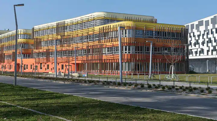
Architecturally, during the past few decades, the exteriors of many school buildings have been built as large concrete or stucco blocks, devoid of inspiration, with exceptions to universities with long-standing
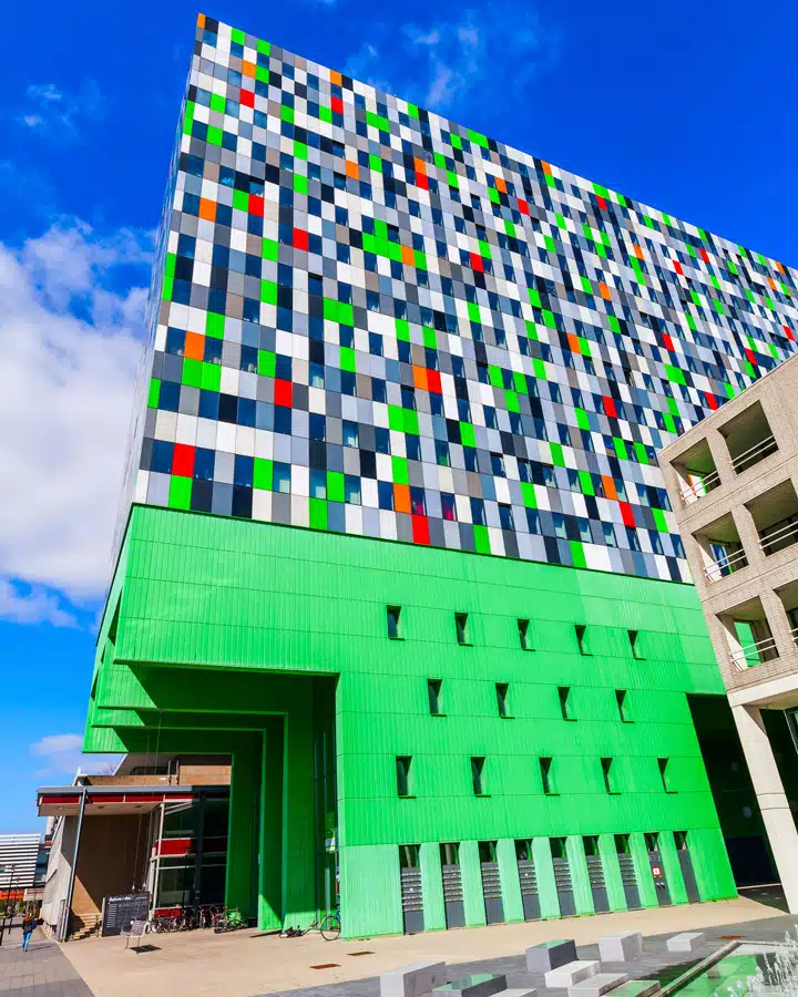
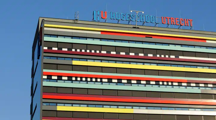
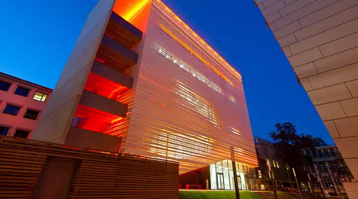
histories such as Harvard University. However, design professionals are beginning to take these boring facades and create amazingly colorful buildings and campuses. The renewed excitement of unusual designs leaves the students wanting to return to these creative environments, taking pride in their
surroundings. Here are examples of forward-thinking, colorful architecture for schools.
Two images above: University of Economics and Business Campus, designed by CRABstudio, London, England. Photo credits: iStock
Student Apartment Building, The Uithof in Utrecht, Netherlands. Photo credit: iStock
University of Applied Sciences Building, Utrecht, Netherlands. Photo credit: iStock
Two images above: Aachen University, Germany. Photo credits: iStock
High School Building, Athenee de Luxembourg. Photo credit: iStock
For further inspiration, here is a recent specs+spaces story showcasing examples of vibrantly colorful schools from around the world
Featured Articles
-
 Best Oranges for the Perfect Summer Beach Cottage
-
 Get Ready for Fall with These Trendy Color + Design Moods
-
 Try These Color Palettes To Nail A Tomato Girl Summer At Home
-
 Embracing Barbiecore: Popular Pinks Throughout The Ages
-
 The Color Yellow: Essential Color Theory, Symbolism and Design Application


