Four Things Every Contractor Should Know About Color
10/25/2021 | Dunn Edwards |
The Four Things Every Painting Contractor Should Know About Color
Use the Power of Color Theory to Make Sure Every Job Looks Its Best
Color theory might not be in your official job description, but chances are that you deal with it every day. When you're lucky enough to work with an interior designer, you probably don't have to think about it much... but in many cases, a homeowner or property owner will tell you which colors to use—or worse, they'll ask you for color advice.
Some contractors have found a workaround to this color conundrum: they simply recommend the same few colors for every job. While this can save time (why reinvent the wheel?), it doesn't always work. That's because there are several factors that play a role in making good color decisions. Architectural style, property location, type and amount of natural lighting, furnishings, fixtures, decor, and personal preference are all key factors. In addition, what worked last season might be out of fashion the next.
Here are four things to keep in mind when it comes to color.
- Color should come last.
When it comes to both interiors and exteriors, color should be one of the last big decisions a homeowner or property owner makes. That's because color should serve the architecture and decor, not the other way around. If a client approaches you with color selections before they've built or furnished their property, advise them to lock in their architectural elements and at least a few pieces of key decor first. Once those pieces are in place, they'll have a foundation from which to make educated decisions about color.
Example of a room painted to match its decor
- Ask an expert.
While color advice often happens on your watch, it doesn't mean you have to do it without help. With the Dunn-Edwards InstaColor® iD Handheld Color Matching Tool, you can color match the important design elements from your clients' properties, such as artwork or fabrics. Taking these accent colors into consideration can make the difference between a paint job that sings... or one that feels out of tune. If you run into color questions, let our Professional Color Advisors help! Dunn-Edwards provides color consultations in-store, online, or even in the comfort of your client's own home (depending on the location). On the color page of the Dunn-Edwards website, you can search every one of the 2,006 colors in our Perfect Palette® collection, and every color is listed with its perfect trim and accent color, so you'll never have to guess.
Dunn-Edwards InstaColor® iD Handheld Color Matching Tool
- Learn the basics.
In color theory, there are three basic themes you can use to find colors that will work together: monochromatic, analogous, and complementary. A monochromatic theme is the simplest because it contains variations on the same hue. For example, blue walls, light blue trim, and an even lighter bluish-white for the ceiling color.
Example of a room that uses a monochromatic theme
The analogous theme uses colors that are positioned next to each other on a color wheel. To develop an analogous theme, start with two primary colors (red, blue, or yellow). The third color will be a blend of the two colors. An example of an analogous theme would be red, yellow, and red-yellow (otherwise known as orange). The third color acts as a bridge between the first two colors, creating a sense of harmony in the palette. Of course, most buildings aren't painted in true primary colors; they are usually tinted or shaded versions of true primaries, but the formula still works.
Example of a room that uses an analogous theme
The complementary theme uses two colors that are opposite each other on a color wheel, for example, red and green. The third color is usually neutrals, such as white or gray. This theme works best when one of the colors is selected as the main or dominant color, with the other being used sparingly as an accent.
Example of a room that uses a complementary theme
- Stay on top of trends.
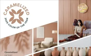
What worked on your last few projects might not work on your next. Trends change, and with them, all of your clients' architectural styles, countertops, fixtures, decor, and color preferences. One easy way to stay on top of the latest color trends is to follow our Specs+Spaces design blog. Here, we'll announce the latest color and design trends, in addition to our much-anticipated Color of the Year. For 2022, the color is Art and Craft (DET682), a versatile brown that works with many different design styles: from Victorian and Craftsman to Modern, Bohemian, and Transitional. Check out our post about Art and Craft for ideas on style, accent colors, and palettes.
Dunn-Edwards 2022 Color of the Year Art and Craft (DET682)

