4 Fun Spring Color Palettes to Inspire Your Design
03/24/2022 | Dunn Edwards |
Spring has officially sprung! And we’re sharing 4 Fun Spring Color Palettes to Inspire Your Design. Lucky for us color-obsessed folks here at Dunn-Edwards, spring is chalk full of vivid colors—from fuchsias to greens, and more. While this spring season’s bountiful blooms are an easy choice for fun spring color palettes, we’ve been inspired by the unique colors that have come with winter’s substantial rains and want to share with you some fresh and fun paint color palettes that reflect what we’re seeing around us.
To kick things off, we’re starting with a palette inspired by March’s traditional cherry blossom blooms. From the west coast and places like Seattle to the east coast and Washington, DC, to international locales like Japan, the annual cherry blossoms turn city sidewalks into magical thoroughfares. This cherry blossom palette is a great way to add a pops of pink color in your space from a wide spectrum with shades that are barely there to classically pink.
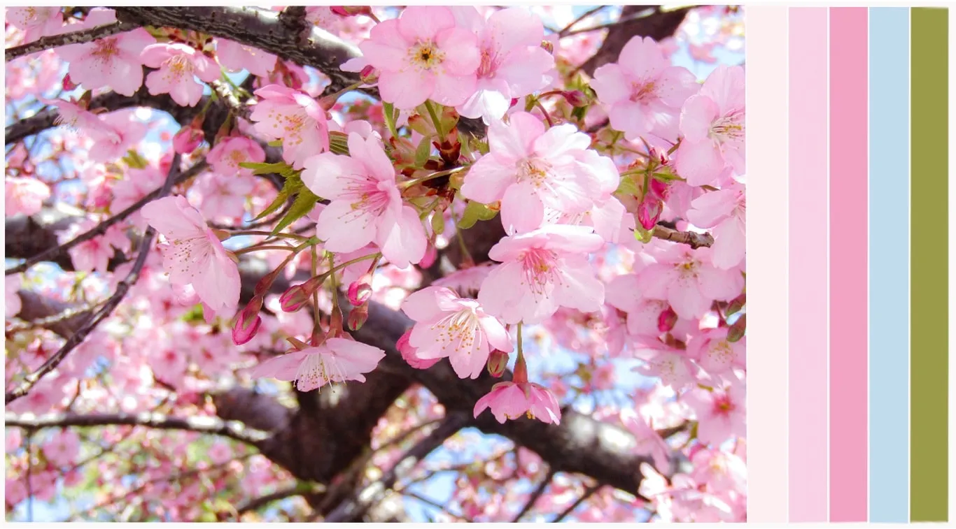
Colors used in order from left to right: Powder Puff (DE5063), Ballerina (DE5036), Taffy Pink (DE5045), Island View (DE5848), and Lazy Lizard (DE5523).
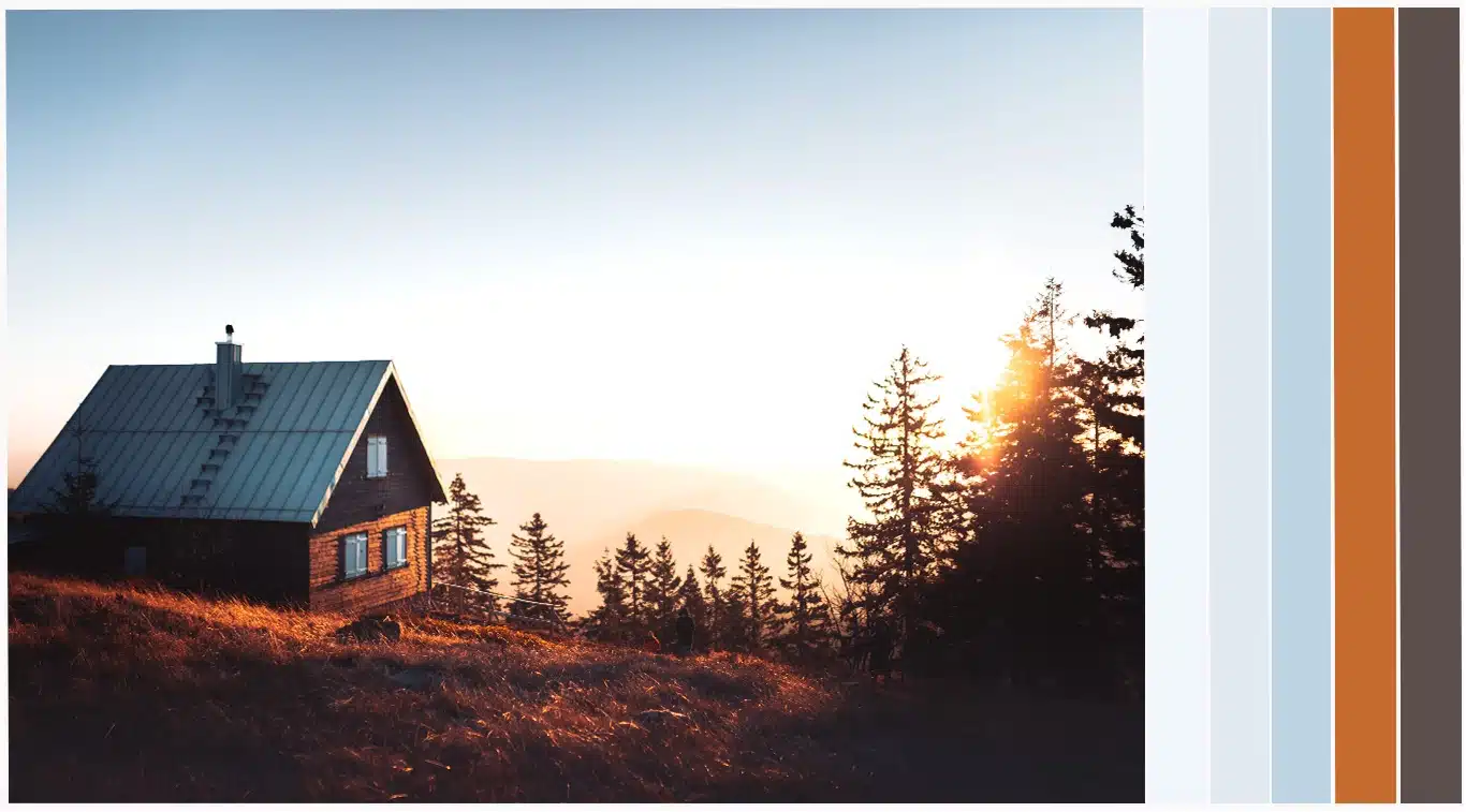
This next fun palette for spring is takes a cue from our Après Ski design trend. In this case après your après ski, when the last snow has finally melted away. The days are a little longer and the warmth of sunset can be enjoyed from the deck. Soft sky blues are accompanied by the shadow and and rusty lights of golden hour to create a spring color palette with contrast and interest.
Colors used in order from left to right: Cotton Ball (DEW387), Worn Denim (DEW378), Two Harbors (DE5813), Desert Spice (DE5202), and Nomad (DET697).
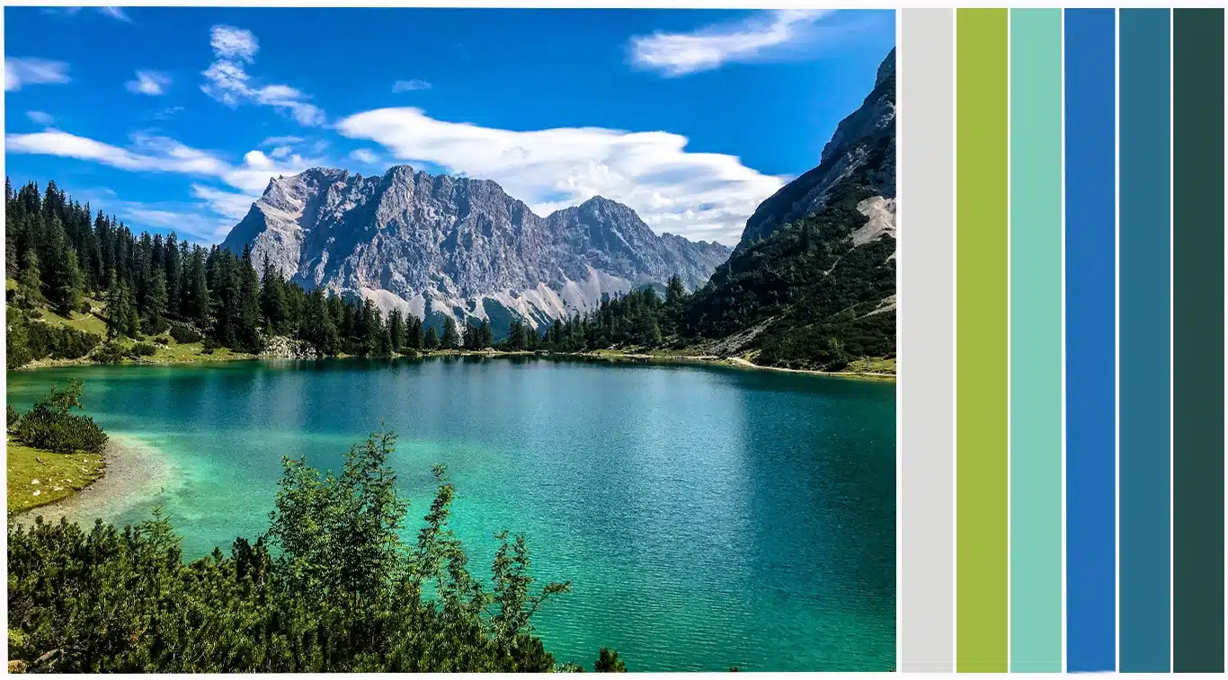
This next palette for spring is comprised of colors we see after the rain when lake waters gleam anew and surrounding foliage bursts with vibrant greens. Bright blue skies dotted with wispy clouds passing softly by cast blue hues on the gray mountains. Watery jewel tones such as these shades of teals and aquas help make a space feel relaxed.
Colors used in order from left to right: Porpoise (DE6373), Clipped Grass (DE5552), Star Grass (DE5682), Beautiful Blue (DEA136), Teal Tune (DE5831), and Deep Pine (DEA180).
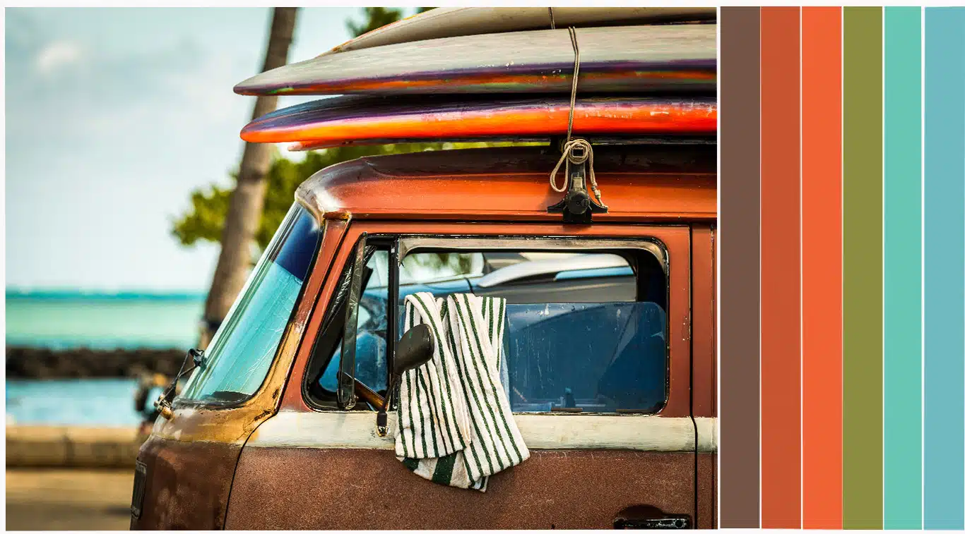
Last but not least, we have another palette influenced by life during springtime. This time it’s inspired by warming temps and yearning to get outside and find adventure. This surf palette for spring brings the best of 1970s-inspired dogtown vibes while infusing some serene coastal hues to give it a more modern spin.
Colors used in order from left to right: Briar (DEC712), Spicy Tomato (DE5139), Exuberant Orange (DEA112), Vegetable Garden (DE5524), Sweet Garden (DE5696), and Castaway (DE5738).
Featured Articles
-
 Best Oranges for the Perfect Summer Beach Cottage
-
 Get Ready for Fall with These Trendy Color + Design Moods
-
 Try These Color Palettes To Nail A Tomato Girl Summer At Home
-
 Embracing Barbiecore: Popular Pinks Throughout The Ages
-
 The Color Yellow: Essential Color Theory, Symbolism and Design Application
