The Color Brown: Essential Color Theory, Symbolism and Design Application
11/10/2021 | Sara McLean |
Brown Color Theory
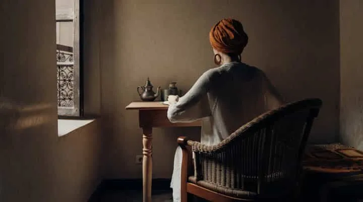
Known as the color of natural elements of wood, sand, soil and stone, as well as comfort and stability, brown is a color of nature and a grounding force in design. It can be an elegant hue in the right setting, creating a cocoon of warmth. And as brown is trending forward and permeating all areas of design, as a symbol of the warming of colors in design, Dunn-Edwards even named Art and Craft (DET682) as the 2022 Color of the Year.
How is the Color Brown Created?
Brown is not featured on a traditional color wheel as it is what’s known as a composite color—a color made of a mix of pigments, a blend of primary and secondary colors. It is considered a warm hue, along with red, orange and yellow and is noted as a deep shade of orange on modern color wheels.
The Meaning of the Color Brown
Like most colors in color theory, brown has both positive and negative associations. The positive highlights include a sense of strength and reliability, as well as feelings of warmth, comfort and security. Negative characteristics include feelings of loneliness, sadness, dullness and boredom, as well as decay and poverty. And when it comes to marketing and branding, brown is associated with reliability, dependability and nurturing.
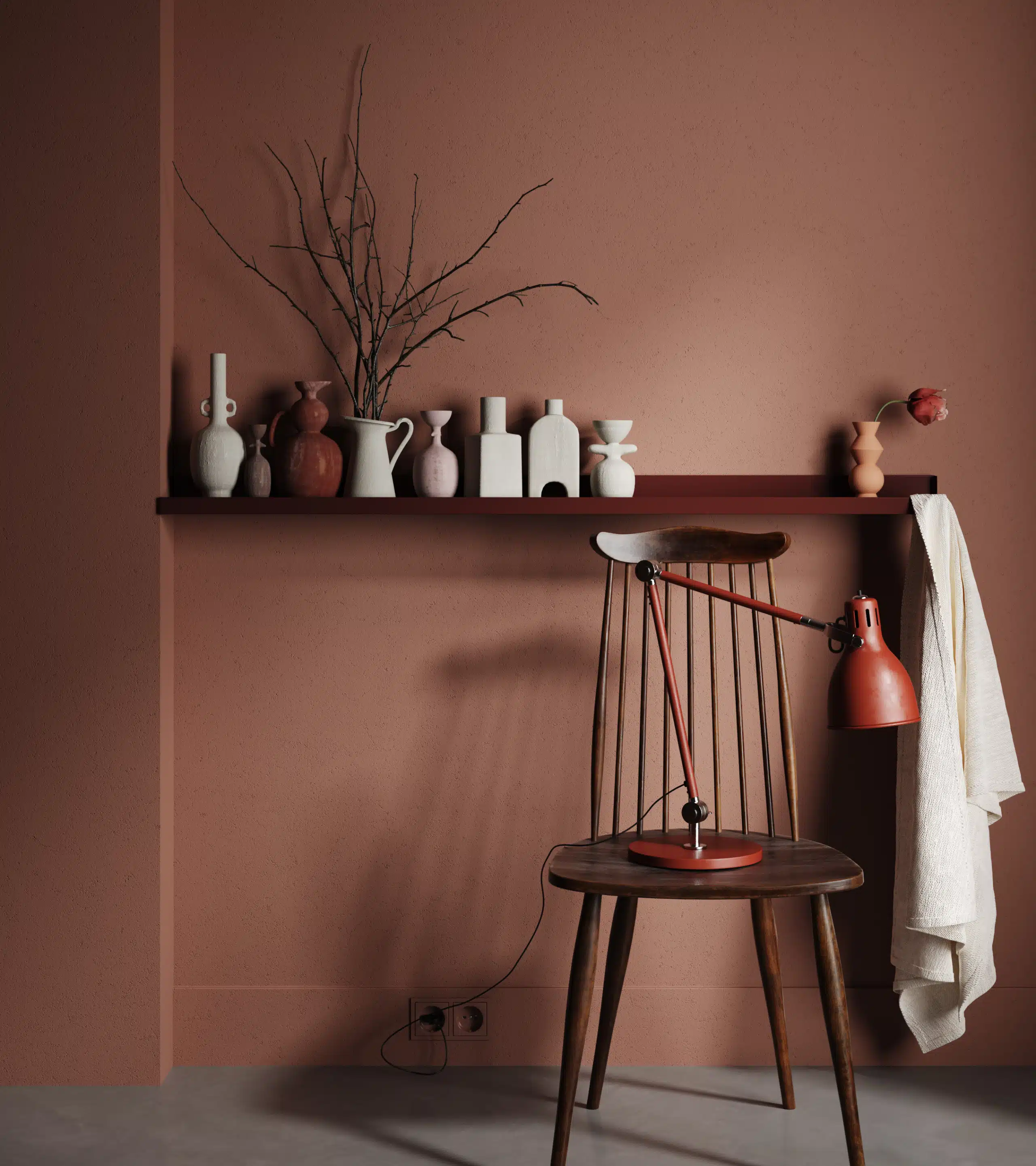
In design, brown is a neutral, warmer than black, so adds a warming effect to palettes that otherwise might feel too stark. It’s a hue that provides stability and grounding, allowing designs to create a sense of warmth
and inclusion in the room setting.
In trends, historically brown has been associated with poverty, largely with its ties to rural life. However, in recent years, browns have become quite chic, as rural lifestyles are romanticized and cottagecore,
as well as light and dark academia, highlight the best of brown in social media.
Where does the Color Brown Originate From?
Nature and soil are the first ideas that comes to mind when asked where brown comes from. We see it all around us in the dirt, wood, and sand, plus on the fur and hides of animals. With the color so prevalent all around us, it is perceived as a neutral.
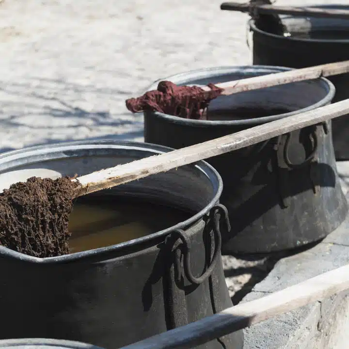
Used in art since prehistoric times thanks to the availability of natural clay, this is one of the oldest color names on record in English and was first used in 1000. Many cultures use a word similar to the
word for coffee to describe this color.
In ancient history, some of the earliest drawings in cave dwellings were created using umber and sienna(link). And in ancient Greece, they experimented and created a red-brown dye called sepia, made from the ink of cuttlefish. This sepia was also used by many Renaissance artists including Leonardo da Vinci and
Raphael and continues to be used by artists today.
As referenced earlier, traditionally brown was associated with poverty and lower classes and many couldn’t afford the more colorful dyes for their clothing. The Romans even had a name for the poor–pullati, which translates to “those dressed in brown.” It then makes sense that in the Middle Ages, monks wore brown as a sign of poverty and humility.
As times changes, the significance and use of brown changed in artwork. In the 17th and 18th centuries, brown was favored for creating layers of depth and shadow by the painters including Caravaggio and Rembrandt.
Fast forward to the 1970s, brown was a staple of color palettes in all areas of design. Typically infused with other earthy colors including harvest gold, avocado and sunny orange, this decade solidified the
popularity of brown.
These recent years, brown has cycled through a few trending phases, with coffee color ranges showcasing the popularity of coffee shops, mainly Starbucks when it created a mass market chain of coffee shops in the
90s. Then more recently, brown has been highlighted as a key color through this decade as part of the eco-sustainable movement, along with ties to cottagecore, light and dark acadamia and general rural fantasy design aesthetics.
On fashion runways and in luxury interiors, brown is often seen as a luxury color in camel, taupe and beige tones often on leathers, fine grain woods, and fine linen weaves.
How to Design with Brown
Brown is an incredibly versatile color with a wide range of tones for almost every design aesthetic. From wood floors, furniture and fixtures, brown touches almost every element in design. When choosing colors to go with these elements, try matching undertones. Warm-toned woods have gold or yellow undertones and look good with colors on the warm end of the spectrum, while woods with blue or gray tones can be paired with cool hues. Here are four trending design themes using brown and warm neutrals:
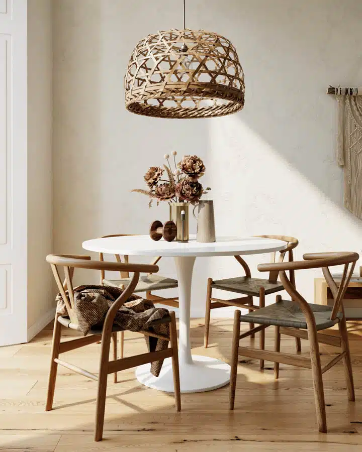
Warm Scandinavian Design
Scandinavian design emphasizes a grounding comfort and return to natural settings. Using a wide range of browns and whites plus natural woods creates a soothing, monochromatic palette as a perfect accompaniment to the aesthetic.
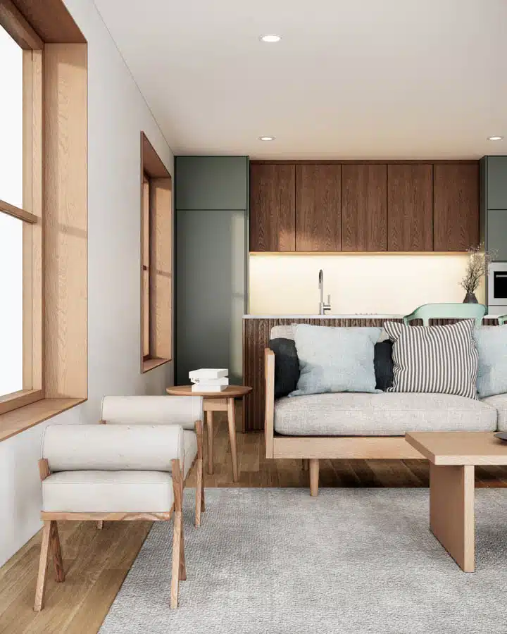
Japandi Design
Defined as the juxtaposition of Japanese Zen-minimalism and Scandinavian functionality, Japandi creates a perfect fusion of form and function. Neutral paint color palettes with calming and tranquil qualities— such as beige, tan, stone, oatmeal—are contrasted sparingly with deep indigo, dark gray and brown. If brighter hues are chosen, it’s done with intention.
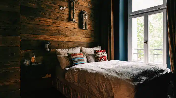
Cottagecore Design
A rebuttal against technology overload, Cottagecore is an extension of Grandmillennial or Granny Chic lifestyle and defined as a romantic interpretation of rural, agricultural times and simpler life through a style of dress, design and décor — reminiscent of what one might find in a cottage in the countryside. Browns and neutrals are infused through a palette that is worn in and comfortable paired with muted accent colors including ivory, brown, beige, olive green, mustard yellow, baby pink, dusty rose, light and buttery yellows, baby and watery blues and warm grays.
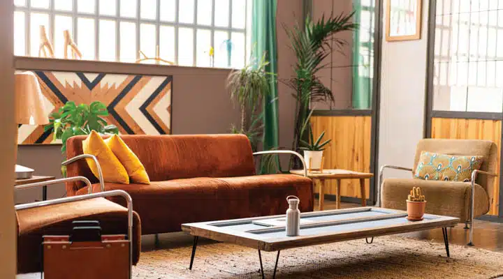
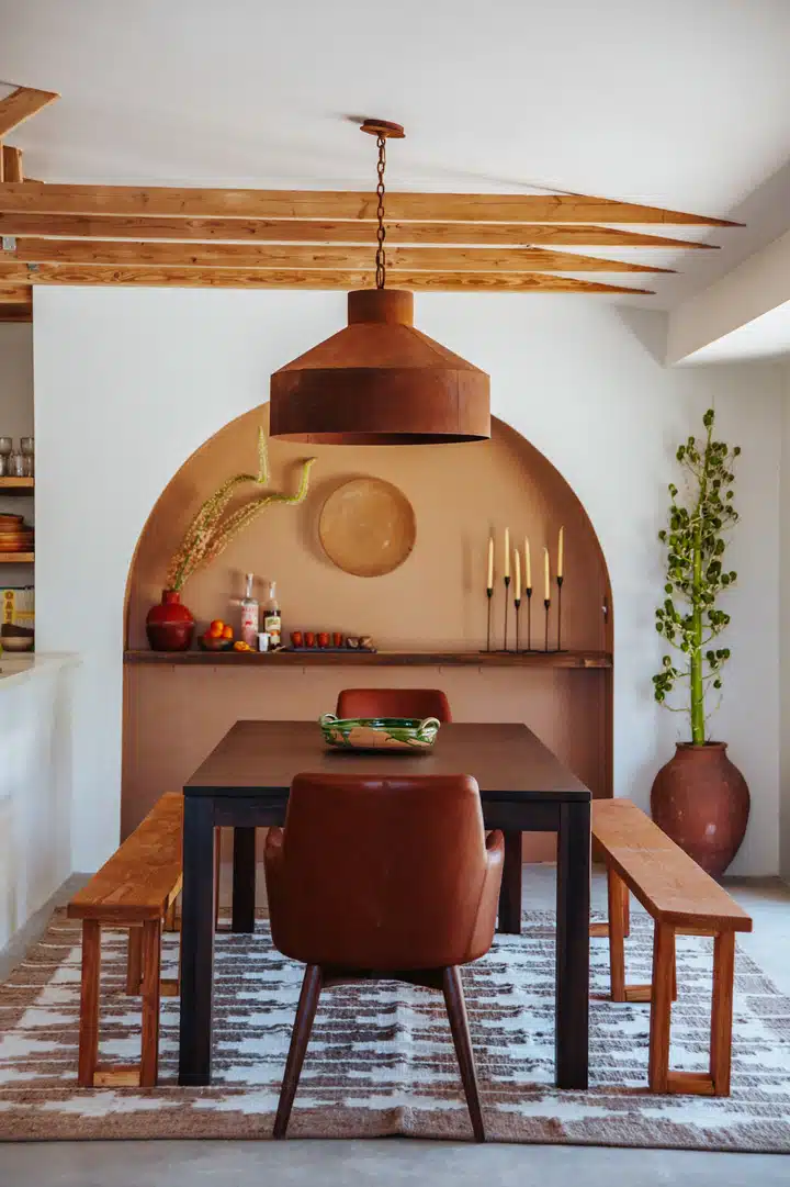
Desert Abode
As desert living has trended forward in recent years, with Palm Springs and Joshua Tree highlighting fresh ideals in desert lifestyle and slow living, so to have the color palettes trended to warm neutrals and browns. Transformative quiet retreats for the “always on” or for anyone looking to take a breath and reconnect with the natural world dot the desert landscape and the color palettes stay true to the region and its natural, picturesque landscape.
Photo credit: Claire Thomas
Brown Color Palettes
Browns offer a wide range of choices when it comes to creating color palettes for almost any aesthetic you’re creating.
Monochromatic Palette: uses a range of browns and neutrals to create a sophisticated approach.
Complementary Palette: as brown is a considered a deep orange on modern color wheels, blue would be incorporated.
Analogous Palette: using colors bordering on either side of the color wheel, this means reds and yellows would complete the analogous palette for browns.
Find out more on ways to incorporate brown into your designs and why warm hues are trending, including our in-depth 2022 color + design trends report.
Featured Articles
-
Best Oranges for the Perfect Summer Beach Cottage
-
Get Ready for Fall with These Trendy Color + Design Moods
-
Try These Color Palettes To Nail A Tomato Girl Summer At Home
-
Embracing Barbiecore: Popular Pinks Throughout The Ages
-
The Color Yellow: Essential Color Theory, Symbolism and Design Application


