4 Surprising Green Color Palettes For Spring
04/27/2021 | specs+spaces staff |
In bloom this season are some delightful and surprising green color palettes for spring. With every spring, we’re reminded that, as the world blooms anew around us, we can look at the everything around us with fresh eyes. Look around and you’ll catch the color green everywhere this season — from a fresh sprig of mint to verdant stems bearing flowers — this natural color that’s all around us continues to inspire and delight.
The prevalence of green in design over the last few years is due in part to two things — its presence as a calming earth tone and its versatility in design. Green has been an ongoing color trend as many reevaluate their connection with mother nature and also fight to roll back climate change. Green is so prevalent in recent design, in fact, that at Dunn-Edwards we’ve previously named green shades as our color of the year in 2020 with Minty Fresh (DE5687) and in 2018 with The Green Hour (DET544). We continue to see green influence style, fashion, technology and culture.
As consumers continue to reach for earth tones that ground them in times of anxiety, green rules as a popular hue and has made appearances in a variety of shades throughout our 2021 Color + Design Trend reports, from Lagom’s teal-infused Navajo Turquoise (DET547) and Hanabi’s Emperor Jade (DE5734), to the subtle lime-moss Flower Stem (DE5605) in our Solibre 2021 Color + Design Trend report.
When it comes to our first surprising color palette for spring, green helps create a dramatic, yet peaceful setting. When fashion and design trendsetter Annette Vartanian of A Vintage Splendor desired a rich look in her newly painted bedroom, she reached for deep green Stone Bridge (DE5747). This palette is filled with other calming hues that complement this rich green hue.
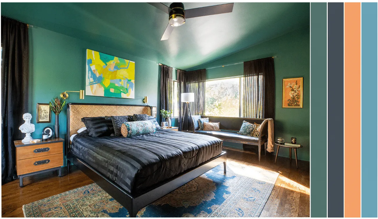
Colors used in order from left to right: Stone Bridge (DE5747); Deepest Sea (DE5825); Nectarine (DE5166); Pacific Palisade (DE5787)
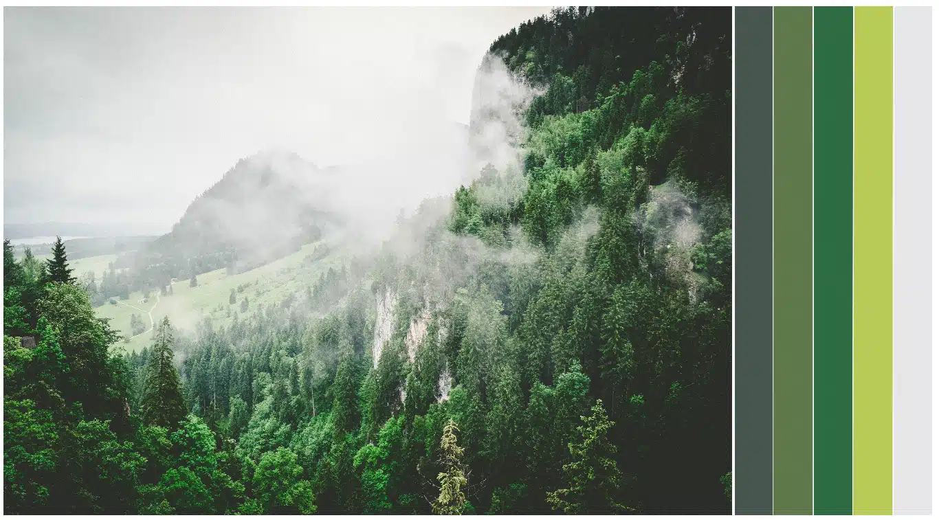
This next surprising spring color palette is comprised of green tones seen on a foggy spring morning. A kaleidoscope of greens poke through the misty fog for an unexpected spring palette that’s full of anything but your typical pastels.
Colors used in order from left to right: Huntington Woods (DET538); Jolly Green (DE5594); Lucky Clover (DEA130); Asparagus Fern (DE5551);Wisp Of Smoke (DE6344)
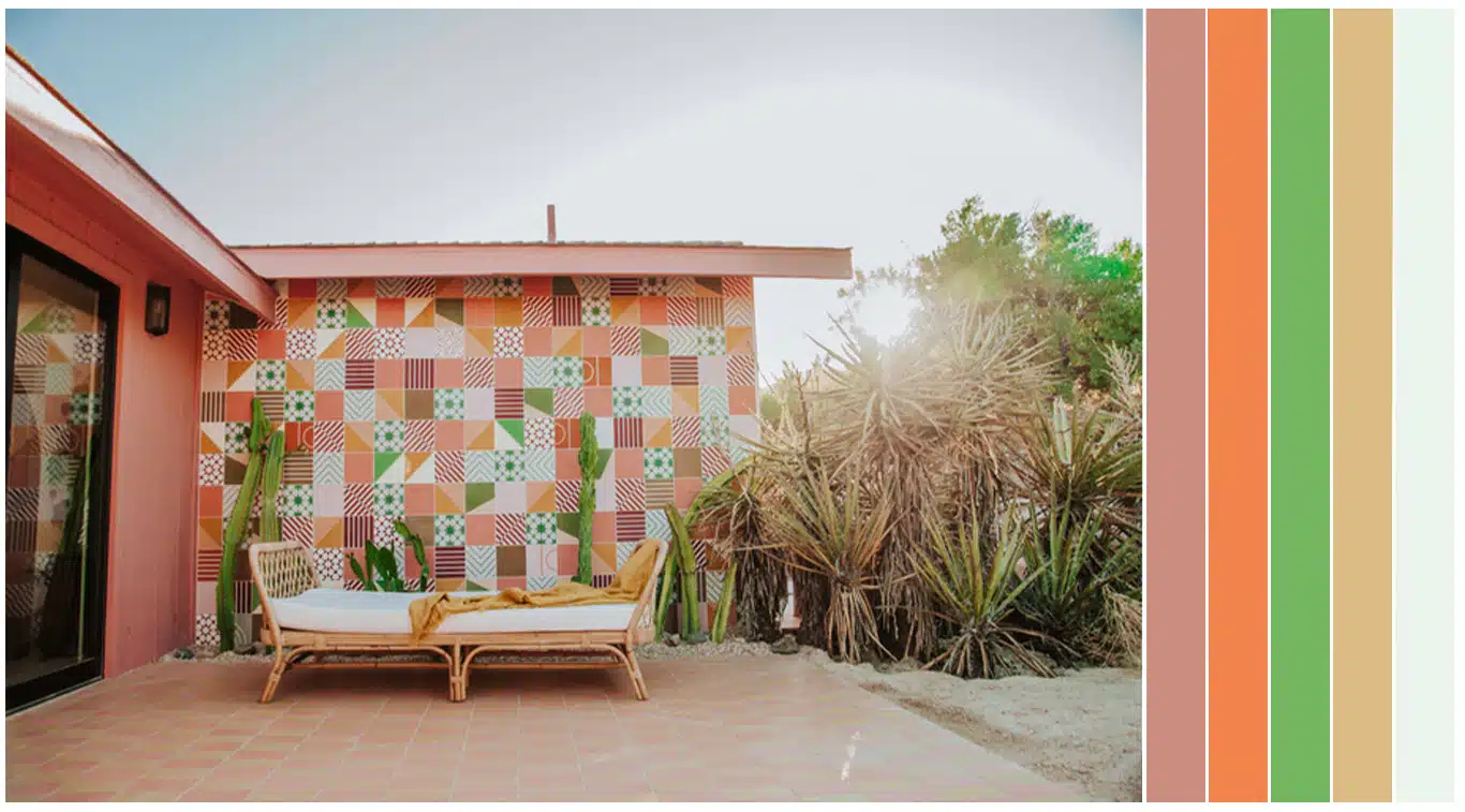
Another surprising spring color palette takes us to the desert. This palette finds inspiration in the colors of Dunn-Edwards collaborator and designer Claire Thomas’ Yucca Valley, California project Oeste.
Colors used in order from left to right: Rose De Mai (DET432); Tangerine Dream (DE5160); Palm Tree (DE5600); Toasted Marshmallow (DE6165); Spring White (DEW363)
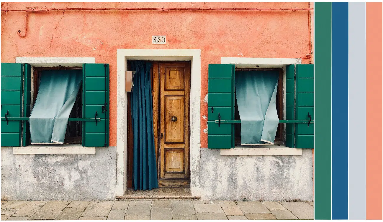
Our last surprising spring color palette takes inspiration from the far-flung locales we haven’t visited in over a year. Spring has once again awakened our zest for travel as the world takes small steps towards opening up. Here, emerald-teal shutters in a hue like Teal Waters (DEA131) pop against the coral-toned stucco walls of this quaint European village.
Colors used in order from left to right: Teal Waters (DEA131); Ink Blotch (DE5839); Shiny Nickel (DE6338); Pouring Copper (DE5144)
Inspired to play with color this spring? Take a look at some other spring palettes we’ve pulled together in the past.
Featured Articles
-
 Best Oranges for the Perfect Summer Beach Cottage
-
 Get Ready for Fall with These Trendy Color + Design Moods
-
 Try These Color Palettes To Nail A Tomato Girl Summer At Home
-
 Embracing Barbiecore: Popular Pinks Throughout The Ages
-
 The Color Yellow: Essential Color Theory, Symbolism and Design Application

